Fluid Typography in Tailwind
Tailwind’s default text sizes are fixed rem values — text-xl is 1.25rem at
every viewport — and fluid typography is not built in. There are three ways to
add it: write clamp() expressions into the v4 @theme block, put one clamp
on the root font size so every rem-based utility glides, or reach for a
community plugin. The first two need no dependency at all, and v4’s
CSS-first configuration made the first considerably more natural than it used
to be.
This article computes both plugin-free roads with real numbers. The arithmetic that produces those numbers — slope, intercept, bounds — is covered in our fluid typography guide; the question here is where the numbers live in a Tailwind project.
Why isn’t fluid type built into Tailwind?
Tailwind’s type scale is a set of named, static tokens: text-sm is 0.875rem,
text-base is 1rem, text-xl is 1.25rem, text-2xl is 1.5rem. The
framework’s job is to name sizes, not to decide how they respond to the
viewport — responsiveness is expressed through variants like md:text-2xl,
which is the breakpoint model: sizes that jump at chosen widths. If you want
sizes that glide between widths
instead, you supply the glide.
The v4 shift is what makes supplying it cheap. Configuration moved into CSS: a
token is declared in an @theme block,
becomes a CSS custom property, and the matching utility reads it — declare
--text-xl and text-xl uses your value. Because a custom property can hold
any CSS length expression, it can hold
a clamp(). Fluid type in v4 is
therefore plain CSS in a plain block; in v3, the same move meant editing
fontSize entries in tailwind.config.js and passing clamp strings through
JavaScript configuration.
How do you write fluid text sizes in @theme?
Redefine the text tokens. Here are three sizes in the fixed form Tailwind ships by default:
@theme {
  --text-base: 1rem;     /* 16px at every width */
  --text-xl: 1.25rem;    /* 20px at every width */
  --text-2xl: 1.5rem;    /* 24px at every width */
}
And the same three made fluid — each grows to 1.125× its size across viewports 360→1280px:
@theme {
  --text-base: clamp(1rem, 0.9511rem + 0.2174vw, 1.125rem);      /* 16 → 18px */
  --text-xl: clamp(1.25rem, 1.1889rem + 0.2717vw, 1.4063rem);    /* 20 → 22.5px */
  --text-2xl: clamp(1.5rem, 1.4266rem + 0.3261vw, 1.6875rem);    /* 24 → 27px */
}
Spot-check --text-2xl at both ends: at a 360px viewport, 0.3261vw is
≈1.17px, and 22.83 + 1.17 ≈ 24px; at 1280px it is ≈4.17px, and 22.83 + 4.17 ≈
27px. Writing text-2xl in markup now renders 24px on a narrow phone, 27px on
a wide desktop, and the on-the-line value everywhere between — no variants, no
media queries.
Two details worth noticing. The slopes differ — 0.2174vw, 0.2717vw, 0.3261vw —
but each is proportional to its token’s size, because every token grows by the
same 12.5%. That shared proportion is what keeps the hierarchy constant
through the glide; three clamps computed independently, each with an arbitrary
slope, would let the levels drift apart as the viewport changes. And each text
token has a companion line-height token (--text-xl--line-height), which
keeps its default unless you redefine it — leading deserves its own decision
once sizes start to move.
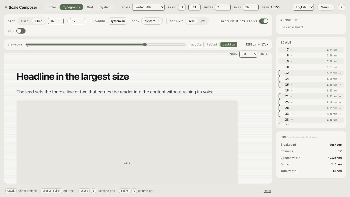
Computing proportional clamps for a whole scale by hand is mechanical, which
is exactly what makes it generatable: Scale Composer’s Tailwind v4 export in
fluid mode writes this block for you. Set the base glide (16→18 across
360→1280) and every type level’s clamp is derived from that single slope —
open the Tailwind export in fluid mode and flip the
fixed/fluid toggle to watch the @theme values switch between plain rem and
the clamp() expressions above.
Can one root clamp make every utility fluid?
The second road doesn’t touch @theme at all:
html {
  font-size: clamp(1rem, 0.9511rem + 0.2174vw, 1.125rem); /* ≈16px @360 → ≈18px @1280 */
}
(Keep the bounds in rem: on the root element, rem resolves against the reader’s browser font-size preference, so this form respects that setting — a px-denominated clamp would override it.)
Tailwind’s default text sizes are rem-based, and rem resolves against the
root. With the root gliding from 16px to 18px, text-xl renders 20px on the
narrow end and 22.5px on the wide end without a single token changing — the
untouched default theme is already fluid-ready. Two lines, and every utility
that speaks rem glides.
That “every” cuts both ways. Spacing utilities are rem-based too: p-4 is
1rem, which now renders 16px → 18px across the same glide. For a system where
space should scale with type — which keeps text-to-space proportions constant
— that is exactly what you want. But it is a global decision: the glide
reaches everything, and opting a single component out means writing its sizes
in px, stepping outside the token system for that element. The @theme road
is per-token; the root road is all-or-nothing.
What do fluid typography plugins add?
A category of community plugins generates per-size clamps from configuration:
you declare min/max pairs, or a scale and a viewport range, and the plugin
emits fluid utilities — some add variations like container-query-based sizing.
They automate the same arithmetic this article did by hand, and they predate
v4; part of their historical value was doing in JavaScript what @theme now
accepts as plain CSS. If your needs fit one of the two roads above, v4 has
made the dependency optional; if you want per-size ranges that don’t share one
proportion, a plugin can carry that bookkeeping — weighed against the usual
maintenance and compatibility questions any dependency brings.
Which road fits which project?
- The root clamp when the whole system — type and spacing — should move as one. Least code, one slope to verify, and the accessibility and zoom arithmetic is checked once, at the root.
@themeclamps when different levels need different ranges — a display size that grows faster than body text, or a project where spacing must stay fixed while type glides. More numbers, more control.- A plugin when per-size ranges multiply beyond what you want to maintain by hand.
The roads compose, too: several production setups clamp the root for the
system-wide glide and add one or two @theme clamps for display sizes that
need a steeper ride.
Generate the block from your own scale
The fastest way to a fluid @theme block is not to compute it but to read it:
open the export with editable fluid parameters, set your own
base sizes and viewport range, and watch every clamp in the block recompute
from the four numbers. Paste the result into your stylesheet and the utilities
you already write — text-xl, text-2xl — start gliding.