CSS clamp() Explained with Real Numbers
The CSS clamp() function takes three values — clamp(MIN, PREFERRED, MAX) —
and returns the preferred value locked between the two bounds; formally, it
resolves to max(MIN, min(PREFERRED, MAX)). For typography, the preferred
value is usually a formula that grows with the viewport, which makes a clamp
font size the standard one-line form of fluid type: a size that slides with
screen width but can never leave its designed range.
Most explanations stop at the anatomy. This one computes a real example all the way through — slope, intercept, the final declaration — and verifies it at three viewport widths, because the arithmetic is where clamp() stops being magic. It is part of our fluid typography guide.
How does clamp() decide which value wins?
Think of the three arguments as a floor, a moving value, and a ceiling — an anatomy web.dev’s guide to min(), max(), and clamp() illustrates well. The browser evaluates the preferred value first:
- Preferred below the minimum → the minimum wins (the floor holds).
- Preferred between the bounds → the preferred value wins (the moving part is in charge).
- Preferred above the maximum → the maximum wins (the ceiling holds).
The css clamp function re-evaluates whenever its inputs change — so a
preferred value containing vw is recomputed on every resize, which is
exactly the property
fluid typography exploits.
What do the rem and vw parts of the preferred value mean?
A fluid preferred value like 0.9511rem + 0.2174vw is a line equation in
disguise: size = intercept + slope × viewport. The vw term is the
slope — how many pixels the size gains per unit of viewport width — and
the rem term is the intercept, the value the line would have at a
hypothetical zero-width viewport. Two numbers, and together they fully
determine the glide.
The intercept being in rem is not cosmetic: rem tracks the user’s font-size
setting and browser zoom, so the whole line shifts when the reader zooms. A
preferred value made of pure vw is both inflexible (one term must encode
position and steepness at once) and an accessibility failure, since
text set in viewport units alone
ignores zoom entirely.
How do you calculate the numbers inside clamp()?
Take one of the most common briefs in fluid typography: body text at 16px on a 360px viewport, growing to 18px at 1280px. Three steps.
Step 1 — slope. Growth divided by viewport range:
slope = (18 − 16) / (1280 − 360) = 2 / 920 ≈ 0.002174Multiply by 100 to express it in vw (1vw = 1% of viewport width):
≈0.2174vw.
Step 2 — intercept. Walk the line back from the first known point:
intercept = 16 − 0.002174 × 360 ≈ 15.22px ≈ 0.9511rem (÷16)Step 3 — assemble. Minimum and maximum in rem (16px = 1rem, 18px = 1.125rem), preferred from the two computed terms:
font-size: clamp(1rem, 0.9511rem + 0.2174vw, 1.125rem);Now verify it, because a clamp you can’t check is a clamp you can’t trust:
| Viewport | 0.2174vw | 15.22px + slope term | Result |
|---|---|---|---|
| 360px | ≈0.78px | 15.22 + 0.78 = 16.00 | 16px ✓ (the minimum) |
| 800px | ≈1.74px | 15.22 + 1.74 = 16.96 | ≈16.96px (mid-glide) |
| 1280px | ≈2.78px | 15.22 + 2.78 = 18.00 | 18px ✓ (the maximum) |
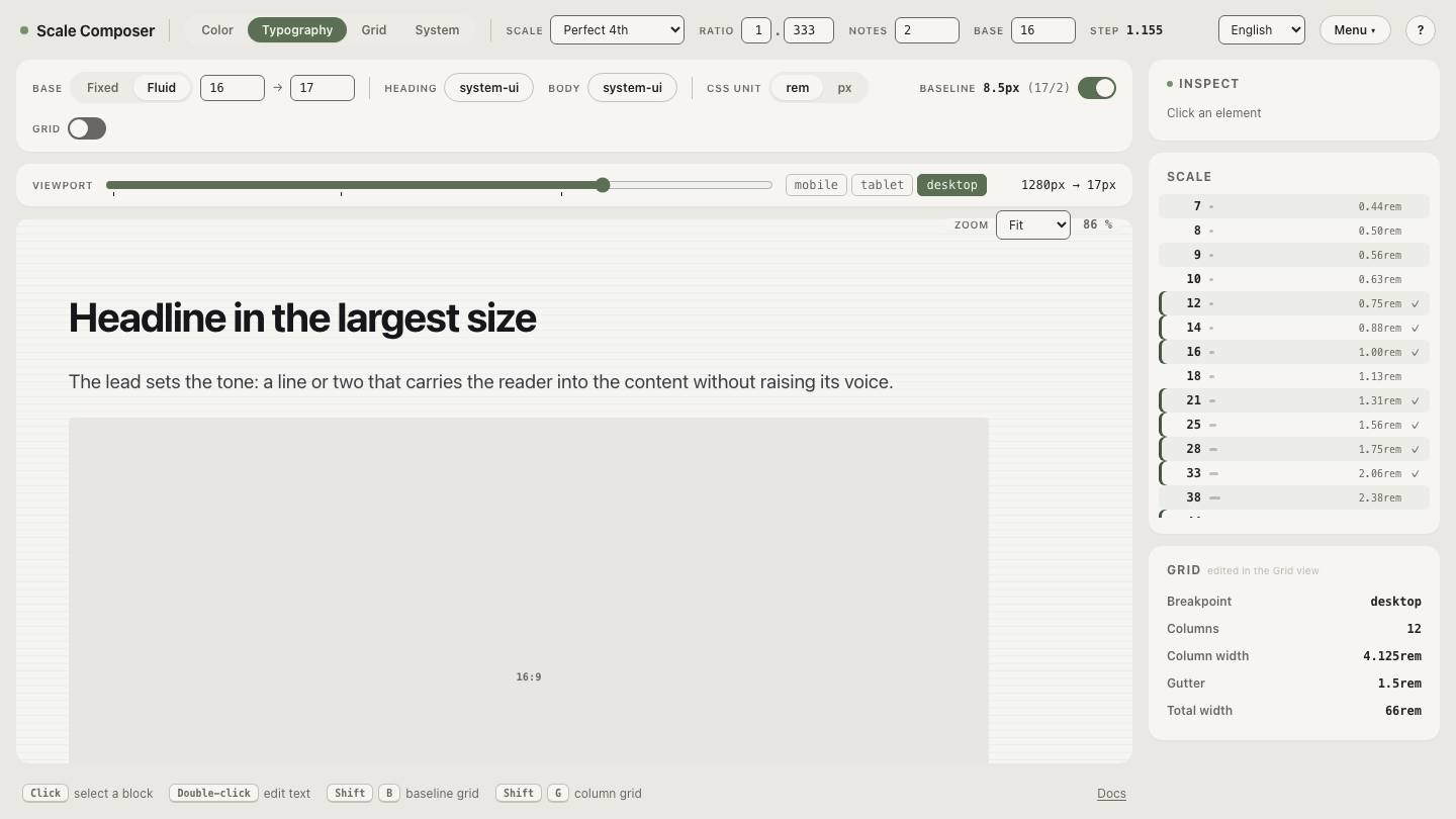
The endpoints land on the designed sizes, and the midpoint falls where the line says it should. You can inspect the same numbers live: open this clamp in Scale Composer — the fluid parameters (16→18 across 360→1280) produce exactly this expression, and dragging the preview width walks the table above in real time.
Does clamp() work on more than font-size?
Yes — clamp() accepts any length-valued property. Padding that breathes with the viewport, a gap that tightens on small screens, a content column that grows to a cap: all are the same pattern with different units in the same three slots. Fluid spacing systems are built on exactly this, with the same slope arithmetic as fluid type.
What are the common clamp() gotchas?
Three failure modes cover the common clamp() surprises:
- A minimum larger than the maximum. clamp() doesn’t reorder its
arguments — by definition,
max(MIN, min(PREFERRED, MAX))— so when MIN exceeds MAX, MIN simply wins and the value goes rigid. Easy to hit when a calculation produces a negative slope. - Percentages in font-size. A
%inside a font-size clamp resolves against the parent’s font size, not the viewport or the root — nested elements compound it. Use rem for the intercept and bounds. - Forgetting the zoom term. The rem part of the preferred value is what
lets browser zoom and user font-size preferences move the whole range. A
clamp whose preferred value is pure
vwholds its pixel size while the user is asking for bigger text.
Move the clamp to the root
One clamp per size works; one clamp for the whole system scales better. Put
the expression on html { font-size: … } and write every other size in rem:
each rem value now rides the root’s glide, so
the entire scale is fluid with one slope
— the architecture Scale Composer’s fluid mode generates for you.
Open the root-clamp setup to see the single expression on the
root and the whole scale gliding beneath it — then change base-max from 18 to
20 and watch one edit retune every size on the page.