What Is Fluid Typography?
Fluid typography defines each font size as a function of the viewport width: a minimum size for small screens, a maximum for large ones, and a smooth, continuous glide between the two. It replaces the breakpoint model — fixed sizes that jump at a few chosen widths — with a responsive font size that is recalculated at every width in between.
The technique became practical when CSS gained a way to express “a sliding value with a floor and a ceiling” in a single declaration, and it becomes a system when that declaration is applied once, at the root, so the entire type scale moves together. Both versions are worked through below with real numbers. This article is the starting point of our fluid typography guide.
What problem does fluid typography solve?
The breakpoint model serves a continuous range of screens with a step function. A heading tuned to look right at 1200px is still the size being shown at 900px, where it crowds the narrower columns, and at 1400px, where it no longer carries the wider layout. Between any two breakpoints, the design is drifting away from the width it was tuned for; adding more breakpoints shortens the drift but multiplies the tuning work — and every new step has edges of its own.
The intuitive version of the problem: screens are a continuum. Devices ship at practically every width from about 320px up to ultrawide monitors, and a continuum served by steps always has edges — widths where the jump is visible, and stretches where the size is merely tolerated. Fluid type dissolves the edges by making size track width directly: instead of asking “which of my three sizes applies here?”, the browser computes the one size that belongs to this exact width.
How does fluid typography work in CSS?
The whole technique fits in one declaration using
clamp(), which
takes a minimum, a preferred value, and a maximum. The preferred value mixes a
viewport unit (the sliding part) with a rem term (the anchor that keeps zoom
working). Here is a heading that glides from 28px at a 360px viewport to 38px
at 1280px:
h2 {
  font-size: clamp(1.75rem, 1.5054rem + 1.087vw, 2.375rem);
}
The numbers are not arbitrary. The 1.087vw term is the slope — ten pixels of
growth spread over 920 pixels of viewport — and 1.5054rem (≈24.09px) is
where that line crosses zero viewport width. Check it at both ends: at 360px,
1.087vw is ≈3.91px, and 24.09 + 3.91 = 28px. At 1280px, 1.087vw is
≈13.91px, and 24.09 + 13.91 = 38px. Below 360px the minimum holds; above
1280px the maximum holds; between them the size is always on the line.
The history behind that one line is short. Viewport units in the early 2010s
made size-follows-screen possible, and calc() formulas mixing vw with
rem made it controllable. clamp() shipping across the major browsers
around 2020 collapsed the whole pattern into a single declaration.
What turns one fluid size into a fluid system?
Writing a clamp like the one above for every size in a scale works, but it gives every size its own slope — and a dozen independently computed slopes are a dozen chances to disagree. The systematic version moves the clamp to the root font size and puts every other size in rem:
html {
  font-size: clamp(1rem, 0.9511rem + 0.2174vw, 1.125rem); /* ≈16px @360 → ≈18px @1280 */
}
(The bounds and intercept are in rem rather than px for a reason: on the root element, rem resolves against the reader’s browser font-size preference, so a rem-denominated clamp respects that setting while a px one silently overrides it.)
Because rem is defined relative to the root, every rem-based value in the
document now rides that single clamp. Body text at 1rem glides from 16px to
18px; a heading at 2.369rem glides from ≈37.9px to ≈42.6px; nothing else in
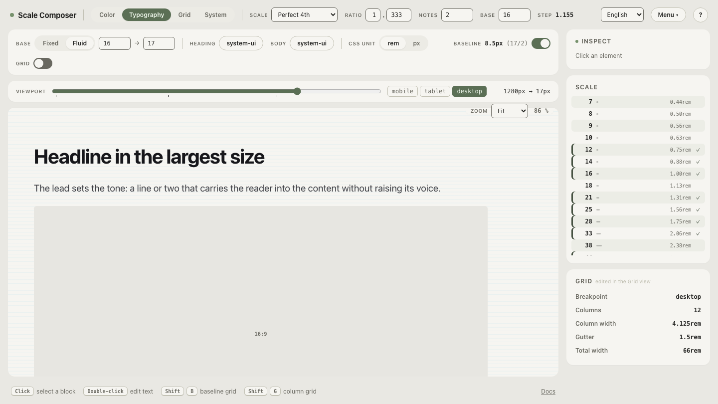
the stylesheet needs to change. This is how Scale Composer’s fluid mode works:
you set four parameters —
the base size at the small end, at the large end, and the two viewport
widths — and one slope carries the whole system.
See the system version in motion: open a full type scale in fluid mode and drag the preview width — every level of the scale recalculates from the same root clamp as the viewport changes.
What does fluid typography not change?
Two things survive untouched, and both are commonly misread as casualties.
The scale’s proportions. Fluid type changes the rendered pixels, not the relationships. With the root clamp above, every rem value grows by the same factor — 12.5% from one end of the glide to the other — so a scale built on a 1.333 ratio is still a 1.333 scale at 360px, at 1280px, and at every width between. The hierarchy you designed is what glides; it doesn’t dissolve.
The layout’s breakpoints. Fluid type is about text, not columns. A layout grid still changes column count in steps, because a grid genuinely is discrete — you can have two columns or three, not 2.4. Fluid typography removes the jumps from type while the layout keeps its breakpoints; the two systems coexist, each responding to width in the way its own content demands.
Compare fixed and fluid on the same scale
The fastest way to internalize the difference is to watch one scale switch models: toggle the same scale between fixed and fluid, then resize the preview in each mode. Fixed, the sizes sit still until a breakpoint would rescue them; fluid, they track the width continuously. The proportions never move in either mode — which is the point: fluid typography changes when sizes are right (always, within the range) rather than what the scale is.