Fluid vs Breakpoint Typography
Open two well-made sites side by side and drag the browser window slowly narrower. On one, the headline holds at 40px, snaps to 33px as you cross 1280px, holds again, and snaps to 28px at 768px — a staircase. On the other, it glides down a fraction of a pixel at a time and never visibly changes at all. Both are deliberate, coherent systems; they answered the same question differently.
Breakpoint typography defines fixed font sizes per viewport tier and jumps between them at media queries; fluid typography defines a size range and lets the browser interpolate continuously across it. Breakpoints buy predictability and per-tier control; fluid buys smoothness and fewer numbers — and many production systems end up combining them: fluid type inside stepped layouts. This is the comparison chapter of our fluid typography guide, and it argues both sides honestly.
What does breakpoint typography do better?
Predictability. In a breakpoint system, the h1 is exactly 33px on a 768px screen. That is a testable statement: QA can assert it, screenshots can be diffed pixel for pixel, and a bug report can say “the heading is wrong at tablet” and mean something precise. Fluid sizes are functions, and functions are harder to check against a spec by eye.
It matches how mockups get made. Designers design at fixed widths — a 375px frame, a 768px frame, a 1440px frame — and a breakpoint system is a direct transcription of those artboards. The tiered model is baked into how responsive design was originally formulated (see web.dev’s responsive design basics for that breakpoint-era model); the workflow and the technique co-evolved, which is part of why the technique persists.
Per-tier control. A breakpoint system can give mobile a genuinely different hierarchy, not just smaller sizes. In the worked example below, the mobile h1 is 1.75× body text while the desktop h1 is ≈2.22× — a flatter, calmer hierarchy on small screens, which is often the right editorial call. (Choosing that ratio is the type scale’s own question.) Pure fluid scaling cannot do this: it multiplies every level by the same factor, so the hierarchy’s shape stays constant.
What does fluid typography do better?
No between-sizes awkwardness. A breakpoint system is correct at its design widths and merely tolerable between them — at 1279px you get the tablet tier stretched to its limit, one pixel before the desktop tier snaps in. Fluid type has no in-between, because every width is a design width.
Fewer magic numbers. The worked example below specifies the same hierarchy as eleven numbers in three media contexts, or as seven numbers in one. The gap widens with every level and tier you add — sizes × tiers grows multiplicatively; four fluid parameters don’t grow at all.
Smoothness where widths are continuous. Foldables, split-screen tablets, resizable desktop windows: a growing share of sessions happen at widths no artboard anticipated, and some change width mid-session. A staircase system snaps during a drag-resize; a fluid one just breathes.
What does the same hierarchy look like both ways?
Three levels, specified as breakpoint tiers:
| 360–767px | 768–1279px | ≥1280px | |
|---|---|---|---|
| h1 | 28px | 33px | 40px |
| h2 | 22px | 25px | 28px |
| body | 16px | 16px | 18px |
Maintenance surface: nine size declarations plus two breakpoint values — eleven numbers across three media contexts. Adding a fourth text level means three more numbers; adding a fourth tier means re-deciding every level once more.
The same hierarchy, specified fluid in the root-clamp style: body = 1rem, h2 = 1.75rem, h1 = 2.375rem, and one root clamp gliding 16→18px across viewports 360→1280. Maintenance surface: three rem sizes plus four fluid parameters — seven numbers in one context, no media queries. The h1 renders at 38px on the narrow end, ≈40.4px at mid-range, 42.75px on the wide end.
Watch this hierarchy glide in Scale Composer — fluid mode’s viewport simulator lets you drag the simulated width across the range and see every level move on the one shared slope.
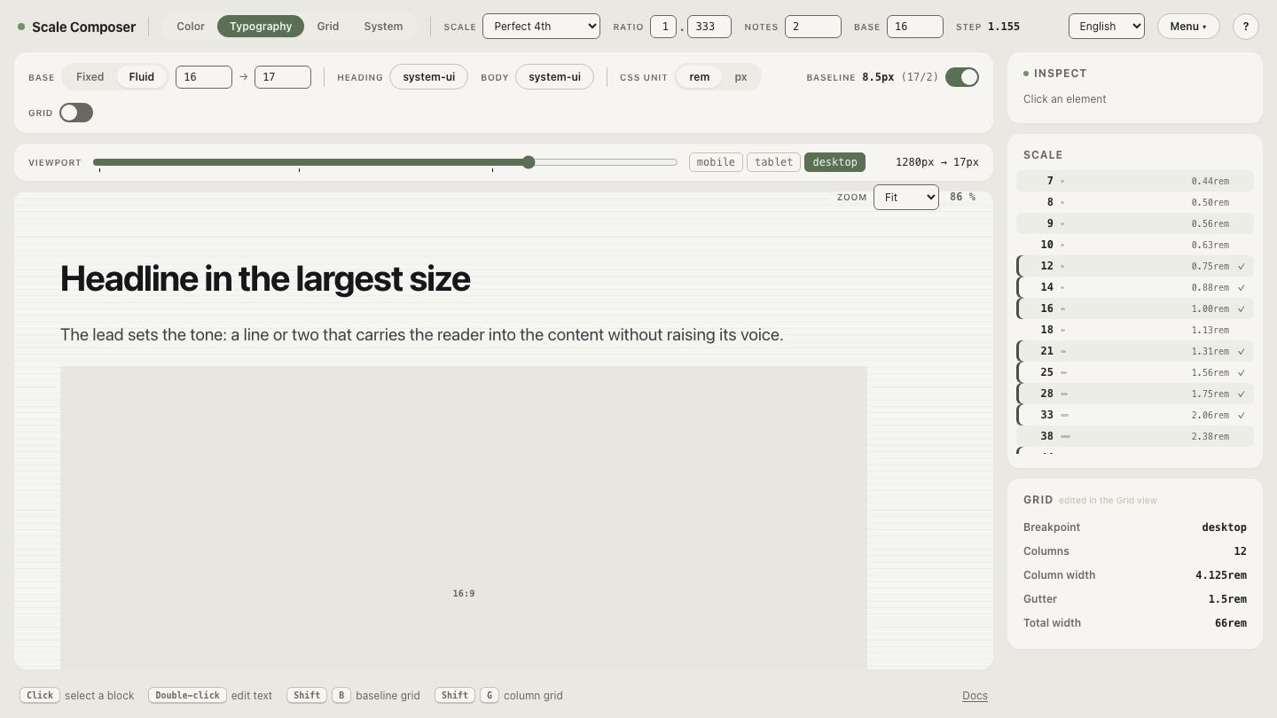
An honest asterisk: these two specs are close, but not the same design. The breakpoint version flattens the mobile hierarchy (h1 at 1.75× body); the fluid version holds 2.375× at every width. If the flatter mobile hierarchy matters to your content, the fluid system needs a per-tier override on top — which costs back some of its simplicity. Count that cost honestly rather than pretending the seven numbers buy everything the eleven did.
What do most products actually ship?
A hybrid: fluid type inside stepped layout. Columns, sidebars and navigation want discrete states — a three-column layout doesn’t degrade continuously, it reorganizes — so the layout keeps its breakpoints. The text inside those columns has no such constraint, so it glides. The two systems are independent and compose cleanly: the layout jumps, the type doesn’t, and neither needs to know about the other. Teams that need per-tier hierarchy changes add them as overrides at the layout’s existing breakpoints — stepped exceptions on a fluid base, rather than a fully stepped system.
Which one should you choose?
- Content and marketing sites: fluid. Long reading, a wide device spread, and a hierarchy whose shape can stay constant — the smoothness is pure gain and the parameter count stays tiny.
- Dense application UI: breakpoints — or no scaling at all. Dashboards and tools live in narrow, predictable width ranges where between-sizes awkwardness barely exists, and testability wins: “the table header is 13px” is a spec you can hold someone to.
- Systems that serve both: fluid tokens with per-tier overrides. One fluid foundation, stepped exceptions where a tier genuinely needs a different hierarchy.
And the testing cost, stated plainly: fluid means there is no finite set of widths at which the system is fully verified. In practice you test the endpoints, a mid-range width, and the widths where the gliding type meets a layout jump — but “in practice” is doing work in that sentence that a breakpoint system’s three screenshots never need.
Feel the difference in one drag
The whole comparison compresses into a single gesture: load the same scale with fluid mode off, read the fixed sizes, then flip the toggle to fluid and drag the viewport simulator across the range. The staircase and the glide agree at the endpoints — everything this guide compares lives in what happens between them.