Calculating a Fluid Type Scale Step by Step
Open the stylesheet behind many fluid sites and you’ll find thirty clamp() expressions — one per size, each with its own slope and intercept, all of which must agree for the scale to stay coherent. Open the stylesheet behind a root-based fluid system and you’ll find one.
A fluid type scale needs four decisions — the base size at the smallest viewport, the base size at the largest, and the two viewport widths — plus the ratio you already have. Compute one slope and one intercept for the root font size, put every other size in rem, and the entire scale glides with its proportions intact. This article walks that calculation once, completely. It’s part of our fluid typography guide; the per-size alternative is covered below too, because you’ll meet it in the wild.
What four inputs does a fluid type scale need?
The four-input model is the methodology popularized by Utopia, which framed fluid type as designing two states — a small-screen scale and a large-screen scale — and letting the browser interpolate. The same four numbers drive the root-clamp architecture shown here:
- base-min — body size at the small end. 16px is the common floor; going below it trades readability for room.
- base-max — body size at the large end. 18px gives a gentle glide; larger values suit reading-focused layouts viewed from further away.
- vp-min — the viewport where the glide starts, typically a small phone (360px here).
- vp-max — the viewport where the glide stops, typically where your layout’s container caps (1280px here).
16→18 across 360→1280 is a sensible default brief: enough growth to keep large screens comfortable, subtle enough that nobody sees it happen.
How do you calculate the root clamp?
Two derived numbers turn the four inputs into a clamp() expression. The slope is growth over range:
slope = (18 − 16) / (1280 − 360) = 2 / 920 ≈ 0.002174 → ×100 ≈ 0.2174vwThe intercept anchors the line at a known point:
intercept = 16 − 0.002174 × 360 ≈ 15.22pxAssembled and applied to the root:
html {
  font-size: clamp(16px, 15.22px + 0.2174vw, 18px);
}
Verify both ends: at 360px, 15.22 + 0.2174 × 3.6 ≈ 15.22 + 0.78 = 16px ✓; at 1280px, 15.22 + 0.2174 × 12.8 ≈ 15.22 + 2.78 = 18px ✓. That is the entire calculation — you will not need it again for any other size.
Why doesn’t every size need its own calculation?
Because rem is defined relative to the root, and the root is what glides.
A heading defined as 2.369rem (three steps up a 1.333-ratio scale) renders
at 2.369 × 16 ≈ 37.9px when the root is at its minimum and 2.369 × 18 ≈
42.6px at its maximum — no second clamp, no second slope. Every step of the
scale inherits the glide the same way:
| Step | Size (rem) | At 360px (root 16) | At 1280px (root 18) |
|---|---|---|---|
| −1 (caption) | 0.75rem | 12px | 13.5px |
| 0 (body) | 1rem | 16px | 18px |
| +1 (lead) | 1.333rem | ≈21.3px | ≈24.0px |
| +2 (h3) | 1.777rem | ≈28.4px | ≈32.0px |
| +3 (h2) | 2.369rem | ≈37.9px | ≈42.6px |
Read the table vertically and the ratio holds at both ends — each row is 1.333× the last. Read it horizontally and every row grows by the same 12.5%, because every row is riding the same root. Proportions intact, one slope, no drift between sizes. This is also why no fluid type scale calculator session is needed per size: the four parameters are the whole input. In the Scale Composer’s fluid mode you can see this directly — open the full parameter set and the scale table shows every step’s pixel value at both viewport endpoints, recomputed as you drag any of the four inputs.
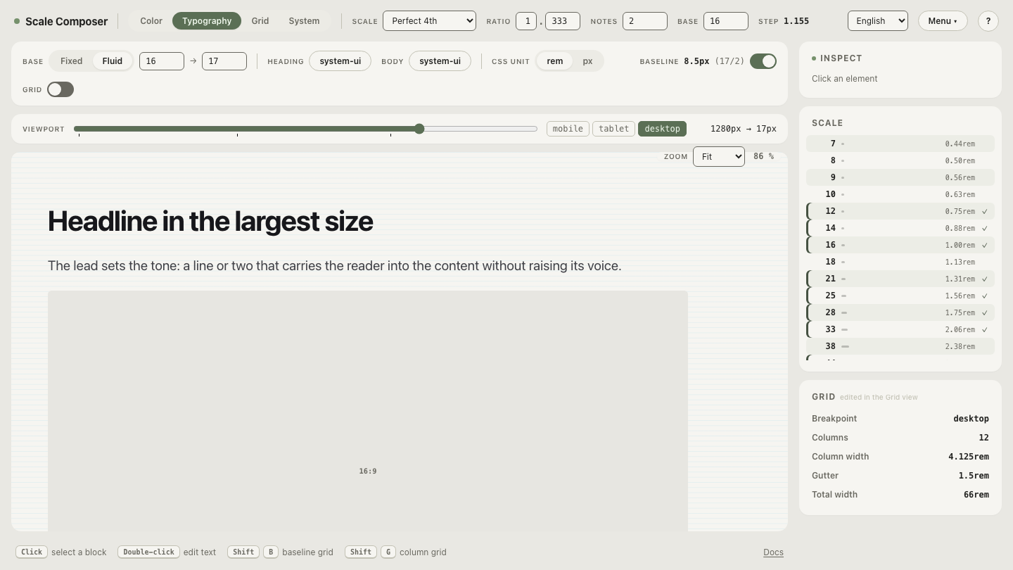
The DTCG token export carries the same four fluid parameters in its scale section, so downstream tools can reconstruct the clamp instead of parsing CSS.
When are per-size clamps the better tool?
The root-clamp model gives every size the same relative growth. Utopia-style output gives each size its own clamp — its own min, max, and slope — which buys one legitimate power: per-level steepness. A display headline can glide from 40px to 64px (60% growth) while body text glides 16 to 18 (12.5%):
font-size: clamp(2.5rem, 1.913rem + 2.6087vw, 4rem); /* 40px @360 → 64px @1280 */Verified: 30.61 + 2.6087 × 3.6 ≈ 40px ✓; 30.61 + 2.6087 × 12.8 ≈ 64px ✓ (intercept ≈30.61px ≈ 1.913rem). If your design wants hierarchy to widen on large screens — editorial headers, marketing heroes — that differential glide is the honest reason to pay the cost. The cost is surface: a size-count × clamp-count stylesheet where thirty expressions must stay mutually consistent, and where changing the viewport range means regenerating all of them rather than editing one line.
How does spacing become fluid in the same pass?
If type glides and spacing doesn’t, the composition drifts — text grows while the space around it stands still. In the root-clamp architecture, spacing needs no clamp of its own: spacing tokens are plain rem values, and rem rides the gliding root exactly like the font sizes do. The export wraps each one in a rounding step:
--space-md: round(nearest, calc(1.5rem * var(--spacing-density)), 0.5rem); /* 24→27px (fluid) */The 1.5rem token renders 24px when the root sits at 16 and 27px when it
reaches 18 — the same 12.5% the type gains, keeping
spacing and type in ratio — and round(nearest, …, 0.5rem)
snaps the moving value to the nearest half-rem, so fluid spacing still lands
on the spacing grid instead of drifting through fractional values. The CSS
export comments each fluid spacing value with its pixel range, so the
designed endpoints stay visible in the code.
Run your own numbers
The four inputs are decisions about your layout, and the fastest way to own them is to change them: start from the default parameters, set base-max to your large-screen body size, move vp-max to your container’s cap, and read the scale table at both endpoints. If the top step looks right at both widths, the thirty clamps you didn’t write were the correct thirty clamps to skip.