Fluid Type and WCAG 1.4.4: The Zoom Test
Fluid typography can satisfy WCAG 1.4.4 (Resize Text), and whether it does is decided by the arithmetic inside the clamp: the rem terms respond to zoom and to font-size preferences, the vw term does not. The larger the rem share of a fluid size, the closer text gets to a true 200% when the user zooms to 200%. A gentle glide such as 16→18px is roughly 90% rem-driven and zooms almost proportionally; a steep glide shifts weight onto the viewport term and quietly degrades the zoom response.
That split — how much of a size lives in rem versus vw — is this guide’s subject. It is the accessibility deep-dive of our fluid typography guide: the failure mode specific to fluid type, the clamp accessibility numbers that decide it, and a test protocol you can run in ten minutes.
What does WCAG 1.4.4 require?
Success Criterion 1.4.4, Resize Text requires that text can be resized up to 200 percent without loss of content or functionality. Two user mechanisms matter, and they are different: full-page zoom, which scales the CSS pixel itself, and the browser’s font-size preference, which changes the default size that rem units reference. A robust system responds to both. Pure viewport-unit text responds to neither — which makes careless fluid type one of the few modern techniques that can fail this criterion outright.
Why doesn’t browser zoom reach the vw term?
Zoom works by scaling the CSS pixel: at 200% zoom, one CSS pixel maps to two device pixels. Everything declared in px or rem therefore doubles physically. But the viewport is now half as many CSS pixels wide — a window 800 device pixels across becomes a 400 CSS-pixel viewport — and vw is defined against that viewport. The two effects cancel: 1vw is 8 device pixels before zoom (1% of 800) and 8 device pixels after (1% of 400, each worth two). Zoomed or not, a pure-vw size renders at the same physical size. The text is zoom-deaf.
A fluid clamp mixes both kinds of term, so it responds partially — and “partially” can be computed.
How much zoom response does a clamp keep?
Take the root clamp for a 16→18px glide across viewports 360→1280:
font-size: clamp(1rem, 0.9511rem + 0.2174vw, 1.125rem);At an 800px-wide window, the preferred value is ≈15.22px from the rem term plus ≈1.74px from the vw term — ≈16.96px in total, split roughly 90/10 in rem’s favor.
Now zoom to 200%. The rem part doubles to ≈30.43px of physical size; the vw part stays at ≈1.74px. Total: ≈32.17px — about 190% of the original. Slightly shy of proportional, and the missing share is exactly the vw share. In practice this passes: the text responds strongly, and a genuine 200% arrives one notch later on the zoom scale, well within what browsers offer.
Compare a hypothetical steeper clamp — clamp(0.75rem, 0.5rem + 1vw, 2rem) —
which at the same 800px window is 8px of rem and 8px of vw, a 50/50 split. At
200% zoom it reaches 24 device pixels: 150% of its original size. For its user
to actually double the text, they must zoom to 300%. That misses the intent of
the criterion, and audits commonly flag it.
The general rule falls out of the arithmetic: the steeper the slope, the more of the size lives in vw, and the worse the zoom response. Slope is not only a design decision about how fast text grows across screens — it is an accessibility decision about how much of the text zoom can reach.
One more consequence worth knowing: the clamp’s bounds are accessibility backstops. As the user zooms, the CSS viewport shrinks, the preferred value falls, and at some point the min bound takes over — past roughly 220% zoom in the 800px example. From there the size is pure rem and the response is fully proportional. The flat zones of a clamp are its safest territory.
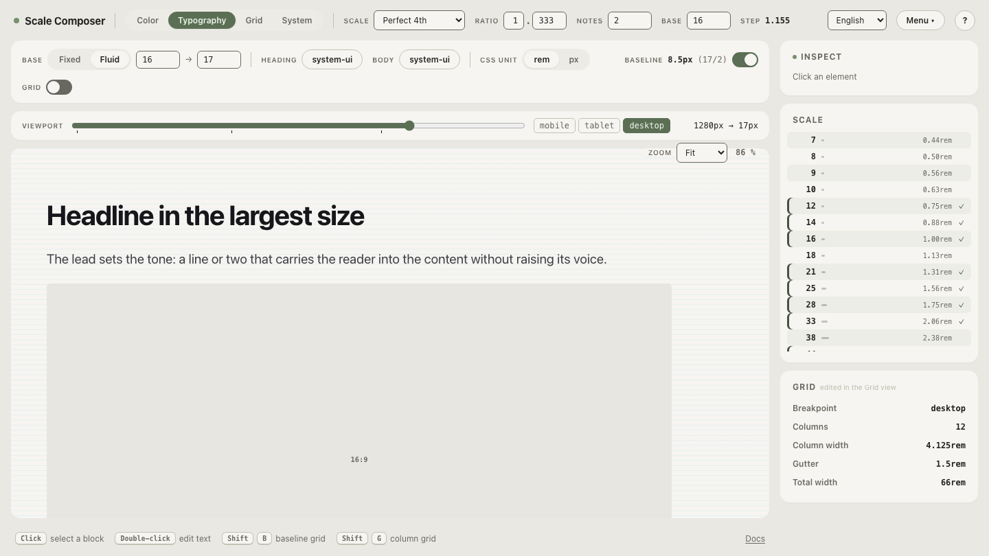
Open this root clamp in Scale Composer — fluid mode holds the four numbers behind it (base 16→18, viewports 360→1280), the CSS export writes the clamp with its pixel range commented, and the DTCG export carries the same four parameters, so the arithmetic above is reproducible.
How do you test fluid type for resize?
Three checks, in order of what they catch:
- Zoom to 200%. Body text should render at close to twice its physical size. If it visibly lags — grows a little, then stalls — the vw share is too high somewhere.
- Set the browser’s font-size preference to Large. Rem-based fluid text grows; px-anchored and vw-anchored text ignores the setting entirely. This catches a different failure than zoom does, so it is not redundant.
- Check at vp-min, vp-max and mid-range. Below the min and above the max the clamp is flat — pure rem, the safest zones. Mid-range is where the vw term carries its largest share, so run the fluid type zoom check at a mid-range width, not just at a comfortable desktop size.
Why does a root clamp make the audit easier?
A per-element fluid system gives you dozens of clamps, each with its own slope and its own rem/vw split — dozens of places for one steep slope to hide. The root-clamp architecture inverts that: one clamp on the root font size, everything else in rem riding it. The zoom behavior of the entire system is the zoom behavior of one expression, verified once.
And a gentle base glide is well-behaved by construction: 16→18 over 360→1280 puts about 90% of the size in the rem term at mid-range widths. The system-level drama — how large an h1 gets — lives in the type scale’s ratio, multiplied on top in zoom-safe rem, not in the slope of the glide.
Run the numbers on a steeper glide
The slope-accessibility connection is easiest to believe when you compute it yourself: open a steeper base glide in Scale Composer — 16→24 across the same viewport range — and redo the 800px arithmetic from its export. The rem share drops to ≈65%, and 200% zoom now yields ≈165%. Somewhere between that glide and the gentle one is your own system’s answer — and the export’s commented ranges give you every number you need to find it.