Readability vs Legibility: The Difference
Legibility is whether a reader can decode individual characters — a property of the typeface at a given size. Readability is whether sustained reading flows — a property of the setting: the size, line height, line length, contrast and spacing wrapped around the typeface. The two words get swapped constantly, including in professional writing, and the swap is not harmless: it points teams at the wrong fix.
The formal definitions draw the same boundary — legibility belongs to the letterforms, readability to the layout around them. A useful shorthand: legibility is the typeface designer’s job; readability is yours. This article is part of our typography guide; it covers what each term actually measures, why one can’t substitute for the other, and how the distinction changes what you fix first.
What makes a typeface legible?
Legibility lives in letterform distinctness — whether each character is unmistakably itself:
- The Il1 test. Set capital I, lowercase l and the digit 1 side by side. In some faces they are three distinct shapes; in others they are nearly one glyph repeated. For interfaces that display codes, passwords or IDs, this one check quickly disqualifies a surprising share of candidate fonts.
- The rn–m test. At small sizes, the pair “rn” can fuse into “m” — “modern” quietly becomes “modem”. Faces with tight spacing and closed forms fail earlier.
- Aperture openness. The aperture is the opening in letters like e, c, a and s. When apertures are nearly closed, e collapses toward o at distance or small size; open apertures keep the shapes apart under bad conditions.
- x-height. A taller lowercase carries more shape information at the same nominal size, which is one reason two fonts “at 14px” can differ so much in apparent size and clarity.
The Il1 and rn–m checks are standard legibility tests, and they share a property worth noticing: they are all about the font file itself. No CSS can change how a typeface draws its lowercase l.
What makes text readable?
Readability lives in everything you wrap around the typeface:
- Size — large enough for the reading distance; 16px is the common body baseline on screens.
- Line height — enough vertical room that lines read as separate lanes; around 1.5 for body text is a common convention.
- Line length — roughly 45–75 characters per line, so the eye’s trip back to the next line stays accurate.
- Contrast — enough difference between text and background to read without effort, which pale gray body text routinely fails.
- Spacing — paragraph spacing and letter spacing appropriate to the size.
Every item on that list is a layout decision. The same typeface can score anywhere from effortless to hostile on readability depending on how it is set — which is exactly why the two concepts need separate names.
Can text be legible but not readable?
Easily — and this asymmetry is the practical heart of the distinction: legibility is necessary but nowhere near sufficient. Take a thoroughly legible workhorse sans — open apertures, distinct Il1 — and set it twice:
| Parameter | Bad setting | Tuned setting |
|---|---|---|
| Font size | 13px | 16px |
| Line height | 15px (1.15) | 24px (1.5) |
| Line length | ~120 characters | ~66 characters |
| Text color | #999 on white (2.8:1) | #333 on white (12.6:1) |
Same face in both columns. In the bad setting every individual character remains perfectly decodable — lean in and you can read any word you point at — but continuous reading collapses: the cramped leading blurs lines together, the 120-character measure makes the return trip to the next line unreliable, and the low contrast taxes every fixation. Perfect legibility, poor readability.
The rescue doesn’t run the other way either. Give an ornate display script ideal size, leading and measure, and it still fails as 11px UI text — the letterforms themselves don’t carry enough distinctness at that size. Good setting can waste legibility; it cannot create it.
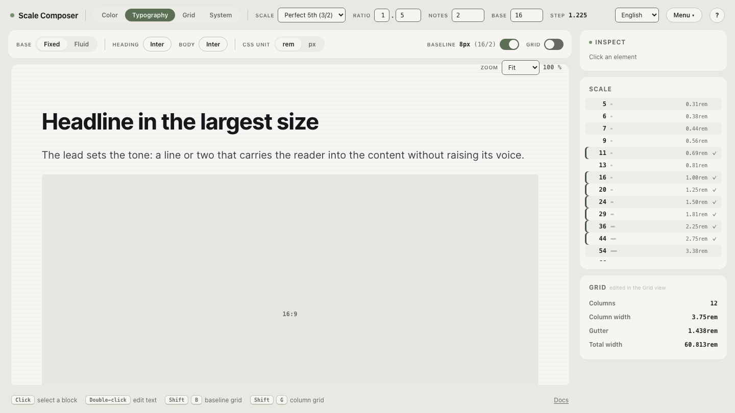
You can inspect the first half of that claim directly: open the mis-set specimen in Scale Composer — a legible face at a cramped line height, long measure and small size — and read a paragraph of it. The point makes itself somewhere around the third line.
Why does the distinction matter in practice?
Because it routes the fix. When users report that text is “hard to read”, the complaint is usually about readability — but the typeface is the most visible suspect, so teams respond by swapping the font, often after a detour through serif versus sans. The new face ships, the setting stays identical, and the complaint survives, because the size, leading, measure and contrast that caused it were never touched.
The distinction turns that guesswork into a checklist, ordered from cheapest and most likely to expensive and least likely:
- Size — is body text at least 16px-equivalent for the reading distance?
- Line height — is there room between lines, or is the leading below ~1.4 for body text?
- Line length — count characters; over ~75 per line, shorten the measure.
- Contrast — check the text color against its background; body text flirting with gray is a frequent offender.
- Then the typeface — only when the first four pass does “hard to read” become a legibility problem, and the Il1 and rn–m tests tell you whether the face itself is failing.
Steps one through four are CSS one-liners. Step five is a font migration. Running them in that order is the entire practical payoff of keeping the two words apart.
See the same face rescued
The fastest way to internalize the difference is to watch readability change while legibility stands still: open the tuned specimen — the same typeface as the mis-set demo, now at 16px on a 24px line with the measure pulled back into the comfortable band — and compare how far you read before effort sets in.