Line Length: The 45–75 Character Rule
Try a small experiment before reading any rules. Maximize your browser on a large monitor and open a page that lets text run the full width of the window — an older documentation site or a raw README usually works. Read four or five lines, and watch what happens at the end of each one: your eye makes a long diagonal trip back to the left edge, and on arrival it hesitates — sometimes re-reading the line it just finished, sometimes landing two lines down. Nothing is wrong with the typeface. The lines are simply too long for the return trip to land reliably.
The rule: body text reads best at 45–75 characters per line, counting spaces, and around 66 characters is the classic sweet spot. The numbers come from print typographic tradition — Robert Bringhurst’s The Elements of Typographic Style is the usual citation for the 66-character ideal — and they make line length one of the most measurable, least taste-dependent decisions in typography. This article is part of our typography guide; it covers why the rule exists, how to hit the range in CSS, and which text is exempt.
Why does line length affect readability?
Reading doesn’t glide along a line — the eye hops between fixation points, several characters at a jump. The hop that matters here is the largest one: the return sweep, the diagonal trip from the end of one line to the start of the next. That trip has a small target — one line height down, a full column width back — and its error rate grows with the distance traveled. On long lines the sweep lands short and the eye re-reads the line it just left (the doubling from the experiment above), or lands long and skips a line. This is a consistent finding in reading research, not a designer’s preference: the longer the line, the more often the trip back misses.
Short lines fail in the opposite way. A line of 30–35 characters holds only four or five words, so phrases that belong together get chopped across line breaks, and the eye spends a large share of its time turning around instead of moving forward. Comprehension survives, but the rhythm turns stop-start and reading feels like work.
The 45–75 band is simply the range where both failure modes stay rare: lines long enough to carry a complete phrase, short enough that the sweep back stays accurate.
How do you control characters per line?
Line length is a quotient: characters per line = column width ÷ average
character width. You rarely control the second term — it belongs to the
typeface and the font size — so the working lever is the first: the width of
the text column, which in CSS means max-width on the text container.
The most direct unit for the job is ch. One ch equals the width of the
digit 0 in the current font and size, which in most proportional text faces
sits close to the average character width. That makes this a one-line
implementation of the rule:
article p {
  max-width: 65ch;
}
It isn’t exact — the 0 is usually a touch wider than the true average
character, so 65ch often holds closer to 70 characters — but it lands the
column inside the band, and it re-scales automatically when the font size
changes, which a pixel value does not.
The structural lever is the column system itself. A layout grid’s text columns are, among other things, a line-length budget: choose column spans so that body text lands in the band at your widest breakpoint, and every narrower breakpoint inherits a safe count.
Why does responsive design complicate line length?
Because screens grew faster than reading did. At 16px, an average character occupies roughly 8px of width, so a paragraph spanning a 1440px window runs about 180 characters per line — more than double the top of the band. This, more than any aesthetic preference, is why max-width containers and column grids exist at all: a full-bleed hero image can span the window, but paragraphs need a fence. On large screens, unconstrained width is the default failure, not an edge case.
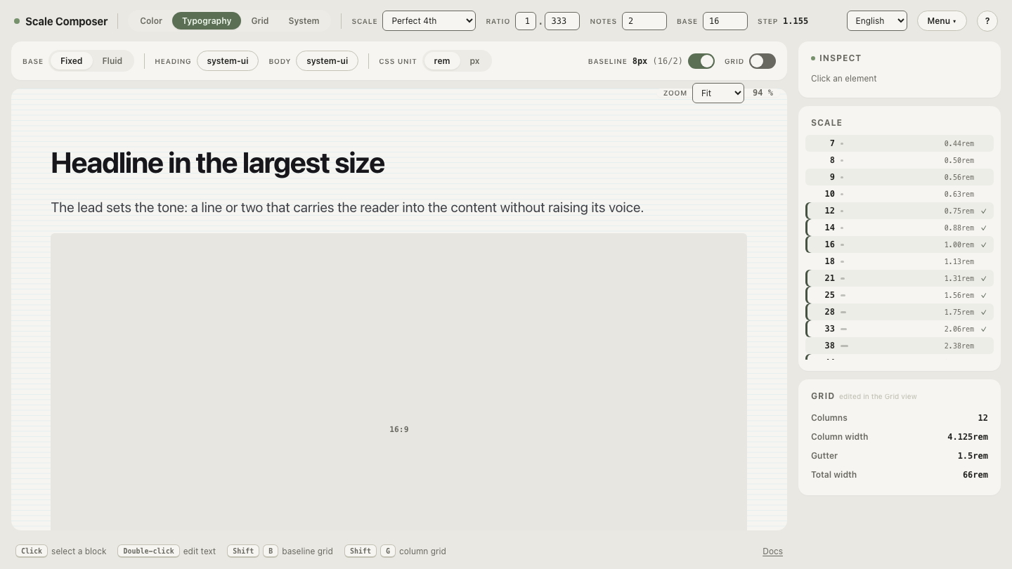
Judging the count against a real column beats estimating from the window. The Scale Composer’s type view carries a read-only column overlay that mirrors the largest breakpoint from the grid settings: open the body-text specimen with the overlay on and read your own body size against actual column widths — the moment a line overruns the comfortable band is visible directly in running text.
Does the rule apply to every kind of text?
No — it protects continuous reading, and much interface text isn’t that:
| Text | Range | Why |
|---|---|---|
| Body text, single column | 45–75 characters | the return sweep must land reliably, line after line |
| Body text, multiple columns | 45–60 characters | with a neighboring column competing for the landing zone, shorter lines keep the eye in its own column |
| Captions, UI labels, buttons | exempt | usually a single line — no return sweep, nothing to protect |
| Headings | exempt | a few words are taken in as a shape, not scanned linearly |
The exemptions matter as much as the rule: forcing a 45-character minimum onto a three-word button label solves a problem the label doesn’t have.
What does the same paragraph look like at 40, 66 and 120 characters?
Take a 70-word paragraph — about 420 characters with spaces — set at 16px, where the average character is roughly 8px wide:
- At ~40 characters (a 320px column) the paragraph runs about eleven lines. Almost no sentence survives a line intact; phrases break mid-thought, the ragged right edge is deep, and the eye turns around every four or five words. The text reads in fragments.
- At ~66 characters (a 530px column) it runs about seven lines. Most lines carry a complete phrase, the ~500px return sweep lands dependably, and the paragraph reads in phrases rather than fragments. This is the setting the rule protects.
- At ~120 characters (a 960px column) it runs about four lines — and each return sweep now travels nearly a thousand pixels. This is where the doubled and skipped lines from the opening experiment appear, and where readers quietly start scanning instead of reading.
Same paragraph, same typeface, same size. The column alone decides which of the three experiences a reader gets.
Check your own columns
The band only becomes conviction against your own layout. Start from the broken end: load a specimen whose lines run well past the band, feel the return sweep degrade in text you can edit, then narrow the container until the count drops through 75 and settles near 66 — open the too-wide specimen and bring it back into the band.