Serif vs Sans for Body Text on Screens
On modern screens, serif versus sans serif is not really a readability decision — studies comparing the two at today’s rendering quality find no consistent advantage either way. It is a voice decision: serifs read editorial and established, sans faces read neutral and product-like. Size, line height, line length and contrast affect readability far more than the serif question does.
The old rule — serifs for print, sans for screens — deserves an honest retirement rather than a quiet one, because it was right once, and knowing why it expired is the fastest way to know what to do instead. This article is part of our typography guide.
Where did “use sans serif on screens” come from?
From hardware. Early screens rendered text at around 72–96 coarse pixels per inch, and at that resolution the fine finishing strokes — the serifs that give the class its name — dissolved into noise or vanished from the pixel grid entirely, while the even, low-contrast strokes of a sans survived. That is the whole history in two sentences: the rule encoded a rendering limitation, and high-resolution displays removed the limitation. The advice outlived its reason — advice usually does.
What does the research actually show about serif readability?
At modern rendering quality: no consistent winner. Some studies find a slight edge for serifs, some for sans, and many find no significant difference at all — the effects that do appear are small and don’t replicate reliably across studies.
The consistent finding in this research is a different one, and more useful: the variables people ignore matter more than the one they argue about. Text size, line height, line length and contrast each move reading comfort by amounts that dwarf any serif effect — closer to an order of magnitude than to parity. A 16px serif on a 24px line at a 65-character measure will read more comfortably than a 13px sans with cramped leading in nearly every context. Teams that debate serif-versus-sans while shipping 12px text at line-height 1.2 are optimizing the wrong variable.
What actually differs between serif and sans body text?
Two things survive honest scrutiny:
Register. Serifs read editorial, established, literary — the accumulated association of newspapers, books and journals. Sans faces read neutral, contemporary, product-like — the accumulated association of interfaces. Neither is better; they answer different brand questions. This is the same class of decision as the tone of your copy, and it deserves the same deliberateness.
Small-size robustness. The honest remnant of the old rule: at very small sizes on low-resolution screens — below roughly 12px on a non-retina monitor — fine serifs and thin stroke transitions can still break up. If your product carries dense 11–12px interface text and your users sit at older office displays, a sans at the bottom of the scale remains the pragmatic call. That is a niche, not a law — but it is a real niche.
What changes when you set the same paragraph in both?
Take one paragraph and set it twice at identical settings — 16px, a 24px line, a measure of about 65 characters — once in a Lora-class serif, once in an Inter-class sans:
- What differs: the texture of the block — what typographers call its color. The serif paragraph reads slightly darker and more patterned; the sans reads more uniform. Apparent size can differ too: a serif with a small x-height looks smaller than the numbers suggest, which is an argument for comparing faces visually rather than by point size. And the register shifts — the serif version feels like an article, the sans like an interface.
- What doesn’t: the reading. At these settings both versions are simply comfortable, and most readers, asked afterwards, will remember what the paragraph said rather than which face carried it.
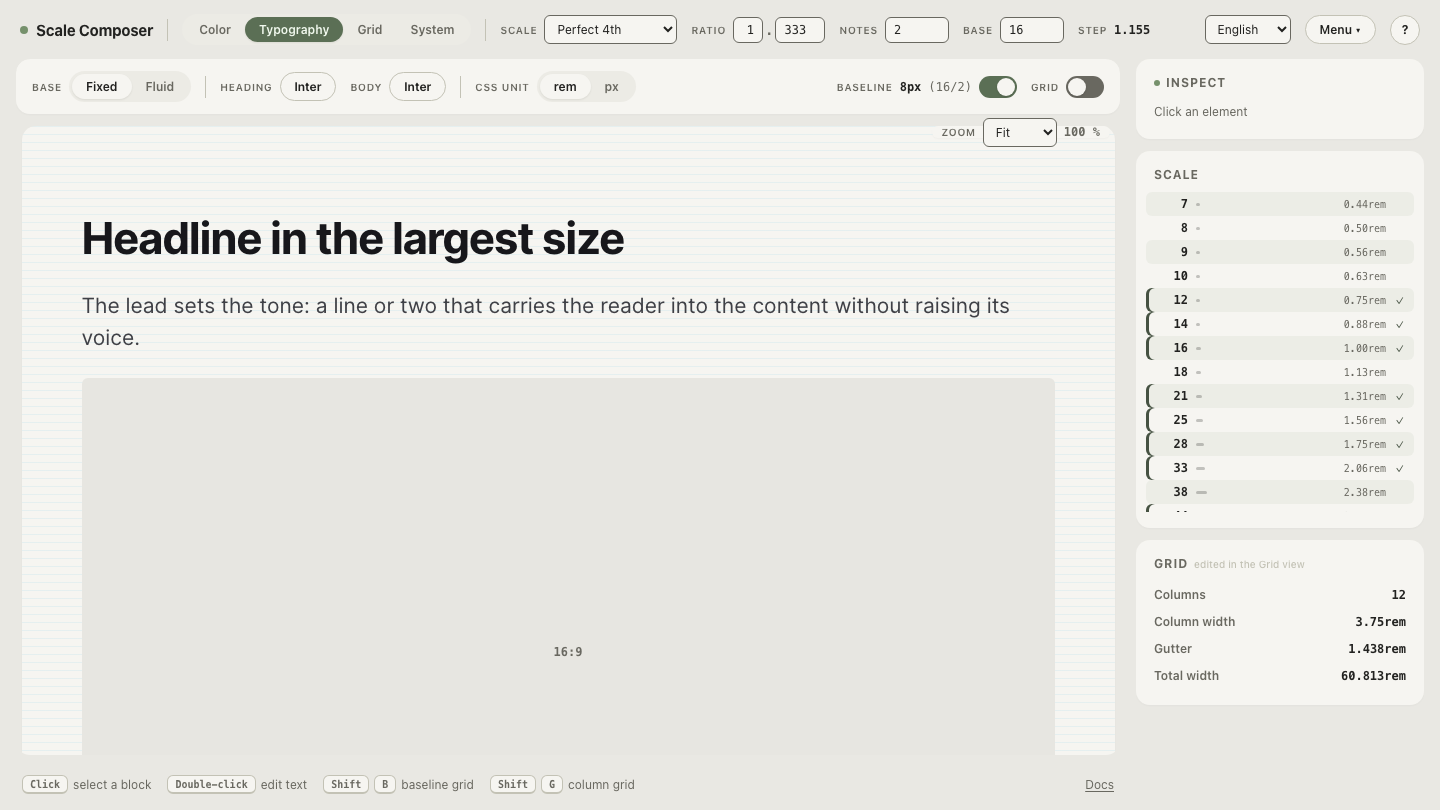
Set the same paragraph in a serif and a sans on one scale — both faces at identical size and baseline-snapped line height, in editable specimen text. Paste a paragraph of your own writing and read both versions to the end before forming an opinion.
How do you decide for your product?
A short framework covers most cases:
- Product UI — buttons, labels, settings, tables: sans, by convention and by small-size robustness. Interface text spends much of its life at the bottom of the scale, where the sans advantage is the one part of the old rule still standing. This is a default with good reasons, not a law.
- Long-form reading — articles, documentation, essays: either. At 16px and up, well set, both classes read comfortably; choose by voice. An established, editorial register argues for a serif; a neutral, product register argues for a sans.
- The mixed pattern — a serif article body inside sans product chrome — is the common editorial answer, and for good reason: news sites and reading apps routinely set navigation and controls in a sans while the story itself runs in a serif. The register split matches the job split.
Read a full paragraph before you decide
Switch the body slot to a serif and read — not a glance: a full paragraph at 16px, with the column overlay on so you can judge the line length you’d actually ship. The answer for your product tends to arrive by the second paragraph — and it will be a voice answer, not a readability one.