Letterforms and Brand Voice: What a Typeface Signals
A typeface signals a register, not a message. Geometric sans faces read engineered, modern and neutral; humanist sans faces read warmer and more human; grotesques read workmanlike and editorial; serifs read established, literary and institutional. These are learned associations built over decades of use — real, but coarse — and category context can override any of them.
That double honesty — the signal is real, and it is coarse — is the whole discipline of this topic. A typeface can say engineered; it cannot say we ship on time. Expecting a register to carry a message is how font psychology tips into astrology — color psychology fails the same way. This article is part of our typography guide.
What do the main typeface categories signal?
The standard typeface classifications map surprisingly well onto registers, because each category’s construction has kept consistent company for decades:
- Geometric sans — letterforms built from circles and straight lines (Futura-class, Montserrat-class). Reads engineered, modern, deliberate: the register of tech products and design studios.
- Humanist sans — letterforms with calligraphic skeletons, descended from the handwritten stroke (Source Sans-class, Open Sans-class). Reads warmer, more human, more approachable.
- Grotesque sans — the plainspoken, slightly stiff originals and their descendants (Inter-class, Roboto-class). Reads workmanlike, Swiss, editorial: type that gets on with the job.
- Serif — the register of print’s accumulated authority. Reads established, literary, institutional; within the class, higher-contrast faces skew formal and elegant, sturdier ones skew bookish and warm.
The caveat belongs in the same breath: these are learned associations, not innate meanings. Geometric sans reads “tech” because tech companies have used it for decades, the same way monospace reads “code” because of code editors — the category taught the association. And category context can override any of it: a law firm set in a friendly rounded sans still reads as a law firm trying something, not as a friendly brand.
What does the same sentence look like in three different voices?
Take one sentence — “Your order is on its way.” — and set it in three faces at the same size:
- Montserrat-class geometric: even, precise, slightly distant. A system is informing you. Competence is the note; warmth is not.
- Source Sans-class humanist: the same words, noticeably warmer. A person at a desk wrote this. The calligraphic skeleton reads as a trace of a human hand.
- Lora-class serif: considered, editorial, established. Less a notification than a note — a register most products don’t want for shipping updates, and some brands want everywhere.
The words never changed; the register did. That is the entire phenomenon this article is about, at its natural scale — one sentence.
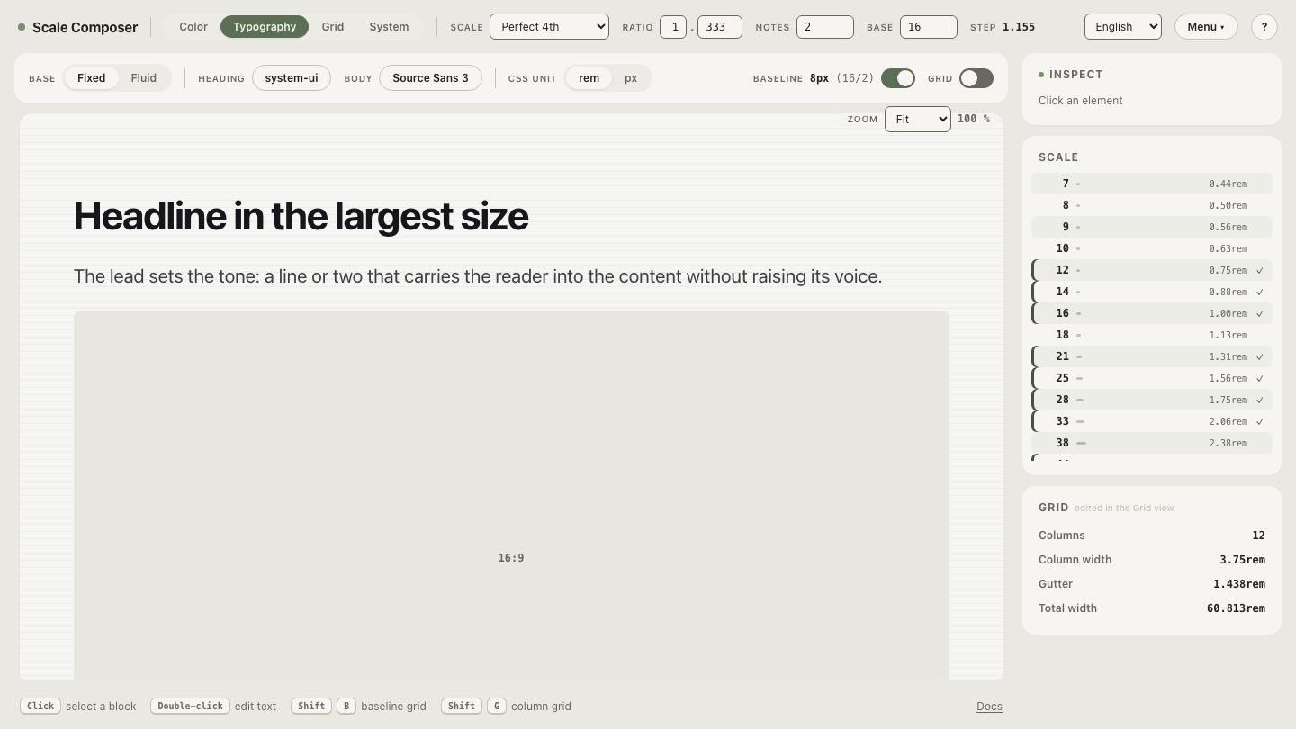
Set your own sentence in three voices in Scale Composer — a geometric, a humanist and a serif side by side in editable specimen text at real sizes. Type a sentence your product actually says, and watch the register shift while the message stays put.
Which letterform mechanics drive the impression?
Under the category vibes sit measurable features, and they travel across categories:
| Feature | Tends to read as |
|---|---|
| Larger x-height | approachable, contemporary, open |
| Smaller x-height | classical, formal, bookish |
| Higher stroke contrast | formal, editorial, refined |
| Condensed width | urgent, dense, economical |
| Wide width | confident, spacious, expensive |
| Rounded corners and terminals | soft, friendly, casual |
Most of these are learned like the categories are. The rounded-corner row is the partial exception — the one association with some direct perceptual grounding: the human response to curved versus sharp contours has been studied outside typography, and curved shapes are consistently rated as more approachable, angular ones as more alert or threatening. Even there, the effect is a nudge, not a script.
The mechanics matter because they let you tune within a choice. Two humanist sans faces can sit at opposite ends of formal-to-casual purely on x-height and corner treatment — the category sets the register’s neighborhood, the mechanics pick the street.
How do you match a typeface to a brand voice?
Adjectives first, faces second. The failure mode is browsing fonts until one “feels right” and reverse-engineering a rationale; the method is:
- Name three adjectives for the brand voice before looking at a single face — capable, warm, direct, say, or precise, calm, established. If the brand work already exists, take them from it rather than inventing new ones.
- Audit candidate faces against the adjectives in real product text — not logo text. A logo is six letters seen a thousand times; the brand’s actual words live in paragraphs, settings screens, error messages and emails. Letterform personality shows in running text, because that is where the reader spends time with it. A face that feels warm as a wordmark and clinical as a paragraph fails the audit.
- Check the register survives the whole scale. The voice has to hold at caption size and headline size alike — or you need a deliberate pairing where a second face carries part of the range.
The adjectives also arbitrate disagreements. “I like this one better” is a stalemate; “this one is warmer, and warm is on our list” is a decision.
Put a face in front of your own adjectives
Audit a candidate face against your brand voice — heading and body slots open to a curated set of around fifty faces, previewed in editable running text. Write your three adjectives down first, paste in a paragraph your product actually says, and swap faces until one earns all three words — in the paragraph, not the headline.