Placeholder, Caption and Secondary Text: The Gray Trap
A support ticket that turns up in nearly every product’s history: a user fills out a form, submits it, gets an error, and cannot work out which field was wrong — because the hint text under the field, the placeholder inside it, and the helper note beside it are all a fashionable light gray they simply cannot read. On the designer’s calibrated monitor in a dim studio the gray looked elegant. On the user’s laptop in a bright room, it was gone. The information was there the whole time; the contrast wasn’t.
The gray trap is what happens when designers signal “less important” by
making text lighter — because the mechanism that creates the de-emphasis is
the same mechanism that destroys legibility. Push the gray far enough and
de-emphasis quietly becomes exclusion. The fix is a floor: secondary text
still has to clear 4.5:1 (normal size) against its background. The classic
#999 on white measures only ≈2.8:1 and fails; #767676 is the lightest
gray that passes at ≈4.5:1 — the famous “accessible gray.” The floors
themselves are covered in our contrast guide; this
article is about the text that falls through them most often.
Why is light gray such a common trap?
Because it works — right up until it doesn’t. Hierarchy asks for some way to say “this matters less,” and lightening the text is the easiest lever on the board: one value change and the caption recedes. The problem is that recession and illegibility are the same physical process seen from two distances. A little lightening reads as quieter; a little more reads as fainter; past a point it reads as absent — and there is no visual alarm at the boundary, so the slider slides right through it.
The framing that keeps you on the right side: hierarchy should whisper, not disappear. A whisper is quieter than speech and still fully intelligible. Gray text that has crossed the floor is not whispering — it has left the room.
Which text falls into it?
The everyday victims, all of them real text carrying real information:
- Placeholders — the example text inside an empty input.
- Captions and helper text — the note under a field, the label under an image.
- Timestamps and metadata — “2 hours ago”, author bylines, file sizes.
- Empty-state hints — “No results yet. Try a different search.”
Every one of these is content a user needs to read. Making them illegible does not make them unimportant; it makes them a barrier.
Placeholder versus disabled: the most-confused pair in WCAG
This distinction sends more accessible-looking designs over the floor than any other, so state it flatly:
- Disabled text is exempt from the contrast minimum. WCAG explicitly excludes inactive, disabled UI components — a grayed-out button reads as “you can’t use this right now,” and its low contrast is part of that message.
- Placeholder text is not exempt. A placeholder sits in an active field, and it is real text conveying real information — a format example, a prompt, sometimes the only label the field has. It has to clear the standard 4.5:1 floor like any other body text.
Designers reach for the same faint gray for both because they look alike — low-emphasis text in a form. But one is a disabled control and the other is live content. The Understanding Contrast (Minimum) document spells out the exemption and its limits; the short version is that “it looks inactive” is not the same as “it is inactive.”
What are the actual numbers?
Take a metadata line — “Updated 3 days ago by Sam” — on a white #ffffff
background, and walk it down the gray ladder to find the boundary:
| Gray | Ratio on white | Verdict |
|---|---|---|
#aaaaaa | ≈2.3:1 | Fails — the “looks nice, reads badly” zone |
#999999 | ≈2.8:1 | Fails — the single most common secondary-text value on the web |
#808080 | ≈4.0:1 | Fails — even true 50% gray misses the floor |
#767676 | ≈4.5:1 | Passes (just) — the lightest gray that clears AA for normal text |
The boundary is sharp and it sits later than intuition suggests: a
mid-gray like #808080 still fails, and #999 — which feels like a
reasonable “secondary” color — is nowhere near passing. Anything you want
below #767676 on white needs to earn its de-emphasis some other way.
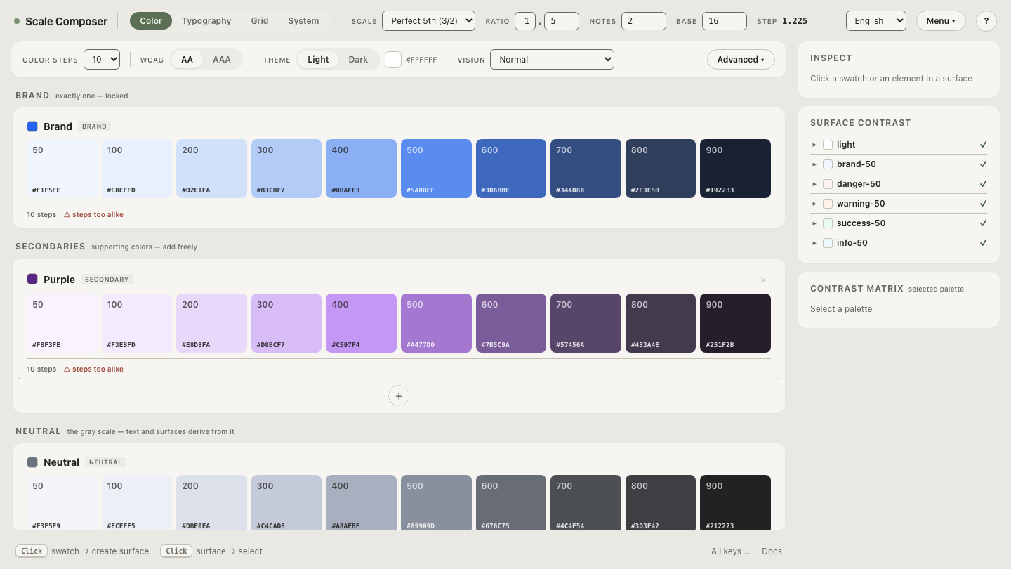
This is exactly the logic Scale Composer’s caption role encodes. Rather than picking a pleasant-looking gray and hoping, it selects the subtlest step that still passes — de-emphasis pushed right up against the floor and stopped there, never through it. The caption is as quiet as the rules allow and no quieter.
Open a palette and inspect the caption role’s scored pick — the derivation lands the caption at the faintest passing step, with its WCAG ratio and APCA value shown so you can see it sitting just above the line rather than below it.
How do you de-emphasize without going illegible?
Lightness is one tool for hierarchy — not the only one, and not the best one past the floor. The rest of the toolkit costs nothing in legibility:
- Size — a smaller caption reads as secondary at full contrast.
- Weight — regular against the body’s semibold; lighter, not fainter.
- Spacing — a metadata line set apart by whitespace recedes on its own.
- Position — below or beside the main content, where the eye files it as supporting.
Combine two of these and you get clear hierarchy while the text stays at a comfortable contrast. Gray is a garnish on top, spent down only to the floor — not the whole meal.
One line for dark mode, because the trap inverts rather than
disappears:
on a dark surface, secondary text goes too dark instead of too light. A
gray like #767676 that passes on white gives only ≈4.1:1 on a #121212
background and fails — on dark, secondary text has to be lifted lighter,
around #888 or above, to clear the same floor.
How do you audit your own grays?
Line them up. Load your palette and walk a metadata line down the gray ladder — watch the contrast ratio fall through 4.5:1 and find the exact step where “elegantly subtle” becomes “cannot read it.” Locate that boundary once in your own colors and every future “let’s make it a bit lighter” decision has a hard stop it can’t quietly slide past.