Dark Mode Contrast Pitfalls
Take the foreground colors of a light theme you trust — the brand blue, both text grays, the off-white that never gets used, pure white — and re-measure each one against a near-black page instead of a white one. The numbers do not degrade uniformly; they reorder. The secondary-text gray that passed with room to spare drops to ≈2.5:1. The brand blue that carried buttons falls to ≈3.3:1. And the two values that were unusable on white — off-white and pure white — post the strongest results in the column.
Dark mode contrast runs on the same floors — 4.5:1 for body text, 3:1 for large text and UI components — but the failure geography moves: mid-lightness values that had headroom on white collapse against near-black, saturated brand colors sink below the floors, and the usable range for text is squeezed from below by separation and from above by glare. Every pairing has to be re-measured on the dark ground, and read with polarity in mind, because the ratio alone cannot see which side is the text. This article maps where the failures relocate; how a dark palette is derived so its values arrive pre-checked is the larger subject of our dark mode guide.
Do the WCAG contrast requirements change in dark mode?
No. WCAG’s contrast minimum asks for the same 4.5:1 on body text and 3:1 on large text and interface components whichever theme is showing. The formula is symmetric — it divides the lighter luminance by the darker and compares the result against the floor — so it does not know, or care, that the page went dark.
What changes is which of your values can still clear the bar. That set turns out to be almost the opposite of the light theme’s, which is why a dark theme inherits almost nothing from the light theme’s checks: not because the standard tightened, but because both sides of every pairing moved.
Why do mid-tone colors fail on dark backgrounds?
Because on a dark page, the text has to bring all the light itself. On white, the ground supplies the contrast — its luminance is close to maximal, so any sufficiently dark foreground passes, and the eligible values sprawl across half the lightness scale. Against near-black the roles reverse: the page contributes almost nothing, the ratio is driven by the foreground’s own luminance, and luminance falls away steeply through the middle of the lightness range. A mid-tone simply does not emit enough to separate.
The arithmetic for neutral grays makes the squeeze concrete. On a white page, a gray passes body text at any lightness up to L ≈0.57 in OKLCH — everything from black through medium gray works. On a near-black page at L ≈0.22, a gray needs L ≈0.61 or higher to reach 4.5:1, and the comfortable end stops around L ≈0.9–0.95, where glare takes over. The passing band shrinks by roughly half and relocates entirely to the light end — and the two bands do not overlap: against these two grounds, no single neutral can carry body text in both themes.
Where do the same colors pass and fail?
Five foregrounds, two grounds. The light page is white; the dark page is
oklch(0.22 0.015 262.9) ≈ #171B22, a neutral-900-class near-black.
| Foreground | vs. white page | vs. near-black page |
|---|---|---|
brand blue #2563eb | ≈5.2:1 — passes body text | ≈3.3:1 — fails body, scrapes the 3:1 UI floor |
| mid gray, L ≈0.47 | ≈6.8:1 — comfortable | ≈2.5:1 — fails everything |
| light gray, L ≈0.78 | ≈2.0:1 — unusable | ≈8.6:1 — comfortable |
| off-white, L ≈0.90 | ≈1.4:1 — invisible | ≈13:1 — strong and calm |
| pure white | 1:1 — is the page | ≈17:1 — passes everything, blooms |
The blue row is the one that surprises teams. #2563eb is
oklch(0.546 0.215 262.9): vivid, saturated — and mid-lightness. Saturation
adds no luminance, so a color can be as intense as the gamut allows and still
sit in the middle of the scale, which is exactly where dark grounds are
unforgiving. The blue that anchored buttons and passed as text on white
arrives on near-black as a value that cannot legally carry body copy. That is
not a defect in the color; it is the geography shifting under it.
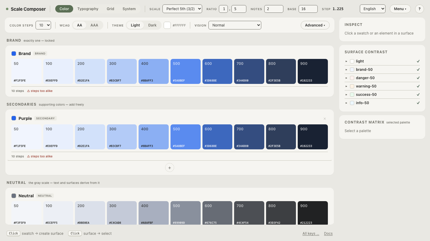
Open these pairings in Scale Composer — the same five foregrounds checked against the dark page, each with its WCAG ratio and its APCA score side by side, the failing rows marked against their floors.
Is light-on-dark the same contrast as dark-on-light?
Not to the eye. The WCAG ratio is polarity-blind by construction — swap text and background and the number is identical — but perception is not symmetric. At the same measured ratio, light text on a dark ground commonly reads stronger: bright strokes radiate into the dark field rather than being contained by it. The same effect is hard on thin type — the glow eats hairline strokes — which is why dark themes often want a slightly sturdier text weight than their measured ratios suggest.
APCA, the emerging contrast model, scores polarity explicitly: it uses different curves for each direction and signs light-on-dark results negative. The two models can disagree about order, not just magnitude. The light theme’s secondary text above — the L ≈0.47 gray on white — measures ≈6.8:1 and scores ≈Lc 84 in APCA. The dark theme’s secondary text — the L ≈0.78 gray on near-black — measures ≈8.6:1, a higher ratio, yet scores ≈Lc 62, noticeably lower. The ratio ranks the dark pairing stronger; APCA ranks it weaker. Neither number is a mistake — they model different things — and APCA is a research-grade instrument rather than a conformance requirement today. That is the case for reading both, and it is why Scale Composer reports APCA alongside every WCAG ratio it checks.
Can a dark theme have too much contrast?
Past a point, yes — dark mode is where “more contrast is better” stops being true vividly. Pure white on near-black clears every floor at ≈17:1, and that surplus is the problem: high-luminance strokes on a dark field tend to bloom and halo, an effect commonly reported as worse at night and for readers with astigmatism. An off-white around L ≈0.9 still measures ≈13:1 — close to triple the body-text floor — and reads calmer. The floors are floors, not targets; nothing in the standard rewards the last four ratio points, and the eye charges for them.
Does the exemption for disabled text still apply?
It does — disabled controls and inactive elements carry no contrast requirement in either theme. What changes is how quickly “dimmed” drifts into “gone.” Near a dark page the denominators are tiny, so small lightness moves swing the ratio hard: a disabled gray at L ≈0.45 sits at ≈2.3:1 — dim but findable — while nudging it down to L ≈0.38 leaves ≈1.7:1, which most eyes will simply miss on a dim screen. On white, the same 0.07 L of drift barely registers. Disabled and placeholder values on dark are worth choosing deliberately rather than inheriting, exemption or not.
Re-check the geography, not the habit
The habits that made a light palette pass are the ones that fail here, which is why the check has to run on the dark values themselves. Compare WCAG and APCA across a dark palette — every text and UI pairing re-measured on the dark ground, both numbers side by side, so the pairings that swapped places in the table above are visible in your own colors before they ship.