Testing a Dark Palette
The dark theme passed review. On a bright office display at noon, every screen looked composed: crisp text, tidy cards, the brand accent glowing nicely. Three weeks after launch the feedback arrived from a different planet — the pure-white headings “glow like a headlight” at night, the cards melt into the page, and nobody can tell which row of the table is hovered. Nothing in the review was dishonest; the review was simply run under the one condition dark mode is not for.
Dark mode testing is a re-verification pass, ordered by what actually breaks: text contrast for every pairing, surface separability, state visibility, glare, color-vision safety, real content at night-time brightness, and unadapted media. Light-mode passes carry over nothing — the physics change, so every check runs again. This is the QA checklist for the palettes built in our dark mode guide: seven checks, each with its number and method.
1. Does every text pairing still pass contrast?
The floors are the same — 4.5:1 for body text, 3:1 for large text and UI components, per WCAG’s contrast minimum — but every ratio is new, because both sides of every pairing changed. A brand core that carried body text on white can drop to ≈3.3:1 on a near-black page; a border that registered on light can vanish on dark.
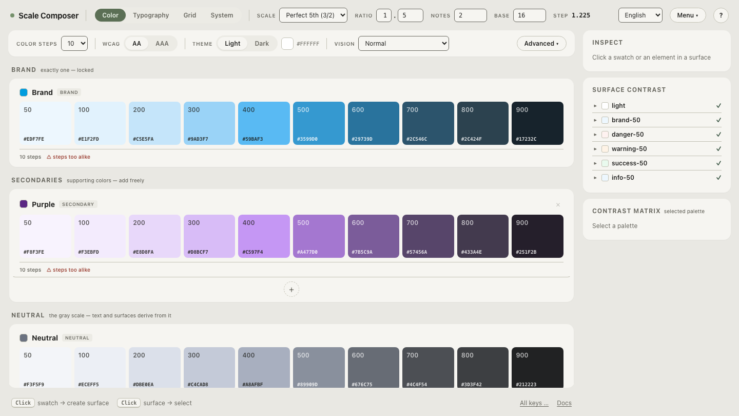
Method: re-measure every text/surface pairing against the dark values, not the light ones. Scale Composer re-derives the semantic roles per theme with the floors enforced and APCA reported alongside, so the dark theme’s pairings arrive as checked values rather than ported ones.
2. Can you tell neighboring surfaces apart?
Dark themes signal elevation with lightness — raised surfaces are lighter — which packs several near-black steps into a narrow band. When two adjacent rungs of that ladder are too close, cards merge into pages and menus into cards. The threshold worth remembering: below about 0.02 L of separation, two surfaces read as one for most viewers — the just-noticeable difference, and the point where Scale Composer raises its JND warning. Comfortable ladders run wider, roughly 0.04–0.09 L per rung.
Method: walk the elevation ladder from page to topmost surface and check each adjacent pair’s ΔL ≥ ≈0.04.
Open the dark roles in Scale Composer’s contrast panel — every text pairing re-checked with its floor, the surface ladder’s steps listed with their lightness values, APCA alongside the ratios.
3. Are hover and pressed states still visible?
In light mode, interactive states usually darken; on a dark surface the visible direction is up — hover and pressed steps go lighter. A theme ported without flipping that direction produces states that technically change value but read as nothing. The arithmetic is the same as the surface check: state steps want ≈0.04 L or more between them, in the lighter direction.
Method: trigger hover and pressed on the dark theme’s buttons, rows and list items; confirm each step is visible and moves lighter, not darker.
4. Does the white text glow?
Pure #fff on a near-black page sits at ≈17:1 — far more contrast than any
floor asks for — and that surplus is the problem: high-luminance text on a
dark field is commonly reported to bloom or halo, an effect known as
halation, especially at night and for readers with astigmatism. An off-white
around L ≈0.9 still measures ≈13:1 — nearly triple the floor — and reads
calmer. The trade costs headroom that was never needed.
Method: check that body text is an off-white (L ≈0.9-class), reserving brighter values for small, deliberate moments — and judge it at low brightness, not noon.
5. Which pairs break under color-vision deficiency?
Dark themes shift which combinations are risky: pairs that separated by lightness on white may sit at similar lightness in the compressed dark range, leaving hue as the only signal — exactly the signal color-vision deficiency removes. Success-green against error-red at similar L is the classic casualty.
Method: run the dark palette through all three simulations in the Scale Composer’s Vision selector and re-check the functional pairs specifically.
6. Does it hold up with real content, at night?
A palette review at day brightness on placeholder text misses what users see: dark mode is used at night, at low screen brightness, where shadows compress and small contrast sins become invisible text. Real content also stresses what swatches never show — long-form paragraphs, dense data tables, form fields with placeholder text, disabled states.
Method: an evening pass in a dark room with the screen at low brightness, reading actual pages — long text, tables, forms. This is the condition the theme exists for; it should be the condition it is judged in.
7. Do images and embeds fit the theme?
The palette adapts; photographs do not. A bright white-background product
shot or chart sits in a dark UI like a lit window, and ad embeds or iframes
bring their own schemes. The common pattern is a gentle wrapper dim — one
line of CSS such as filter: brightness(0.85) on media containers in dark
mode — plus dark variants for the images you control.
Method: scan every media-bearing view in dark mode and confirm bright assets are dimmed, swapped or deliberately accepted.
The list, runnable
| # | Check | Number / method |
|---|---|---|
| 1 | Text contrast | every pairing ≥4.5:1 body, ≥3:1 large/UI, re-measured per theme |
| 2 | Surface separability | adjacent ladder steps ΔL ≥ ≈0.04; warning fires at 0.02 |
| 3 | State visibility | hover/pressed ≥ ≈0.04 L apart, moving lighter |
| 4 | Glare | body text ≈L 0.9 off-white, not #fff |
| 5 | CVD | all three Vision simulations; functional pairs re-checked |
| 6 | Real content | dark room, low brightness, long text + tables + forms |
| 7 | Media | bright assets dimmed via wrapper or swapped |
Start with the check that fails silently
Contrast failures announce themselves; surfaces that merge just quietly flatten the design. Run the surface-separability check on a dark ladder — the near-black steps with their ΔL gaps measured, the JND warning marking any pair too close to distinguish, so the cards that held their edges at noon still hold them at midnight.