WCAG Contrast Ratios Explained (4.5:1, 3:1, 7:1)
A WCAG contrast ratio compares the relative luminance of the lighter of two
colors against the darker, on a scale from 1:1 (identical colors) to 21:1
(black on white). Three floors do the practical work: 4.5:1 for normal-size
text, 3:1 for large text and meaningful interface components, and 7:1 for the
stricter AAA tier. A useful anchor: 21:1 is black on white, and 4.5:1 is
roughly a mid gray — #767676 — on white.
The three numbers are usually quoted as one rule, and much of what goes wrong in practice comes from applying the wrong floor to the wrong thing. This reference walks through what the ratio actually measures, what each floor covers, what is exempt, and the misreadings that surface most often — the foundation piece of our contrast guide. Every number in the examples below is computed, not quoted.
What is a contrast ratio, exactly?
The ratio is built on relative luminance: a measure of how much light a
color sends to the eye, running from 0 for black to 1 for white. WCAG defines
the contrast ratio as (L1 + 0.05) / (L2 + 0.05) — the lighter color’s
luminance over the darker’s, each padded by a small constant that models stray
ambient light. Two identical colors give 1:1; black against white gives the
maximum, 21:1. The formula is symmetric: swapping text and background changes
nothing about the number.
The intuition behind the measure: the eye’s edge-detection machinery runs almost entirely on differences in lightness, not in hue. A vivid blue and a gray of the same luminance score nearly the same against white, because to the part of your vision that resolves letterforms, they are nearly the same. That is why a ratio built purely on luminance predicts readability as well as it does — and why “make it a different color” fixes nothing when the lightness stays put.
What does the 4.5:1 floor cover?
Normal-size text — in practice everything below 24px at regular weight, or below 18.66px at bold: body copy, labels, captions, links, placeholder text, and text inside images. The floor comes from Success Criterion 1.4.3, Contrast (Minimum), and the number is not arbitrary: the standard’s stated rationale is that 4.5:1 compensates for the loss in contrast sensitivity that accompanies roughly 20/40 vision — a level of acuity common among older readers and people with mild vision loss. The floor is calibrated to keep text readable for them, not merely for young eyes on bright screens.
When is 3:1 enough?
In two cases. The first is large text: 24px and up at regular weight, or 18.66px and up at bold. Bigger strokes stay legible at lower contrast, so the floor relaxes. The second is meaningful UI components — the visual information needed to identify or operate an interface part: the border that marks where a form field is, an icon that carries meaning by itself, a focus indicator, the visual difference between a checked and an unchecked control. Both cases have enough edge conditions to deserve their own treatment; the short version is that 3:1 is a carve-out with precise boundaries, not a general discount.
When is 7:1 worth targeting?
7:1 is the AAA tier — Success Criterion 1.4.6, “Contrast (Enhanced)” — and it is opt-in. Most regulation that cites WCAG cites the AA tier, so 7:1 is a choice, and a reasonable one in specific situations: reading-heavy products where people spend hours in body text, documentation, and products serving audiences with a higher share of low-vision readers. It costs palette room — the band of colors that clears 7:1 on a given background is much narrower than the 4.5:1 band — which is why it works better as a targeted decision for text roles than as a blanket policy.
How do six real pairings score?
Six pairings, computed with the WCAG formula, checked against all three
floors. The brand blue is #2563eb — oklch(0.546 0.215 262.9):
| Pairing | Ratio | 4.5:1 body | 3:1 large/UI | 7:1 AAA |
|---|---|---|---|---|
near-black #111827 on white | ≈17.7:1 | passes | passes | passes |
mid gray #767676 on white | ≈4.5:1 | passes, barely | passes | fails |
brand blue #2563eb on white | ≈5.2:1 | passes | passes | fails |
white on red #DC2626 fill | ≈4.8:1 | passes | passes | fails |
lighter blue #4A8CF7 on white | ≈3.3:1 | fails | passes | fails |
gray #9CA3AF on white | ≈2.5:1 | fails | fails | fails |
Two rows repay attention. The white-on-red row is measured against the red fill, not against the page — text on a colored button is always checked against the color it sits on. And the lighter blue is the classic middle case: unusable for body text, entirely legal as a headline or an icon.
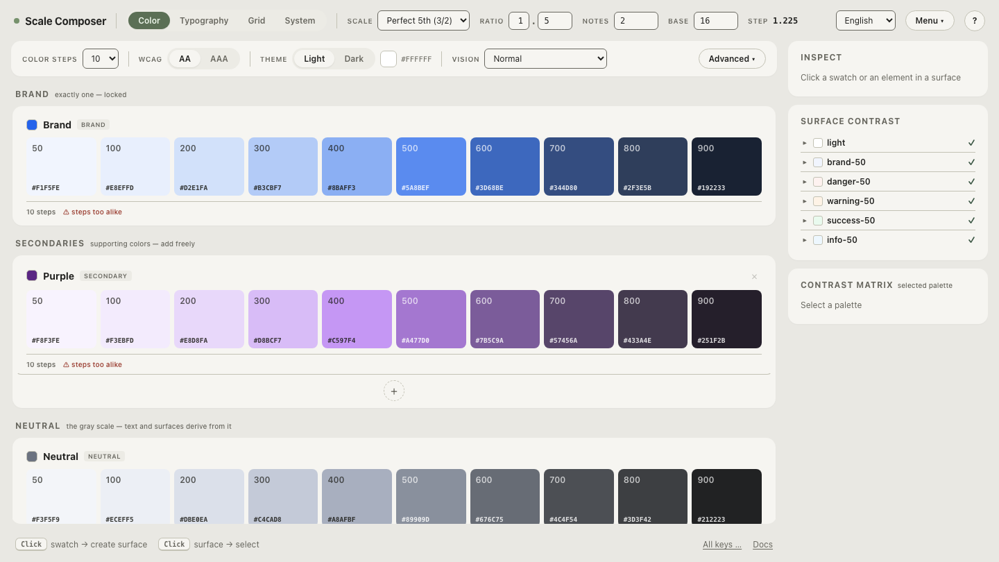
Open this pairing table as a live role panel in Scale Composer — each of the ~17 semantic roles a surface needs, checked against its floor at derivation, with the APCA Lc value alongside every ratio.
What is exempt from the contrast floors?
Four categories carry no contrast requirement, and they are missed in both directions — flagged when they are exempt, ignored when they are not:
- Disabled controls — an inactive button’s label has no floor.
- Purely decorative elements — flourishes and background patterns that convey nothing.
- Logos and brand names — a wordmark is exempt as a logo; the same words set as body text are not.
- Incidental text — text that happens to sit in a photograph, as opposed to text placed over an image to be read.
One caution: exemption means no legal floor, not that invisibility is good design. Disabled states still need to be findable — a topic with its own subtleties, especially on dark backgrounds.
What do people get wrong about the ratios?
Three misreadings account for most confusion. First, the floors apply per pairing, not per palette — a color does not “pass WCAG”; a combination of two colors does, and the same gray can pass on white and fail on a tinted card. Second, AA versus AAA is decided per criterion, not per site — a product can meet the AA contrast criterion and the AAA one for its reading view, and saying “we are AAA” about a whole site claims far more than contrast. Third, “our brand color fails WCAG” almost always means one pairing fails — usually the brand color as body text on white — and the fix is scoped the same way: darken that one pairing a step, reserve the color for large text and UI where 3:1 applies, or derive the text role against each background instead of hardcoding one value everywhere.
Walk a pairing down to the floors
The three numbers become intuitive the moment you watch a real pairing cross them. Take a text color and walk its lightness toward the background — the ratio slides from comfortable past 7:1, then 4.5:1, then 3:1, and the role panel marks each floor as it breaks, so you can see exactly how much room your own colors have before they stop being legal for the job they do.