AA vs AAA: Which Level Should You Target?
Put two builds of the same documentation page side by side — the left one meeting WCAG AA contrast, the right one AAA. At a glance they are nearly twins: the headings match, the layout matches. Look closer and the right page’s body text is darker, its captions have lost their light-gray subtlety, and the brand-blue links have deepened to navy. Whether that second page is an upgrade or a cost depends entirely on what the page is for — which is the actual question behind the levels.
Target AA — 4.5:1 for body text, 3:1 for large text and UI components — as the floor for everything: it is what laws and contracts mean by “WCAG compliant.” Treat AAA contrast — 7:1 body, 4.5:1 large — as a selective upgrade for reading-heavy surfaces rather than a site-wide goal; W3C itself advises against requiring AAA across entire sites. The rest of this piece of our contrast guide is the decision: what each level costs, what survives it, and where AAA genuinely earns its keep.
What do A, AA and AAA actually mean?
The three letters are cumulative conformance tiers: each level includes
everything below it, and each WCAG success criterion is assigned to one
level. For contrast specifically,
two criteria carry the numbers.
At AA,
Contrast (Minimum) asks 4.5:1 for normal-size text and 3:1 for
large text —
24px and up regular, 18.66px and up bold. At AAA,
Contrast (Enhanced)
raises the floors to 7:1 for normal text and 4.5:1 for large. Two anchor
points make the tiers concrete: on white, the lightest gray that passes AA
body text is #767676 (≈4.5:1); to pass AAA the same gray must darken to
≈#595959 (≈7.0:1).
Conformance is claimed per criterion, not per vibe — a product can meet the AA contrast criterion everywhere and the AAA one in its reading view, and saying “we are AAA” claims far more than contrast.
Why is AA the standard answer?
Because AA is what the outside world means when it says WCAG. The European Accessibility Act’s standards chain runs through EN 301 549 to WCAG 2.1 level AA; US practice under the ADA and Section 508 references the same tier; procurement checklists and contract clauses that say “WCAG compliant” mean AA unless they say otherwise. AAA appears in regulation essentially nowhere as a blanket requirement. So AA is not the timid choice — it is the level the entire compliance ecosystem is calibrated to, and meeting it fully is more than many shipping products manage.
Why does W3C discourage blanket AAA?
This position comes from the standard itself, and it is worth quoting the substance: W3C’s conformance guidance states that it is not recommended to require AAA as a general policy for entire sites, because some content cannot satisfy all AAA criteria. For contrast, the honest cost is palette room, and it can be computed rather than asserted.
On a white background, the AA body floor admits every gray down to
#767676. The AAA floor stops at ≈#595959. The band between them — grays
from #595959 to #767676 — is precisely the range palettes use for
secondary text, captions, placeholders, and timestamps: visible but
deferential. At AAA that entire midtone band is off-limits for normal-size
text, which means the palette loses its main tool for typographic hierarchy
below the size threshold. Subtlety gets harder exactly where it does its
work.
Mid-lightness brand colors fare worse: they drop out of body-text use
entirely. The brand blue #2563eb passes AA on white at ≈5.2:1 but misses
7:1; even darkened a full step to #1D4ED8 it reaches only ≈6.7:1. The hue
does not return to body-text legality until around #1E40AF (≈8.7:1) — a
navy, visibly not the brand color anymore. Under AAA, colored body text is
mostly a closed category.
What survives at both targets?
The same five text roles on white, checked against both floors — every number computed:
| Role | Color | Ratio on white | AA 4.5:1 | AAA 7:1 | AAA fix |
|---|---|---|---|---|---|
| primary text | #111827 | ≈17.7:1 | passes | passes | none needed |
| secondary text | #6B7280 | ≈4.8:1 | passes | fails | darken to #4B5563 (≈7.6:1) |
| muted / caption | #767676 | ≈4.5:1 | passes, barely | fails | darken to #595959 (≈7.0:1) |
| link / brand | #2563eb | ≈5.2:1 | passes | fails | ≈#1E40AF (≈8.7:1) |
| error text | #DC2626 | ≈4.8:1 | passes | fails | ≈#991B1B (≈8.3:1) |
Four of the five roles need darkening, and the fixes cluster: secondary,
muted, and primary text end up compressed into a narrow dark band, so the
visual distance that once separated three text tiers now has to fit between
#4B5563 and #111827. The hierarchy survives, but with less room to
breathe — and the two colored
roles shift far enough to read as different
colors, which is a brand conversation, not just a contrast one.
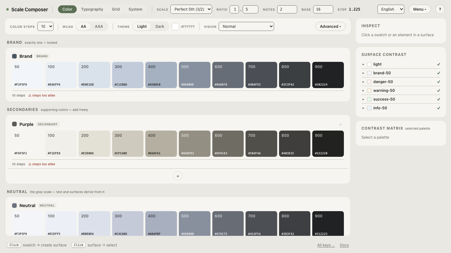
Open this palette at both targets in Scale Composer — the same roles derived twice, AA beside AAA, with each ratio computed at derivation and the roles that fail the higher floor re-derived to meet it.
When does AAA contrast earn its keep?
Three situations recur. Reading-heavy products — documentation, news, e-readers, long-form anything — where users spend sustained time in body text and the criterion’s rationale (readers with moderately low vision, roughly 20/80, who read without assistive technology) describes real users at real volume. Audiences that skew older or low-vision: contrast sensitivity declines with age, so a product for retirees is serving exactly the population 7:1 is calibrated for. Government and health services, where the audience is everyone by definition and several countries’ guidelines already push past minimums.
And in each case, selectively. The coherent posture is body text at 7:1 while UI chrome, captions and controls stay at AA — reading comfort where reading happens, palette room where it does not. This is a per-derivation decision, not a site switch: in Scale Composer the floor is selectable per target, so a reading surface can be derived against AAA while the rest of the product stays AA.
What is the pragmatic ladder?
Three rungs, in order:
- AA everywhere, actually met. Every text role, every surface, both themes — verified rather than assumed. This is the compliance bar and a real achievement on its own.
- AAA for body text where reading is the product. The article view, the docs page, the reader mode — upgraded deliberately, with the darkened roles from the table above.
prefers-contrastfor the rest. Users who need more contrast everywhere can say so; aprefers-contrast: morestylesheet that swaps in the AAA-derived text roles serves them without imposing the cost on everyone.
The ladder spends effort where the evidence is: floors for all, enhancement where reading concentrates, user choice for the long tail.
Try both targets on the same palette
The cost of 7:1 is easiest to judge on your own colors, not our table. Derive your palette at AA, then flip the target to AAA — the roles that fail the higher floor re-derive darker in place, and you can see exactly which of your colors survive and which come back navy.