What Is a Modular Type Scale?
A modular type scale — often shortened to simply a modular scale — is a small, fixed set of font sizes where every size is derived from one base size multiplied by a constant ratio. Instead of picking sizes by eye, you make two decisions — a base (usually 16px) and a ratio (say 1.333) — and a formula generates every other size. The result is a typography system where sizes relate to each other mathematically instead of accidentally.
Many modern design systems organize their typography around some form of scale, and the modular scale is the most common form. The idea has deep roots in print typography and was brought to web practice largely through Tim Brown’s essay More Meaningful Typography on A List Apart. It’s one of the first foundations worth defining, alongside spacing. This article is part of our type scale guide.
How does the type scale formula work?
The classic formula is:
size(i) = base × ratio^iwhere i is the step number — positive steps go up from the base, negative
steps go down. With a base of 16px and a ratio of 1.333 (a “perfect fourth”),
the scale looks like this:
| Step | Calculation | Size (rounded) | Typical use |
|---|---|---|---|
| −1 | 16 × 1.333⁻¹ | 12px | captions, labels |
| 0 | 16 × 1.333⁰ | 16px | body text |
| 1 | 16 × 1.333¹ | 21px | lead paragraph |
| 2 | 16 × 1.333² | 28px | h3 |
| 3 | 16 × 1.333³ | 38px | h2 |
| 4 | 16 × 1.333⁴ | 51px | h1 |
One consequence is easy to miss in the table: every jump between levels is proportionally the same. An h2 relates to an h3 by the same ratio that an h3 relates to body text (sizes are rounded in practice, but the relationship holds).
That proportional consistency is what makes a page feel composed rather than assembled. People are remarkably good at perceiving proportion even when they can’t name it — the same faculty that hears when a chord is out of tune. A consistent scale also lowers the page’s visual noise: when every size relationship is an instance of one ratio, the eye has one rule to reconcile instead of a dozen arbitrary ones.
How do you choose a ratio?
The ratio controls how dramatic the size jumps are, and the right value depends on how text-dense your product is:
- 1.125–1.25 (major second to major third): subtle steps. Best for dense product UI — dashboards, tables, settings screens — where you need many usable sizes close together.
- 1.333–1.414 (perfect fourth to augmented fourth): clear hierarchy without drama. The workhorse range for marketing sites and content pages.
- 1.5–1.618 (perfect fifth to golden ratio): big, expressive jumps. Works for editorial layouts and landing pages with short text; wasteful for UI, because the upper steps get enormous fast.
A useful rule of thumb: the more text your interface carries, the smaller your ratio.
What are “notes,” and why do plain ratios fall short?
Here’s the problem every team hits with the pure formula: the gaps are too big exactly where you need precision. With base 16 and ratio 1.333, there is nothing between 16px and 21px — but real interfaces constantly need an 18px size (a lead paragraph, a large button label).
A useful analogy comes from music. An octave doesn’t jump from one C to the next — it’s divided into notes. A type scale can be subdivided the same way:
size(i) = base × ratio^(i/notes)With notes = 2, every ratio-jump gets one intermediate step: 16, 18, 21, 25,
28… The intermediate sizes still live on the scale — they’re half-steps, not
exceptions — so the proportional consistency survives while the scale becomes
dense enough to actually use.
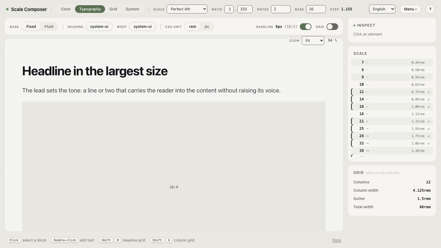
See it live: open this exact scale in Scale Composer — perfect fourth, 16px base, 2 notes per interval. Drag the ratio and watch every level recalculate.
Why is a scale better than hand-picking sizes?
Four practical reasons:
- Fewer decisions. Every “should this be 17 or 18px?” debate disappears — if it’s not on the scale, it’s not a size.
- Drift protection. Hand-picked systems accumulate sizes. Audit any mature codebase and you’re likely to find 14, 15, 16, 17 and 18px all in production, doing the same job. A scale makes that class of entropy much harder to introduce.
- Nameable tokens. A finite set of sizes maps cleanly onto typography
tokens (
heading-lg,body-md) that design and code can share — and fewer sizes are needed than most teams expect. - A shared progression. The same base and ratio can drive more than type: spacing steps most commonly, and some systems even use the same progression when generating color ramps — so changing one number retunes the system consistently.
Where does line height fit in?
A scale for sizes solves half of typography; the other half is vertical. A common convention is to derive a baseline unit of half the base size (8px on a 16px base) and set every line height as a whole or half multiple of it: body 16px on a 24px line (3 baselines), h2 38px on 48px (6 baselines). Text then lands on a shared rhythm instead of arbitrary per-element values — the same rhythm the spacing system can build on.
Try it on your own numbers
The fastest way to understand a modular scale is to break one: open the same scale with four notes per interval and watch the scale get denser without losing its proportions — then set it back to two, raise the ratio to 1.5, and see exactly when the top steps stop being usable. Your body size and your densest UI moment will tell you your ratio faster than any table will.