Perfect Fourth vs Major Third: Choosing a Type Scale Ratio
A type scale ratio is the constant multiplier that generates every font size in a modular scale, and the right one follows from content density: text-dense interfaces are best served by smaller ratios like the major third (1.25), while content and marketing pages can carry the bigger jumps of a perfect fourth (1.333). The two are close enough to be confused and different enough to produce visibly different systems within three steps.
This article compares them with real numbers and gives you a test for choosing. For the scale mechanics themselves, start with our type scale guide.
Why are type scale ratios named after musical intervals?
The names — major second, major third, perfect fourth — are borrowed from musical intervals, where they describe the frequency relationship between two pitches: a perfect fifth is a 3:2 frequency ratio, hence 1.5. Typography borrowed the vocabulary, not the theory. A type scale doesn’t derive from harmony; the interval names are simply memorable labels for numbers that would otherwise be hard to keep apart:
| Interval name | Ratio |
|---|---|
| Major second | 1.125 |
| Major third | 1.25 |
| Perfect fourth | 1.333 |
| Augmented fourth | 1.414 |
| Perfect fifth | 1.5 |
The analogy earns its keep in one respect: intervals in music compound, and so do ratios in a scale. Two perfect fourths stacked are much more than twice one — which is exactly the property the comparison below makes visible.
How different are 1.25 and 1.333 really?
At a 16px base, across five levels:
| Step | Major third (1.25) | Perfect fourth (1.333) | Gap |
|---|---|---|---|
| 0 | 16px | 16px | 0 |
| 1 | 20px | 21.3 → 21px | 1px |
| 2 | 25px | 28.4 → 28px | 3px |
| 3 | 31.3 → 31px | 37.9 → 38px | 7px |
| 4 | 39.1 → 39px | 50.5 → 51px | 12px |
They diverge slowly, then fast. At level 1 the two are practically interchangeable; by level 4 one is a restrained h1 and the other is a hero headline. That compounding is the real content of the decision: choosing a ratio is less about your next heading size and more about where the top of the system ends up after four or five multiplications.
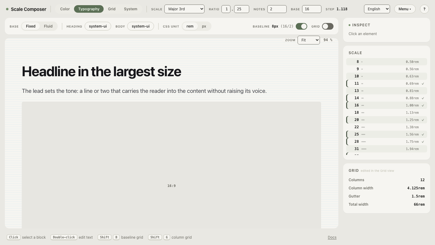
Open the major third at base 16 in Scale Composer, then drag the ratio to 1.333 and watch the upper levels pull away while the lower ones barely move.
Which ratio suits which kind of product?
The pattern behind the ranges: a small ratio reads as one voice speaking at different volumes, while a large ratio reads as different voices. A dashboard needs the first — many levels that stay clearly related, so hierarchy never interrupts the work. A landing page can afford the second, because it has few levels and wants them loud. That perceptual difference, more than any formula, is what the numbers encode:
- 1.125–1.2 (major second and nearby): many usable sizes close together. Data-heavy UI — tables, dashboards, settings.
- 1.25 (major third): the workhorse for product UI. Clear hierarchy, nothing shouts.
- 1.333 (perfect fourth): content pages, documentation, marketing sites — more air between levels, still disciplined.
- 1.414–1.5 and up (augmented fourth, perfect fifth): expressive layouts with few hierarchy levels and short text.
How do notes change the decision?
Scale Composer’s modular-scale formula subdivides each ratio interval:
size = base × ratio^(i/notes), where notes work like the notes inside a
musical octave. This changes the comparison, because density is no longer the
smaller ratio’s exclusive advantage. A perfect fourth with two notes per
interval produces 16, 18, 21, 25, 28 — nearly as fine-grained near the body
sizes as a major-second scale — while still reaching 51px within four full
intervals.
So a larger ratio with 2 notes can beat a smaller ratio with 1: you keep the dramatic top steps and gain the precise middle ones. The real comparison is between ratio-and-notes pairs, not between bare ratios — worth knowing before you conclude that 1.25 is your only route to an 18px size.
What’s the practical test before committing?
Skip the theory and stage a confrontation: open your densest screen and your biggest hero side by side, and set both in the candidate scale. The dense screen asks: are there enough distinct-but-related sizes for labels, values, and section heads? The hero asks: does the top of the scale still command the page? A ratio that serves both is yours.
When the test fails, it usually fails one way: the dense screen wins and the hero sags. Before dropping to a smaller ratio, try adding a note instead — it fixes the density problem without giving up the ceiling.
Try the other end of the range
The fastest way to calibrate your own taste is to feel the extremes: open the augmented fourth at base 16 — at 1.414 the scale roughly doubles every two steps, landing near 32px at step 2 and 64px at step 4. Compare it against the major third table above, then walk the ratio back until your densest screen stops complaining. The value where it settles is your answer.