Musical Intervals in Typography: What Notes Do in a Scale
Notes subdivide each interval of a type scale into equal proportional steps:
the formula becomes size = base × ratio^(i/notes), and each note multiplies
the previous size by the notes-th root of the ratio. On a perfect-fourth
scale (base 16px, ratio 1.333), two notes per interval add an 18px step between
16 and 21 — and because the new size is a power of the same constant, it sits
on the scale rather than beside it.
Both the mechanism and the name are borrowed from music, and the borrowing is unusually honest: the mathematics really is the same. This article is the deep dive on that mechanic — where the parallel comes from, what the formula does, and when adding notes to a working scale helps. If you need the foundations first, start with our type scale guide.
Where does the musical parallel come from?
An octave in music is a frequency ratio of 2:1 — the A above concert A vibrates
twice as fast. Equal temperament,
the tuning system most Western instruments use today, divides that 2:1 span
into twelve equal steps. Equal in a specific sense: not equal in hertz, but
equal in ratio. Each semitone multiplies the frequency by the twelfth root
of 2 (about 1.0595), so twelve semitones compound to exactly 2, and every
interval in the system — a fifth, a fourth, a major third — is a whole number
of semitones: 2^(k/12).
A type scale with notes performs the same operation on a different quantity.
The scale’s ratio plays the octave’s role; the notes play the semitones’. With
ratio 1.333 and two notes per interval, each step multiplies size by
1.333^(1/2) ≈ 1.155, and two steps compound to exactly 1.333. This is what a
musical type scale means in the literal sense: sizes spaced the way equal
temperament spaces pitches.
It’s worth being precise about the relationship. This is a genuine mathematical parallel — both systems subdivide a ratio geometrically, and the arithmetic is identical — but typography borrowed the idea; it didn’t inherit a law. The vocabulary came along with the structure (the “perfect fourth” of ratio 1.333 is named for music’s 4:3 interval), yet nothing about how sound works obligates a web page. The structure earns its place on the page for its own reasons, which the rest of this article walks through.
What does size = base × ratio^(i/notes) actually do?
Set notes = 1 and the formula collapses into the classic modular scale,
size = base × ratio^i: each step multiplies by the full ratio. Raising
notes splits every one of the modular scale’s intervals into that many equal
sub-steps. The constant between adjacent sizes — the step multiplier — is
ratio^(1/notes):
| notes | Step multiplier (ratio 1.333) |
|---|---|
| 1 | 1.333 |
| 2 | ≈ 1.155 |
| 3 | ≈ 1.101 |
| 4 | ≈ 1.075 |
The index i counts notes, not intervals. At two notes, the even indices
reproduce the one-note scale exactly, and the odd indices are the additions —
half-steps between the sizes you already had.
What does a perfect fourth look like at one vs two notes?
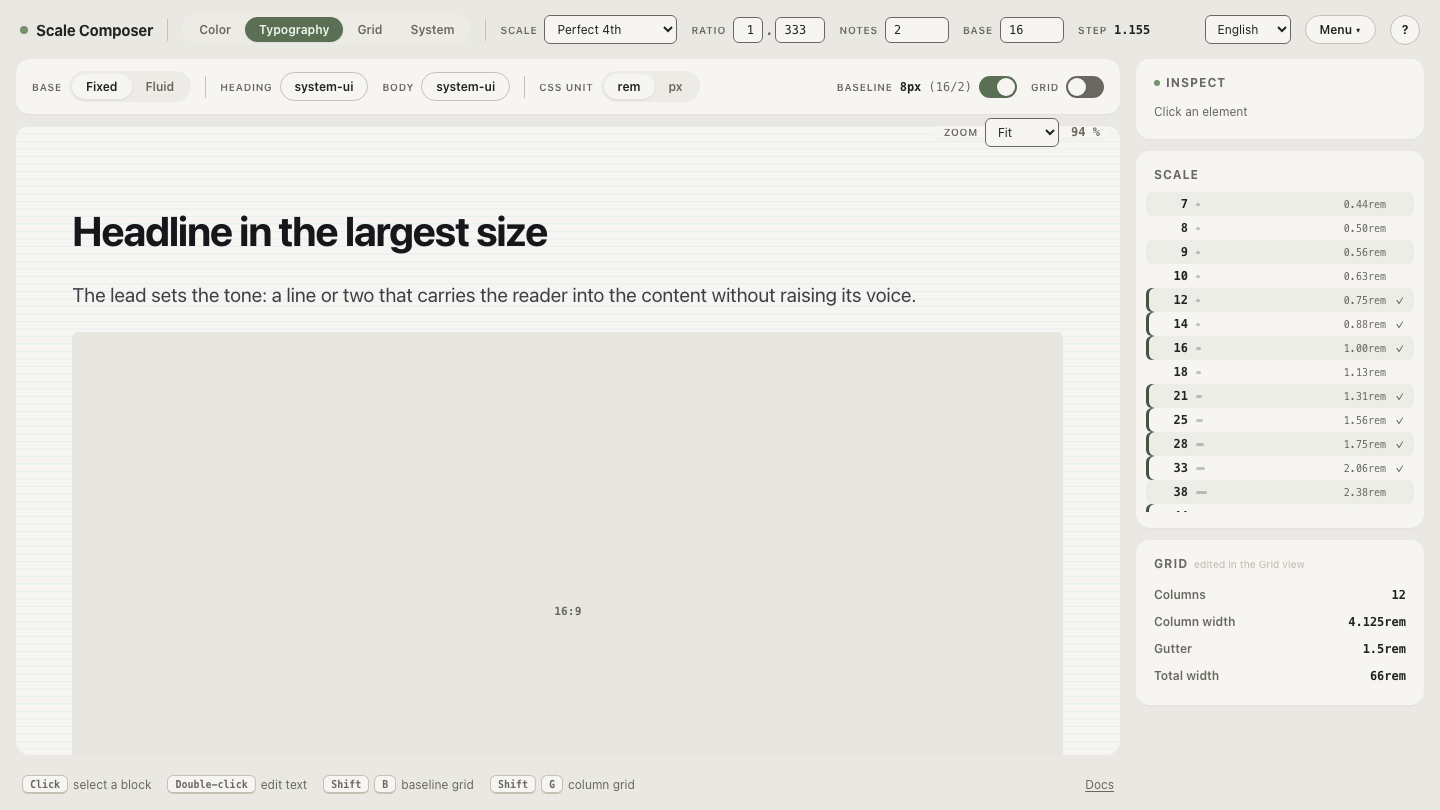
Base 16px, ratio 1.333, sizes as Scale Composer rounds them for display:
| Size | notes = 1 | notes = 2 | Typical role |
|---|---|---|---|
| 16px | ✓ | ✓ | body text |
| 18px | — | ✓ | lead paragraph, large label |
| 21px | ✓ | ✓ | h4 |
| 25px | — | ✓ | heading in a dense layout |
| 28px | ✓ | ✓ | h3 |
| 33px | — | ✓ | small display size |
| 38px | ✓ | ✓ | h2 |
| 44px | — | ✓ | in-between display size |
| 51px | ✓ | ✓ | h1 |
At one note the problem is visible immediately: there is nothing on the scale between 16px and 21px — exactly the band where interfaces need the most precision, because lead paragraphs, large button labels, and prominent UI text all want something around 18px. The gaps widen at the top too (38 to 51 is a 13px jump), but those matter less: display sizes appear a few times per page, body-adjacent sizes hundreds of times.
At two notes the scale gains 18, 25, 33 and 44 — the in-between sizes real UIs keep reaching for — without a single arbitrary value.
Open this comparison in Scale Composer to see the same perfect fourth at one and two notes side by side. Drag the ratio and every size in both columns recalculates from the same two decisions.
Why do half-steps stay in proportion?
Because every size — original or added — is a power of the same constant, any
two sizes on the scale relate by ratio^(k/notes) for some whole number of
notes k. The 18px half-step sits one half-step from body text and three from
28px; promote a label by one step and its relationship to everything else is
still a scale interval. (Sizes are rounded for display; the relationships hold
in the unrounded values the scale computes.) Music has the same property under
a different name: transposition. Shift a melody by any number of semitones and
its internal relationships survive, because every equal-temperament interval
is a whole number of the same unit.
There is also a perceptual reason the subdivision is geometric rather than arithmetic. Pitch perception is close to logarithmic — we hear equal frequency ratios as equal musical distances, which is why equal temperament divides the octave by ratio and not by hertz. Judging relative size appears to work similarly: a move from 16px to 18px and a move from 33px to 38px read as comparable steps, because both are one half-step — the same proportional jump. Subdividing by ratio therefore feels even along the whole ladder, where adding a fixed pixel amount (16, 18, 20, 22 …) feels progressively more cramped as sizes grow.
When do more notes help — and what do they cost?
The value of extra notes is concentrated in dense products: dashboards, data tables, settings screens — anywhere a lot of text must be differentiated within a narrow band of sizes. Between 12px and 24px, a one-note perfect fourth offers three sizes; two notes offer five; four notes offer about ten. Text-heavy marketing and editorial pages rarely need that density — their hierarchy lives in the big intervals, not between them.
The cost is subtler than the benefit: every added step is a size someone can now choose, and more choices invite more use. The scale defines what’s available; your type roles decide what’s used. A four-note scale from which six roles are assigned is a precision instrument; the same scale used in full is hand-picking with extra arithmetic. And since Scale Composer derives spacing steps from the same scale, extra notes densify the spacing options too — the same discipline applies there.
See what four notes feels like
The trade-off is easier to feel than to read about. At four notes per interval, the step multiplier drops to about 1.075 and the ladder from body text to h1 grows to seventeen sizes, many nearly indistinguishable from their neighbors. Ask of each step the only question that matters — what job would this size do? — and let the steps with an answer become roles while the rest stay reserve. Open the same perfect fourth, supersampled at four notes per interval, and see how quickly you can tell the workers from the reserve.