Golden Ratio Typography: Does 1.618 Actually Work?
Golden ratio typography is a modular type scale built on the ratio 1.618, so each font size is 1.618 times the size below it. It can work — under one condition: the jumps between sizes are dramatic, which suits editorial layouts with few hierarchy levels and generous whitespace, and overwhelms text-dense interfaces, where the upper steps outgrow their usefulness within four levels.
That condition is the whole story, so this article walks through it with real numbers: what the scale produces at a 16px base, why the steps escalate the way they do, and where 1.618 genuinely belongs. It builds on the fundamentals in our type scale guide.
What is the golden ratio, and why do designers reach for it?
The golden ratio is the number φ ≈ 1.618, defined by a proportion: cut a line so that the whole relates to the larger part as the larger part relates to the smaller. That self-similarity has given it a long career in art and architecture — some of it documented, as in Le Corbusier’s Modulor system, and some of it attributed after the fact, as with the many golden rectangles “found” in classical buildings.
Typography inherited the reputation. The pitch is appealing: if one ratio can govern shells, façades, and canvases, surely it can govern font sizes. The honest version is more modest. In a type scale, 1.618 is one ratio among several usable ones, sitting at the expressive end of the range — and what it does to a scale is knowable arithmetic, not mystique.
What does a golden ratio type scale look like at base 16?
A modular scale generates sizes with size = base × ratio^i. At a 16px base
and ratio 1.618:
| Step | Calculation | Size (rounded) |
|---|---|---|
| −1 | 16 × 1.618⁻¹ | 10px |
| 0 | 16 × 1.618⁰ | 16px |
| 1 | 16 × 1.618¹ | 26px |
| 2 | 16 × 1.618² | 42px |
| 3 | 16 × 1.618³ | 68px |
| 4 | 16 × 1.618⁴ | 110px |
Two things stand out. Going up, the scale reaches 110px within four steps — poster territory, on a scale that started at body text. Going down, the single step below base lands at 10px, smaller than the sizes commonly used for captions and labels. The usable window is narrow: body, two or three headings, a display size, and nothing in between.
Compare the same four steps at a major third (1.25): 16 → 20 → 25 → 31 → 39. Where the smaller ratio has produced a modest h1, the golden ratio has produced a headline over 100px tall.
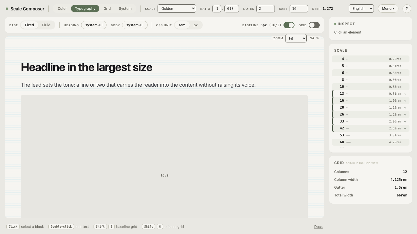
Open the golden ratio scale at base 16 in Scale Composer and step through it — seeing the sizes rendered next to each other makes the escalation more concrete than any table.
Why do the jumps feel so dramatic?
Hierarchy is perceived relationally: a reader doesn’t measure a headline, they register how it relates to the text around it. At small ratios, adjacent levels read as gradations of one voice — the same speaker, slightly louder. Around 1.618, each level reads as a different class of object: the headline doesn’t just outrank the body text, it seems to belong to a different order of information. That is precisely the effect an editorial opener or a poster wants. It is also what a settings screen cannot afford — six levels of “different order” turn a working interface into a contest for attention.
Where does the golden ratio genuinely work?
The pattern in successful uses is consistent: few hierarchy levels, short text, generous whitespace.
- Editorial layouts. A feature article needs body text, a pull quote, one or two heading levels, and a display opener. Five roles fit inside the scale’s narrow usable window, and the drama between them is the design.
- Landing pages. A hero, a handful of section heads, short supporting copy. The whitespace these pages already carry absorbs the scale’s appetite for size.
- Anything poster-like. Slides, covers, campaign pages — surfaces where one enormous statement is the point.
There is also a way to keep the character while gaining usable middle sizes:
subdividing each interval. With two notes per interval — size = base × 1.618^(i/2) — half-steps appear at 16, 20, 26, 33, 42. The proportional
skeleton is unchanged; the density doubles.
Is 1.618 aesthetically special?
The empirical case is thin. Studies of preference for golden-ratio rectangles have produced mixed results, and in typography specifically there is no evidence that 1.618 outperforms 1.5 or 1.414 on readability or perceived quality. What a golden ratio scale reliably delivers is not beauty but commitment: every size relationship on the page is an instance of one rule, and it is that consistency — not the constant — that the eye rewards. A scale built on 1.5 with the same discipline composes just as well. The golden ratio’s practical value is that it is a committed choice, not that it is golden.
So should you use it?
A fair verdict: the golden ratio works when your hierarchy has few levels and room to breathe, and works against you in text-dense UI, where ratios between 1.125 and 1.333 keep more of the scale usable. If your project is editorial — long reads, big openers, sparse pages — it is a legitimate choice, made stronger by choosing it for its behavior rather than its legend.
Judge it in its natural habitat: open an editorial setup — the golden ratio on an 18px base — a larger base tuned for long-form reading, with the scale carrying body, pull quote, and display. Then lower the ratio to 1.5 and watch what the top of the scale loses in drama and gains in room.