Display vs Heading vs Body Styles Explained
Take one sentence — Ship interfaces people trust — and set it three ways. At 51px, weight 700, letter spacing −0.02em, line height 1.1, it’s a statement: you read it before deciding to. At 28px, weight 600, line height 1.3, it’s a signpost: you register it while scrolling past, deciding whether to stop. At 16px, weight 400, line height 1.5, it settles into a paragraph and waits its turn. Same words, three different jobs.
Those three jobs define the three families of text roles in a type system: display styles sell (hero statements, read in one glance), heading styles navigate (wayfinding, read while scanning), and body styles carry (sustained, multi-line reading). Each family gets its own treatment — not just bigger or smaller versions of one style — because each is optimized for a different act of reading. This article walks through the three jobs, the settings that follow from them, and why display is not simply a bigger h1. It’s part of our type scale guide.
What is a display style for?
Selling — in the broad sense: making one statement land before the reader has committed to reading anything. A hero headline, a pricing-page number, a 404-page apology. Display text is read in a single glance, usually once, and almost never in quantity — a screen carries one display statement, rarely two.
The settings follow from the job. Sizes are the largest on the scale (44px upward; 51px in the worked example below). Line height drops to around 1.1, because a two-line display statement with body-style line spacing falls apart into two separate statements — at a glance, the lines must read as one shape. Letter spacing tightens to about −0.02em, since a font’s built-in spacing reads loose when enlarged far past reading sizes. Weight is typically 700 or heavier: at these sizes there are pixels enough for heavy strokes to keep their counters open, and the darkness gives the statement its authority.
What do heading styles do that display doesn’t?
Headings navigate. They exist so a reader scrolling a page can reconstruct its structure without reading it — which section am I in, what comes next, where is the part I need. That means headings are read comparatively: an h2 matters mostly by being visibly bigger than an h3 and visibly smaller than the h1, so heading sizes come in a ranked run (21, 28, 38px on the worked scale) rather than as one size.
Because a heading can be long enough to wrap, its line height stays reading- friendly — around 1.3 — and its letter spacing tightens only gently (0 to −0.015em as sizes grow). Weights sit at 600–700: dark enough to rank above body at a glance, restrained enough that six headings on a page don’t shout each other down. A heading is a signpost, and a signpost that demands to be admired is failing at its job.
What makes body text different?
Body carries the actual reading — many lines, sustained attention, the eye returning left a few hundred times per page. Everything in a body style serves that return sweep. Size sits in the range fonts were designed for (14–18px; 16px is the common default). Line height opens to around 1.5, because the blank channel between lines is what lets the eye find the start of the next one without stumbling. Weight stays at 400 — the stroke thickness the typeface was drawn to read at — and letter spacing stays at zero, because fonts are already spaced for this size range.
This is also the family where restraint pays most: body text is most of the words on almost every screen, so any quirk in the style is a quirk the reader must live with for paragraphs at a time.
How do the three families compare?
| Role family | Size range* | Line height | Letter spacing | Weight | When used |
|---|---|---|---|---|---|
| Display | 44–72px (51px) | ~1.1 | −0.02em | 700+ | one hero statement per screen |
| Heading | 21–38px | ~1.3 | 0 to −0.015em | 600–700 | section wayfinding, ranked run |
| Body | 14–18px (16px) | ~1.5 | 0 | 400 | paragraphs, sustained reading |
| Caption / overline | 12px | ~1.35 | +0.02em / +0.08em | 400–500 | metadata, labels |
* Ranges are typical for interface work; the parenthetical values are from a 16px-base modular scale at ratio 1.333 with two notes per interval. On that scale, with line heights snapped to the 8px baseline (half the base): display 51/56, heading-lg 38/48, heading-md 28/36, body 16/24, caption 12/16.
Read the table by columns and the pattern shows: moving down from display to caption, line height rises while size falls, and letter spacing swings from negative to positive. The three families aren’t sizes of one style — they’re three styles that happen to share a typeface.
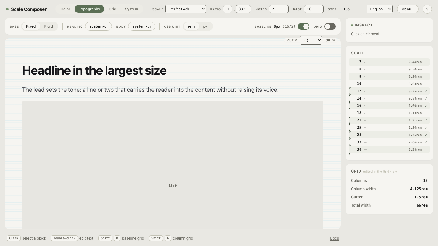
See all three families in one system: open this role set in Scale Composer — display, the heading run, body sizes and caption side by side, each with the line height, weight and tracking its job calls for. Compare the display level’s 1.1 line height against body’s 1.5 directly.
Why isn’t display just a bigger h1?
Because the h1’s job is still navigation — it’s the top of the wayfinding run, obeying the run’s conventions: heading line height, heading weight logic, a size that ranks relative to h2. Display sits above that run and breaks its conventions on purpose: tighter line height, tighter tracking, often a heavier weight — settings that would be wrong anywhere in the heading run itself.
The distinction earns its keep in practice. Stretch the heading run to cover
a 51px hero and you either give the hero heading-style line height (it falls
apart on two lines) or you quietly bend h1’s style until it no longer matches
its siblings. Keeping display as its own role lets both be right — and note
that display is a style, not an element: a marketing hero styled as display
is usually still marked up as h1, because visual role and document
structure are separate decisions. Platform type systems draw the same line —
Apple’s Human Interface Guidelines
define a Large Title role above the title run, with body, footnote and
caption roles below, mirroring the same three families.
Where do captions and overlines fit?
They’re body’s quiet siblings — smaller than reading size, used for metadata, timestamps, table labels and image credits. A caption is small lowercase text: it keeps body’s weight, gains a touch of letter spacing (+0.02em) to stay open at 12px, and often steps down in color rather than weight. An overline is the uppercase variant — the small label above a card title — and uppercase at small sizes needs real air: +0.08em and a 500 weight so its strokes survive the size. Neither belongs to the heading run; they rank below body, not above it.
Build the minimal set
Most products need fewer styles than they think: open a minimal role set — one display, two headings, one body, one caption — and test it against your most complex screen. Add a style only when two existing roles genuinely collide, and let each addition inherit its family’s logic: heading line heights for headings, reading line heights for body. The three jobs — sell, navigate, carry — are the checklist; if a proposed style doesn’t map to one of them, it’s probably a variant of a style you already have.