Heading Sizes: Building an h1–h6 Hierarchy
Heading sizes work best derived, not picked: map the heading levels onto steps of a modular type scale — body text at the base, each heading a fixed number of steps up — instead of choosing six independent values. On a 16px base with a perfect fourth (ratio 1.333), that gives h4 21px, h3 28px, h2 38px, h1 51px, with captions at 12px below the base. Two honest notes belong in the answer: most pages never use h5 or h6, and HTML heading levels are document structure while size is presentation — related, but separable.
This article is part of our type scale guide. It walks through the mapping with real numbers, what to do with the bottom levels, why semantics and size must be kept apart, and how steep the size jumps should be.
How do you map h1–h6 onto a type scale?
A modular scale generates sizes as base × ratio^(i/notes). With two notes
per interval, half-steps exist between the whole ratio jumps — 18px, 25px,
33px, 44px on this scale — and the cleanest heading mapping skips them: give
headings the whole steps, and keep the half-steps for lead paragraphs, large
UI labels and other in-between roles.
| Role | Scale step | Size (rounded) |
|---|---|---|
| Caption | −2 | 12px |
| Body | 0 | 16px |
| h4 | +2 | 21px |
| h3 | +4 | 28px |
| h2 | +6 | 38px |
| h1 | +8 | 51px |
Every heading level now relates to the next by the same proportion — one full perfect fourth. That consistency is what a reader actually perceives. Nobody measures pixel values on a page, but people are good at sensing proportion, and when every jump in the hierarchy is the same ratio, the levels read — to borrow an analogy from speech — like one voice at different volumes rather than six different voices. Hierarchy built from six unrelated sizes can be technically ordered and still feel arbitrary; hierarchy built from one ratio feels intended.
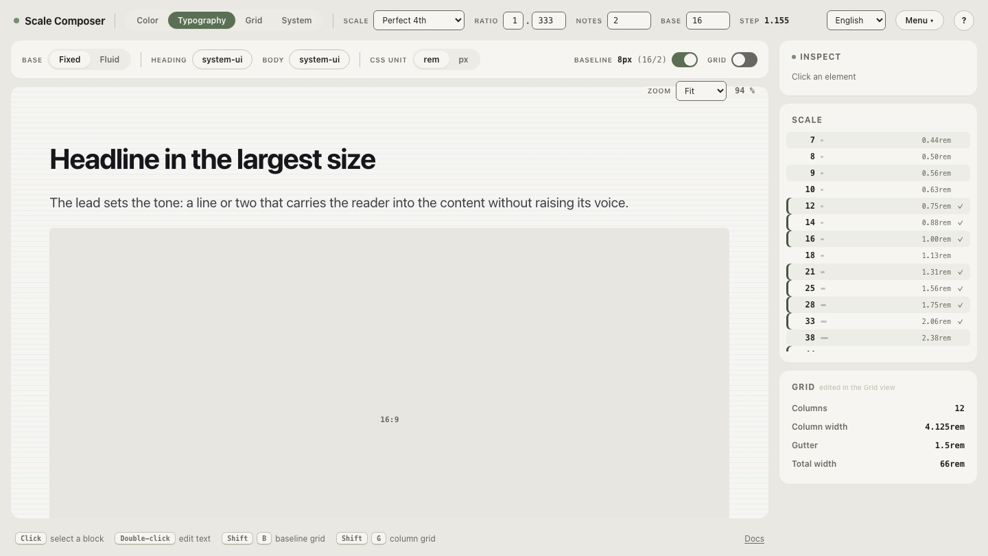
Open the full mapping in Scale Composer — perfect fourth, 16px base, two notes, with the heading levels sitting on the whole steps. Drag the ratio and the entire hierarchy re-derives; no level needs re-deciding.
What should h5 and h6 look like?
Honestly: on most sites, nothing — because they never render. Content that genuinely needs six levels of nesting is rare outside specifications, legal documents and deep API references, and most pages stop at h3 or h4. Spending two scale steps on levels that appear once a year squeezes the levels that appear on every page.
The common, sensible convention: stop scaling at h4 and differentiate the bottom levels by treatment instead — h5 at body size with a heavier weight, h6 at caption size, often uppercase with letter spacing. Size is only one channel for hierarchy; weight, case and spacing carry the last two levels without costing the scale anything. If your content really does run six levels deep, that is a signal to pick a flatter ratio so the top of the hierarchy stays on the page.
Do heading sizes have to match heading levels?
No — and treating them as the same thing causes real accessibility damage. Heading levels are the document’s outline: screen reader users navigate by jumping between headings and rely on the levels being hierarchical — an h3 under an h2 under an h1, no skips — to understand how the page is organized. The W3C’s page structure tutorial covers how that outline should behave. Size plays no part in it: assistive technology reads the level, not the rendered pixels.
Two rules fall out. Choose the tag for the outline — never reach for an h4 because you want its size, and never skip from h1 to h3 because h2 “looks too big here.” Then style freely: an h2 in a sidebar rendered at the h3 size is legitimate — the outline stays true while the visual weight fits its context. The scale makes this easy to implement cleanly, because sizes are named steps rather than properties of tags: any level can point at any step without touching the document structure.
Why does the same h2 end up different sizes across a site?
Because sizes get chosen per page. The landing page gets a 40px h2, the blog template a 32px one, the pricing page a 36px one — each locally reasonable, each picked by a different person or in a different month. Visitors read across pages, and the drift registers as a vague sloppiness nobody can name.
The fix is naming, not discipline. Derive the heading sizes from the scale
once, and export them as tokens — Scale Composer writes DTCG tokens, CSS custom
properties, Tailwind v4 @theme values, or Figma Variables — so that “h2
size” resolves to one value everywhere design and code look it up. Per-page
choosing then has nothing left to decide: a new page inherits the hierarchy
instead of re-inventing it, and the h2 stops being a per-page opinion.
How steep should the heading hierarchy be?
The ratio sets the register. A perfect fourth (1.333) is a workhorse for content and marketing pages: clear jumps, an h1 with real presence. Dense product UI usually wants flatter — around 1.2, the same mapping lands h1 near 33px instead of 51px, and the hierarchy leans more on weight and spacing than on size. Editorial and landing pages can go steeper (1.5 and up) when headlines are short and meant to dominate. The trade is capacity: the steeper the ratio, the fewer whole steps fit between body text and the largest size a layout can hold, so steep scales suit shallow outlines and flat scales suit deep ones.
Compare a flat and a steep hierarchy
The register is easier to feel than to reason about: open the same heading mapping on a flat 1.2 ratio and compare it with the perfect fourth — same levels, same steps, h1 at roughly 33px instead of 51px. Flick between the two and decide which one speaks in your product’s voice; then export the winner as tokens so every page’s h2 means the same thing.