Font Weights on a Scale: Pairing Size and Weight
Typographic hierarchy has two dials — size and weight — and pairing them deliberately beats maxing out either one. The common pattern: body text at 400, headings at 600–700, small labels at 500, and display text at 700 or above with tightened letter spacing. A type scale answers the size question; this article answers the one that comes right after — which weight goes with each size, and when weight can do a size’s job.
The short version of the logic: size ranks text from a distance, weight ranks it at close range, and small text needs more weight rather than less. The worked example below shows the same card built both ways. This article is part of our type scale guide.
Why not just make important text bigger?
Because size is an expensive dial. Every level of importance you express through size alone consumes a step on the scale — and the steps grow multiplicatively, so a size-only hierarchy either runs out of usable steps or ends up with a top step far larger than the design needs. Meanwhile the in-between cases pile up: a label that should outrank the body text next to it but sits inside a small component has nowhere to go. Make it bigger and it breaks the component; leave it and it disappears.
Weight is the second dial that resolves this. Two runs of text can share a size and still rank clearly — a 600-weight line reads as the heading of a 400-weight line at the same size, no new step required. The intuitive reason weight works: the eye reads darkness as emphasis before it reads measurement. A heavier weight puts more ink into the same area, and that density registers pre-attentively, the way a bold word in a paragraph jumps out before you’ve read anything. Size says how far up the document tree you are; weight says look here first within arm’s reach.
Which font weight goes with which size?
Weights in CSS are numeric, 100–900 — the mapping from names like “regular”
and “bold” to numbers is defined in
the font-weight reference.
Here is a worked pairing on a 16px-base modular scale (ratio 1.333, two notes per
interval):
| Level | Size | Weight | Reasoning |
|---|---|---|---|
| Overline / label | 12px | 500 | light weights die at small sizes |
| Body | 16px | 400 | the weight the font was designed to read at |
| H3 | 21px | 600 | close to body size — weight does most of the ranking |
| H2 | 28px | 600 | size now contributes; weight can stay put |
| H1 | 38px | 700 | page-level anchor |
| Display | 51px | 700–800, −0.02em tracking | big sizes give heavy weights room |
Notice what’s not in the table: 900. Very heavy weights close up the counters — the enclosed white spaces inside letters like e and a — and in most text faces they only breathe when the size is large enough to keep those counters open. An 800–900 weight at 51px can be spectacular; the same weight at 21px is a smudge. Heavy weights need size; they don’t replace it.
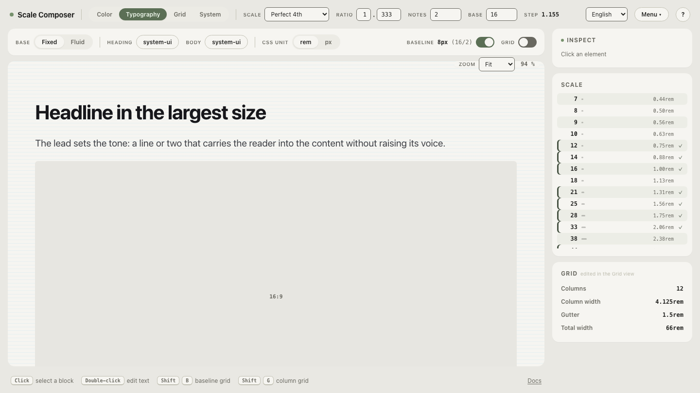
See the pairings live: open this scale in Scale Composer — each level carries its own weight alongside its size, 500 at the label end rising to 700 at display. Change any level’s weight and watch how far it moves in the hierarchy without its size changing at all.
Why does small text need more weight, not less?
It feels backwards — small text is subordinate, so shouldn’t it be lighter? Optically, no. At 12px a stroke may be barely a pixel wide; render a 300-weight font there and anti-aliasing turns those strokes gray, and the text drops below comfortable contrast, especially on low-density screens. Bumping a small label from 400 to 500 keeps its strokes solid at a size where there are few pixels to spare.
This is the mirror image of the display rule. Large text has pixels to spare, so it can afford extremes in either direction — very heavy or very light. Small text can’t afford light. If you want a small label to also feel subordinate, mute its color rather than its weight: a 500-weight label in a secondary gray reads quiet and stays legible; a 300-weight label in full black reads broken.
Can weight replace a size step?
At close range, yes — and this is the most practical move in the whole pairing. A 16px label at weight 600 sitting above 16px body at 400 reads as two unmistakable levels, without spending a scale step. Inside cards, list rows, form groups and table headers, weight-only hierarchy is usually the better tool: the elements are inches apart, so the eye compares darkness directly, and the layout keeps one text size to align.
Here is the same product card built both ways:
/* Version A — size does all the work: four sizes, one weight */
.card-title { font-size: 24px; font-weight: 400; }
.card-label { font-size: 13px; font-weight: 400; }
.card-body  { font-size: 16px; font-weight: 400; }
.card-price { font-size: 21px; font-weight: 400; }

/* Version B — size and weight share the work: two sizes */
.card-title { font-size: 21px; font-weight: 600; }
.card-label { font-size: 12px; font-weight: 500;
              letter-spacing: 0.05em; text-transform: uppercase; }
.card-body  { font-size: 16px; font-weight: 400; }
.card-price { font-size: 16px; font-weight: 700; }
Version A needs four sizes (two of them — 13px and 24px — off the scale) and still reads flat, because everything shares one voice. Version B needs two scale sizes plus the 12px label step: the title drops from 24 to 21px because 600 weight carries part of the load, and the price outranks the body at the same 16px because 700 outranks 400 at close range. Fewer sizes, clearer ranks — and every size still lives on the scale.
A workable rule of thumb: within a component, reach for weight first; across sections of a page, reach for size. Scanning between distant regions needs the measurable difference only size provides; ranking neighbors needs the immediacy of weight.
Try weight before size
The fastest way to calibrate your own pairings is to isolate the weight dial: open two styles at the same 16px size — one at 400, one at 600 — and step the heavier one through 500, 600 and 700. Watch where the pair starts reading as two levels instead of one style with a glitch: that threshold is your same-size hierarchy, and every step it saves is a step your scale doesn’t have to carry.