Line Height: The Baseline-Grid Method
There is a familiar front-end moment: two cards sit side by side, built from the same component, and one text block ends a few pixels lower than its neighbor. Nothing is wrong in the inspector. You nudge a margin, the pair aligns, and the offset reappears two screens later in a different pairing. The cause is usually not a stray style but arithmetic: line heights picked as unrelated multipliers — 1.4 here, 1.5 there, 1.3 on headings — produce block heights that share no common divisor, so blocks line up only by coincidence.
The baseline-grid method replaces per-element line-height guesses with a single rule: derive a baseline unit of half your base font size — 8px on a 16px base — and choose every line height as a whole or half multiple of that unit. Body text becomes 16px on a 24px line (3 units), a 32px heading sits on a 40px line (5 units), a caption gets a 20px line (2.5 units). Every text block’s height is then a multiple of the same unit, so vertical distances add up instead of accumulating error.
This article is part of our type scale guide. A modular scale answers which sizes exist; the baseline unit answers which lines they sit on.
Why don’t per-element line heights add up?
Unitless multipliers are good CSS — line-height: 1.5 inherits more safely
than percentages or fixed values. The problem is not the syntax but how the
values get chosen. Multiply a set of individually reasonable choices out and
near misses appear everywhere:
- 16px body × 1.5 → 24px
- 21px lead × 1.5 → 31.5px
- 28px heading × 1.3 → 36.4px
- 14px caption × 1.4 → 19.6px
Each value is defensible on its own. Together they share no common divisor, so two stacks built from them drift apart by fractions of a line — which is exactly the off-by-a-few-pixels effect. The fractional values make it worse: 31.5px gets rounded differently at different zoom levels and device pixel ratios, so the drift isn’t even stable.
On an 8px baseline the same choices become 24px (3 units), 32px (4 units), 36px (4.5 units) and 20px (2.5 units). You can still write the results as unitless numbers in CSS (24 ÷ 16 = 1.5); what changes is that each value was chosen on the grid rather than guessed per element.
How does the baseline-grid method work?
Two decisions replace all the guessing. First, the unit: half the base font size, so a 16px base gives an 8px unit. Half the base rather than the base itself because a whole-base grid is too coarse — around a 38px heading, a 16px grid offers only a 32px or a 48px line, while an 8px grid offers 40px and 48px. Half multiples (4px steps) remain available where small text needs finer control. Second, the rule: every line height is a whole or half multiple of the unit — never a free value.
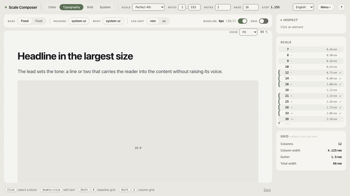
Scale Composer derives this automatically: the baseline unit is base ÷ 2, and every line height on the scale snaps to a multiple of it. Change the base to 18px and the unit becomes 9px; every line height re-snaps to the new grid.
See it on a real scale: open the baseline view in the Scale Composer — a perfect-fourth scale on a 16px base, each size paired with a line height that is a multiple of the 8px unit. Drag the ratio and watch the line heights re-snap to the grid instead of drifting into fractional values.
Should bigger text have tighter line height?
Yes — and smaller text looser. A single multiplier for the whole page flattens a curve that reading actually needs. Here is the full range on a 16px base, perfect fourth, with line heights chosen as baseline multiples:
| Role | Size | Line height | Baseline units | Effective multiplier |
|---|---|---|---|---|
| Caption | 12px | 20px | 2.5 | 1.67 |
| Body | 16px | 24px | 3 | 1.5 |
| Lead | 21px | 28px | 3.5 | 1.33 |
| Heading (h3) | 28px | 36px | 4.5 | 1.29 |
| Heading (h2) | 38px | 48px | 6 | 1.26 |
| Display (h1) | 51px | 60px | 7.5 | 1.18 |
The effective multiplier falls from 1.67 to 1.18 as the size grows. The why is perceptual. Body text is read line after line: the eye travels to the end of a line and has to find the start of the next one, and that return trip needs air — more air the longer the lines run. A headline is different: it is one or two lines read as a single shape, and at body-text spacing it falls apart — a 51px h1 at 1.5 would sit on 76px lines, and the gap between them reads as a hole. Small text inverts the logic again: at 12px the letterforms are already crowded, so tight leading makes dense captions clot; they need proportionally more air, not less.
The grid expresses this curve naturally, because you choose units per size instead of one multiplier for everything.
What is the accessibility floor for line height?
WCAG’s text spacing criterion (1.4.12) requires that a page loses no content or functionality when a reader overrides line height to 1.5 times the font size, among other spacing overrides. Two consequences follow for the grid. First, body text at 3 units — 24px on 16px, an effective 1.5 — already sits at the level the criterion tests for, which is a reasonable floor for comfortable body reading in its own right. Second, the criterion is about surviving user overrides, not about authored values: headings tighter than 1.5 are fine, but fixed-height text containers that clip when spacing grows are not. A baseline grid disciplines your values; it does not exempt the layout from being tested with spacing raised.
Put your line heights on the grid
Start from your body size, halve it, and read the rest off the grid instead of guessing it. To feel how the system follows the base, open a reading-tuned variation in Scale Composer — an 18px base, so the unit becomes 9px and body text settles on a 27px line, 3 units of a slightly bigger rhythm. Then set the base back to your own product’s and take the line heights the grid offers: the per-element debates disappear, and so does the pixel that was always off.