What Is Vertical Rhythm (and Is It Worth It)?
Vertical rhythm is the practice of making a page’s vertical distances — line heights, paragraph gaps, heading margins — multiples of one shared unit, so that lines of text return at a steady interval down the page. On a 16px base the unit is typically 8px: body lines land every 24px, a heading takes a 48px line, and the gaps between blocks measure 16, 24 or 32px. Is it worth it? In its pragmatic form — line heights and vertical margins on the unit — yes, at low cost. In its strict print form — every glyph baseline pinned to a global grid — rarely on the web.
This article is part of our type scale guide. It covers what rhythm does for the reader, how to build it with real numbers, where the term comes from, and where the cost curve turns.
Why does vertical rhythm work on a reader?
The reader never sees the grid. What they perceive is the return: reading is a repetitive movement in which the eye sweeps a line, drops, and starts again, and when every drop is the same distance — or a clean multiple of it — the movement becomes predictable and recedes from awareness. When each block sets its own spacing, every transition demands a small re-calibration instead. A useful analogy comes from music: a steady drummer disappears into the song, and you notice the beat only when it stumbles. Rhythm doesn’t make a page more decorated; it makes the page quieter, and quiet is what long-form reading needs. This is why the effect is easy to feel and hard to point at — the reader senses composure without being able to name its source.
How do you build vertical rhythm with real numbers?
Derive a baseline unit of half the base font size — 8px on a 16px base — then apply two rules: line heights are whole or half multiples of the unit, and vertical margins are whole multiples. Here is a heading-plus-body stack on a 16px base with perfect-fourth sizes:
| Block | Height | Baseline units |
|---|---|---|
| h2: 38px on a 48px line | 48px | 6 |
| Margin below the heading | 16px | 2 |
| Paragraph: 4 lines × 24px | 96px | 12 |
| Paragraph gap | 24px | 3 |
| List: 5 items × 24px lines | 120px | 15 |
| Stack total | 304px | 38 |
The total is a whole number of units, and so is every intermediate boundary — so whatever follows the stack starts on the beat, no matter how the content above it reflows. That additivity is the entire trick: rhythm is not a property you paint on at the end but a consequence of every height being a multiple of the same number.
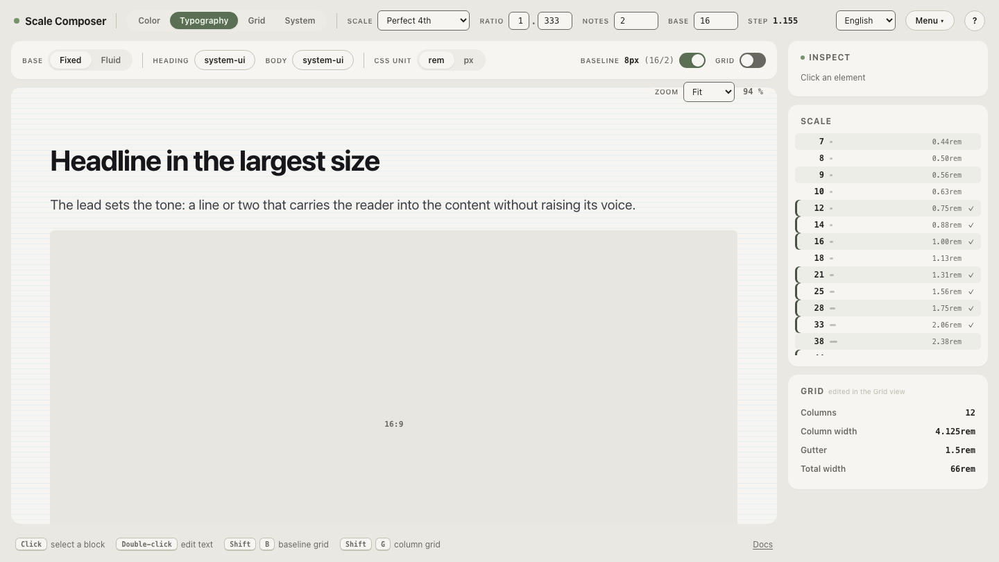
Scale Composer builds both halves from one system: line heights snap to the base ÷ 2 baseline, and spacing steps derive from the same scale — so the margins and the line heights share an origin instead of being two separate guesses.
Open the stack in Scale Composer — heading, body and list on a 16px base with the 8px baseline behind the text; count any block’s height in grid lines and it comes out whole.
One honest caveat: images, embeds and form controls arrive with arbitrary heights. Either round media heights to the unit or let each section restart the rhythm at its top edge — many pragmatic systems do the latter and accept that rhythm lives within sections rather than across the whole page.
Where does the term “leading” come from?
Historical background, worth having because the vocabulary outlived the mechanics: in letterpress printing, the space between lines was set with physical strips of lead inserted between rows of metal type — hence leading, still the standard term for line spacing. The physics made rhythm automatic: lines of type in a column stacked to identical heights, so adjacent columns aligned by construction, not by discipline. The web inherited the word but not the physics — CSS distributes extra space above and below the text (half-leading), and nothing snaps to anything by default. Vertical rhythm on the web is therefore a choice to recreate a property print got for free.
Is strict baseline alignment worth it on the web?
The strict version — glyph baselines pinned to a global page grid, as in a print magazine — fights how CSS lays out text. A line box centers its content vertically: the extra space is split above and below the glyphs, and where the baseline actually lands depends on font metrics, which differ between typefaces and their fallbacks. Pinning baselines therefore means per-font offset corrections, padding compensations, and re-tuning whenever a web font loads late or swaps in over a fallback. The techniques exist, but they are brittle in exactly the places the web moves: responsive reflow, user font settings, embedded content.
And the payoff is smaller than in print. The strongest case for strict alignment is text columns sitting directly beside each other, where a misaligned baseline is visible in the gutter — common in magazines, rarer in web layouts. In practice, most of the perceived steadiness comes from the two cheap decisions: line heights and vertical margins as multiples of the unit. The pragmatic version keeps those and skips the expensive, subtle one. If you are building a genuinely multi-column editorial layout, the calculation changes and strictness starts paying rent; for most products it does not.
Hear the beat by breaking it
The fastest way to decide what rhythm is worth for your product is a comparison: open the same stack with the rhythm broken — line heights as unrelated per-element multipliers instead of baseline multiples — and flick between the two. If your product is text-heavy, the difference tends to be easy to feel and hard to articulate; that feeling is the quality the unit buys. Then take the pragmatic rules — unit of base ÷ 2, line heights and margins on it — and leave the strict grid to print.