Why 16px Is the Default Base Font Size
16px is the default font size in major browsers because it renders body text at a comfortable size for typical screen viewing distances, and it has held that role since the early CSS era. The default matters beyond history: users who need larger text change it in their browser settings, and rem-based sizing inherits their choice — so a type system anchored on the default stays accessible as it scales.
This article covers where the number comes from, what the base actually controls, and when a different base is the better call. It is part of our type scale guide.
Where does the 16px default come from?
Early graphical browsers shipped with a default text size of “medium,” which rendered at 16px, and CSS kept the convention. The number is less arbitrary than it looks. CSS assumes a nominal 96 pixels per inch, which makes 16px equal to 12 points — a body size print typography had settled on long before screens. The intent carried over: at a typical desktop viewing distance, 16px text occupies roughly the same visual angle that printed body text occupies at reading distance. The default endures because it targets the size reading eyes are already trained on — not because the number itself is special.
The MDN documentation on font-size
covers the mechanics: keyword sizes like medium, the relative units em and
rem, and how they resolve against inherited and root sizes.
Why does respecting the default matter for accessibility?
Because the default is a user setting, not a constant. People with low
vision, or simply long days in front of a screen, raise their browser’s
default font size — and every size declared in rem scales with that choice,
since rem resolves against the root element’s font size. A stylesheet that
sets the root in fixed pixels discards the user’s preference silently; one
that leaves the root alone and sizes in rem propagates it through the whole
hierarchy.
This is the strongest argument for treating 16px as an anchor rather than a decoration: build the scale around the default, express it in relative units, and the user’s 20px preference reproduces your entire hierarchy 25% larger — proportions intact.
What does the base actually control in a type scale?
In a modular scale, the base is not one size among many — it is the origin
every other value is computed from. Scale Composer generates sizes with
size = base × ratio^(i/notes), derives spacing steps from the same base,
ratio, and notes, and sets a baseline unit of base/2. Change the base and the
entire system moves in proportion:
| Step | Base 16 (ratio 1.25) | Base 18 (ratio 1.25) |
|---|---|---|
| −1 | 12.8px | 14.4px |
| 0 | 16px | 18px |
| 1 | 20px | 22.5px |
| 2 | 25px | 28.1px |
| 3 | 31.3px | 35.2px |
| Baseline unit | 8px | 9px |
(Values shown before rounding.) Every size shifts by the same 12.5%, and the relationships between levels are untouched — which is the point of deriving everything from one anchor.
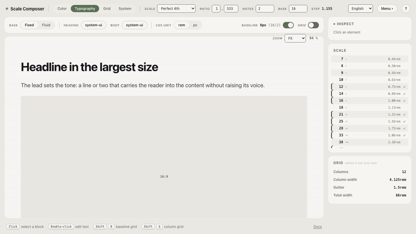
Open the anatomy of a 16px base in Scale Composer — the view centers on step 0 and shows the sizes above and below it, together with the 8px baseline the base produces.
Should you set html to 62.5% to make rem math easier?
The trick — html { font-size: 62.5% } so that 1rem equals 10px — trades a
small arithmetic convenience for structural friction, and many practitioners
have converged on avoiding it. Three reasons come up consistently:
- Media queries don’t follow.
emandremin media queries resolve against the browser’s initial font size, not your root override — so your breakpoints and your components end up running on two different rem values. - Third-party code assumes 16. Component libraries and embedded widgets commonly size themselves in rem on the assumption that 1rem ≈ 16px; under 62.5% they all render smaller than designed.
- The convenience has expired. When a scale generates the values and exports them as tokens or CSS, the mental rem-to-px conversion the trick existed for largely disappears from the workflow — the problem it solved is no longer where the work happens.
When is 18px a better base?
When the product is mostly prose. Long-form reading — articles, documentation, anything a person reads for minutes rather than scans for seconds — benefits from a larger body size, and editorial sites commonly set body text between 18px and 21px. The reader sits back, the lines run longer, and 16px starts to feel small for the distance.
The decision stays simple because the base is a single input: a reading product starts the scale at 18, a mixed or dense product stays at 16 and reserves a step above base for lead paragraphs. Either way the rest of the system follows automatically.
Move the base and watch the system follow
The anchor role is easier to feel than to read about: shift the same scale to an 18px base — a setup tuned for long-form reading — and watch every size, every spacing step, and the baseline (now 9px) move together while the proportions hold. Then set it back to 16 and decide which distance your product is actually read at.