OKLCH in Tailwind v4
Tailwind v4 rebuilt its default color palette in OKLCH and moved
configuration into CSS itself: custom colors are now plain CSS custom
properties written in oklch(), declared under the @theme directive rather
than in tailwind.config.js. The rebuilt palette steps more evenly and
reaches the extra vividness of wide-gamut P3 displays — and both properties
are available to your own brand colors, if you build the ramp the way the
defaults were built.
That last part is the real subject here: not using Tailwind’s colors, but making a custom palette behave like them. The color model doing the work has its own series in our OKLCH guide.
What changed about color in Tailwind v4?
Two shifts landed together.
The default palette was regenerated in OKLCH. Open the
color reference in the Tailwind docs
and the values are oklch() strings rather than hex. The practical effects:
steps within each scale are perceptually smoother, and on Display-P3 screens
the mid-tones carry chroma that sRGB hex could not express — the palette
looks more vivid on most current phones and laptops without any change to
class names.
Configuration went CSS-first. The @theme directive replaces much of
tailwind.config.js: design tokens are CSS custom properties declared in
your stylesheet, and Tailwind generates utilities from them. Colors live
under the --color-* namespace. One consequence worth noticing before any
color theory enters: your palette now sits in the same file and language as
the rest of your CSS, readable and editable in place.
How do you define custom brand colors in @theme?
Declare properties named --color-<name>-<step>, and the utilities follow:
@import "tailwindcss";

@theme {
  --color-brand-100: oklch(0.93 0.03 262.9);
  --color-brand-300: oklch(0.78 0.10 262.9);
  --color-brand-500: oklch(0.60 0.19 262.9);
  --color-brand-600: oklch(0.546 0.215 262.9); /* #2563eb */
  --color-brand-700: oklch(0.49 0.19 262.9);
  --color-brand-900: oklch(0.36 0.12 262.9);
}
With that block in place, bg-brand-600, text-brand-100,
border-brand-300 and every other color utility work exactly as they do for
the built-in palette.
These values are a worked example, not filler. The 600 step is the seed:
oklch(0.546 0.215 262.9) is exactly #2563eb, the blue Tailwind v3 shipped
as blue-600. The other five were generated from it — hue held at 262.9
across the ramp, lightness walked along a curve, chroma following a bell
profile that peaks near the seed and tapers toward both ends. Their hex twins
land at ≈ #dde8fd, #95b7f8, #3f78f0, #2055ca and #19387b.
What does OKLCH buy you over pasting hex codes?
The ramp behaves like Tailwind’s own. The default scales feel even because
they were generated on a perceptual model; a hand-assembled hex brand scale
usually was not, so it sits in the same project with different physics — the
jump from brand-500 to brand-600 is a different size than the same jump
in gray, hover derivations land unevenly, and contrast has to be tested
pair by pair instead of read off the lightness column. A brand ramp generated
in OKLCH inherits the properties the default palette was rebuilt for: even
steps and contrast you can predict from L values.
The values also talk back. #2563eb and #2055ca tell you nothing about how
they relate; oklch(0.546 0.215 262.9) and oklch(0.49 0.19 262.9) tell you
exactly — same hue, one step darker, slightly less colorful. That is the
intuitive reason OKLCH belongs in a theme file: the numbers finally match the
way designers already describe color to each other — “same, but darker” —
so editing in place becomes reasonable. If brand-600 reads too heavy, raise
its L by 0.02 and you know precisely what you changed.
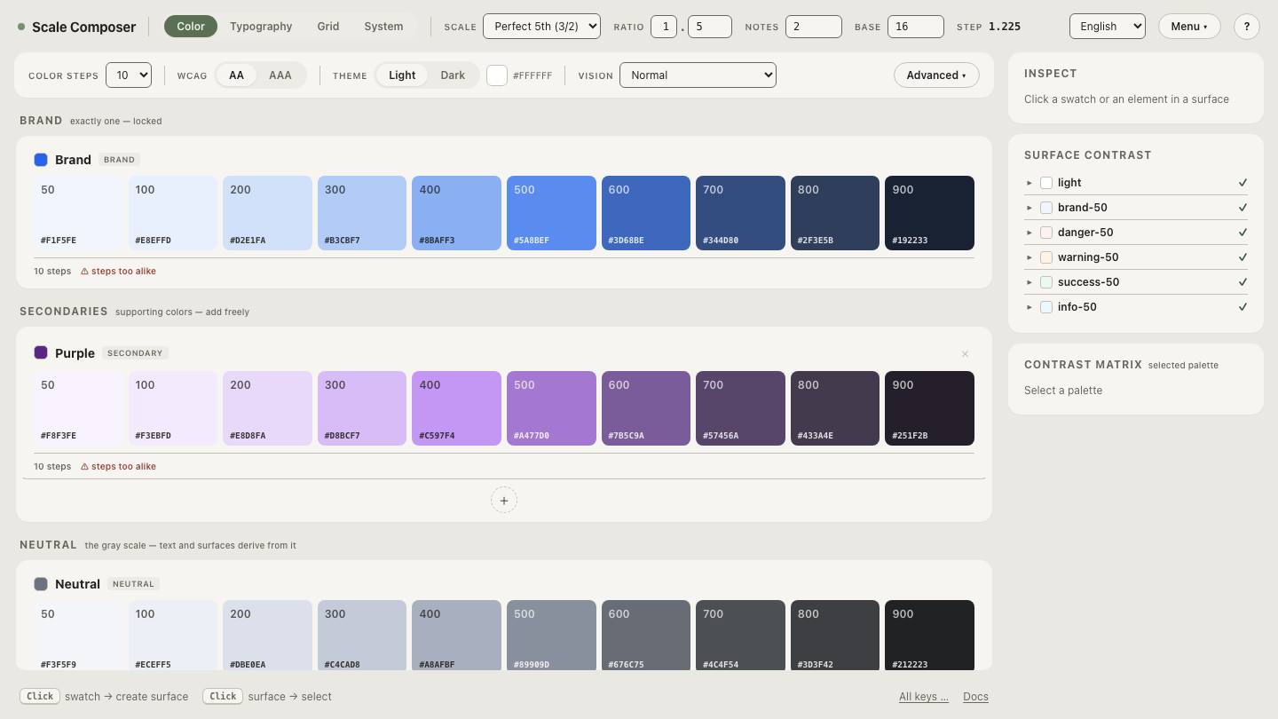
Open this brand ramp with its Tailwind export in Scale Composer
— the scale above, generated from the #2563eb seed, with the @theme
block assembled on the export panel and hex alongside every step.
How does the generate-and-paste workflow look?
Three moves, none of them hand-tuning:
- Seed. Paste the brand color — hex is fine; it is converted to OKLCH coordinates and the ramp is generated around it: steps on a lightness curve, a bell chroma profile with a floor so the palest steps keep a hint of the hue, and chroma capped slightly below the gamut ceiling so no step gets clipped. A dark-mode variant can be derived from the same ramp with its own lightness curve and a chroma boost.
- Check. Contrast floors are evaluated per role (WCAG, with APCA alongside), so the steps you intend for text and backgrounds are verified before anything is exported.
- Export. The Tailwind v4 export is one
@themeblock — the color scales plus, if you want them, type levels, spacing, radii and breakpoints in the same dialect. Paste it into your stylesheet and the utilities exist.
Does OKLCH change how utilities work?
No — and it is worth saying plainly. bg-brand-600 behaves identically
whether the underlying property holds an oklch() value or a hex code; class
names, variants and the build pipeline are indifferent to the notation.
OKLCH changes the quality of the values — even steps, in-place editability,
P3 reach — not the API. That also means migration can be incremental: new
tokens can be written in oklch() while existing hex tokens stay untouched
until you have a reason to regenerate them.
Native oklch() has shipped in all major browsers since 2023,
so for current targets no build transform is involved.
What’s the fastest way to try it with your own brand?
The example ramp above is one seed’s output; the workflow is the same for
any color. Drop your own brand color in as the seed — it is
converted to OKLCH, the ramp is generated under the same rules as the
example, and the @theme block on the export panel is ready to paste.