What Is OKLCH? A Designer’s Explanation
OKLCH is a way of describing color with three values that match how humans actually perceive it: Lightness (how bright it looks), Chroma (how colorful it is), and Hue (which color it is, as an angle). Its defining property is perceptual uniformity: two colors with the same L value genuinely look equally light — something older models like HSL get wrong. That property is why CSS added native support for it, and why tools like Tailwind v4 have moved their palettes to it.
This article is the plain-language version; the full color model series lives in our OKLCH guide.
What do the three letters mean?
- L — Lightness (0–100%). How light the color appears, calibrated against human vision rather than against math on RGB numbers.
- C — Chroma (0 to ~0.37). How colorful it is, from gray (0) upward. Unlike HSL’s saturation percentage, chroma is an absolute quantity — 0.15 chroma means the same amount of colorfulness regardless of hue. That distinction has practical consequences for palette work.
- H — Hue (0–360°). The color wheel angle: ~30 is red-orange, ~145 green, ~260 blue.
The “OK” isn’t reassurance — it names the OKLab color space, introduced by Björn Ottosson in A perceptual color space for image processing (2020), which fixed known distortions in older perceptual models, particularly around blues.
Why does HSL lie about lightness?
Try this in any color picker: hsl(60, 100%, 50%) is a searing, nearly-white
yellow. hsl(240, 100%, 50%) is a deep, dark blue. Same “50% lightness” —
wildly different actual brightness.
HSL’s lightness is a geometric fraction of RGB values,
not a statement about perception, and yellow simply carries far more perceived
light than blue at the same RGB intensity.
This is not a cosmetic bug. It breaks the two jobs designers most need a color model for:
- Ramps. Generate a 10-step palette by marching HSL lightness from 95% to 20% and the steps bunch up, shift in apparent hue, and go muddy in the middle — palettes built this way typically needed a round of hand-correction.
- Contrast. Text contrast is a function of perceived lightness difference. If your model’s L doesn’t track perception, you can’t predict which steps of your palette will pass accessibility — you can only test and patch.
In OKLCH, L is perceived lightness, which is what makes both jobs predictable.
What does perceptual uniformity actually buy you?
Once lightness means what it says, things that used to require hand-tuning become computable:
- Even color ramps. Place your steps on a lightness curve and they look evenly spaced — for every hue, without a per-hue correction pass.
- Predictable contrast. Keep text and background a known L-distance apart and contrast requirements become a property of the scale, not a per-pair test.
- Honest neutrals. Grays can carry an intentional whisper of chroma toward the brand hue instead of an accidental RGB tint.
- Dark mode by derivation. A dark palette can be computed from the light one — new lightness curve, boosted chroma — rather than re-picked by hand.
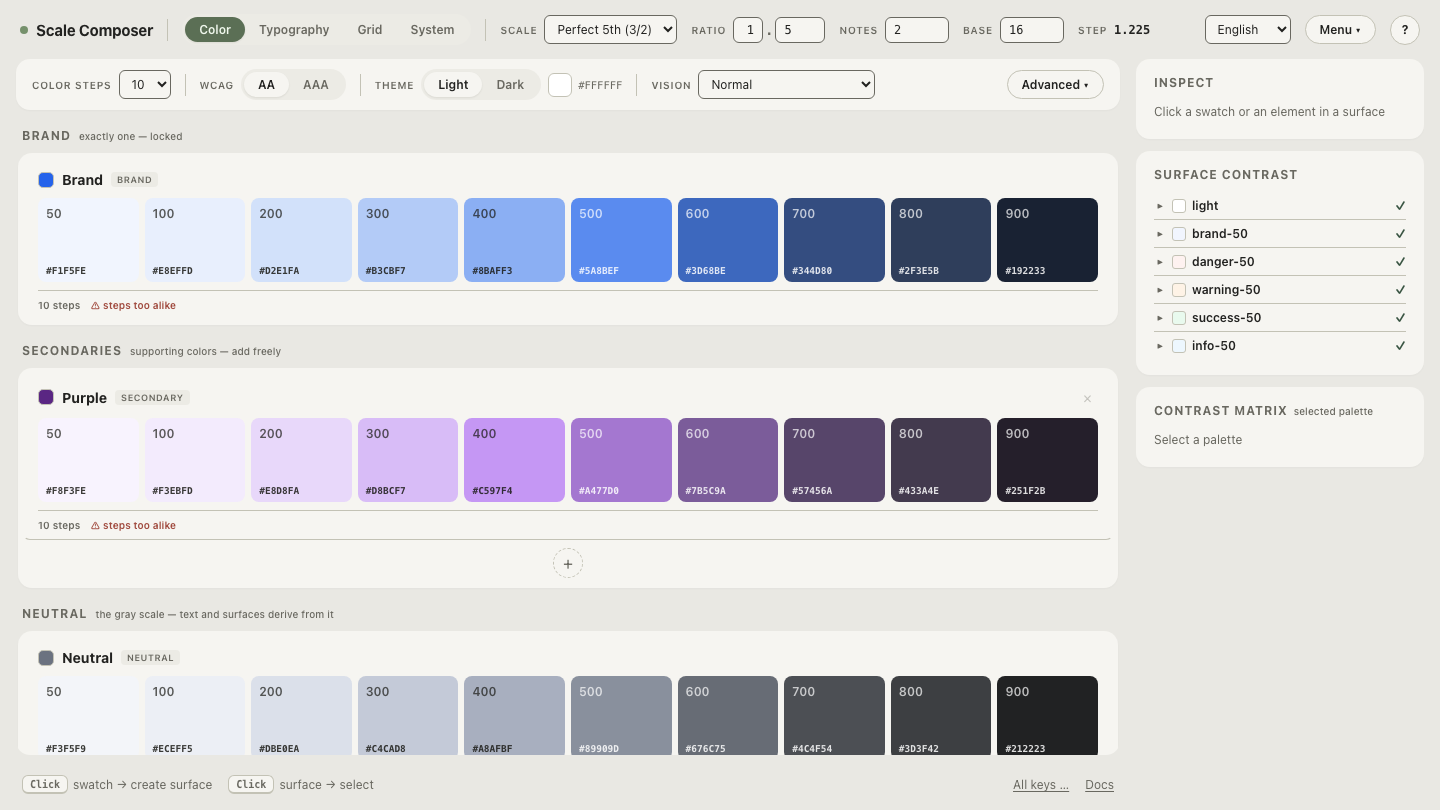
See the first point live: open a 10-step OKLCH ramp in Scale Composer — one blue seed, steps placed on a lightness curve. Every visual jump between neighbors is the same size, which is what HSL-based generation struggles to deliver.
How do you write OKLCH in CSS?
It has been native CSS since 2023 — supported in all major browsers, no plugin or build step:
.button {
  background: oklch(0.55 0.15 260);        /* L C H */
  color: oklch(0.98 0.01 260);
  border-color: oklch(0.55 0.15 260 / 40%); /* optional alpha */
}
There is also a relative color form — oklch(from …) — that derives one color
from another, useful for hover states and tints.
What’s the catch? Chroma and gamut
Because chroma is absolute, not every L/C/H combination corresponds to a color your screen can produce. Very light and very dark colors can only hold a little chroma; push past the limit and the color gets clamped (“gamut clipping”), which flattens ramps exactly where they should glow. The usual solution is to cap chroma slightly below the physical ceiling at every lightness — headroom instead of clipping.
Wider-gamut displays raise that ceiling: Display-P3 screens (most current phones and Macs) can show noticeably more chroma in the midtones than sRGB allows.
Do I ever write OKLCH values by hand?
Rarely — and that’s the point. OKLCH’s real role is as the engine under your
palette: you pick one seed color, and lightness curves plus chroma profiles
generate the scale. You’ll meet raw oklch() values mostly in generated
tokens, in Tailwind v4’s default palette, and when debugging why a color looks
off.
A quick way to build an intuition for the model: flip the same blue ramp between sRGB and P3 and watch the mid-steps gain chroma as the gamut ceiling lifts — L and H hold still while only “how colorful” moves. Once you’ve seen the three axes move independently, hex starts to look like what it is: an output format, not a way to think about color.