OKLCH vs HSL: Why HSL Lies About Lightness
The difference that matters between OKLCH and HSL is what “lightness” means. HSL’s L is a geometric fraction of a color’s RGB values; OKLCH’s L is a measurement of how bright the color actually looks. Two HSL colors that share “50% lightness” can differ drastically in perceived brightness — two OKLCH colors with the same L look very close to equally light.
Both models describe color as three values with a hue angle, which makes them feel interchangeable. This article takes apart why they are not; the rest of the color model series lives in our OKLCH guide.
How can two colors share a lightness value and look nothing alike?
Compare hsl(60, 100%, 50%) with hsl(240, 100%, 50%) in any color picker.
The first is yellow — so bright it barely survives on a white background. The
second is a deep blue dark enough to carry white text. Both claim 50%
lightness.
Measure all six of HSL’s corner hues at “100%, 50%” in OKLCH, where L tracks perception, and the spread becomes visible as numbers:
| HSL input | Hex | Perceived lightness (OKLCH L) |
|---|---|---|
hsl(60, 100%, 50%) — yellow | #ffff00 | 0.97 |
hsl(180, 100%, 50%) — cyan | #00ffff | 0.91 |
hsl(120, 100%, 50%) — green | #00ff00 | 0.87 |
hsl(300, 100%, 50%) — magenta | #ff00ff | 0.70 |
hsl(0, 100%, 50%) — red | #ff0000 | 0.63 |
hsl(240, 100%, 50%) — blue | #0000ff | 0.45 |
Six colors, one HSL lightness value — and a measured lightness spread from 0.45 to 0.97, more than half the entire axis. Yellow at “50%” sits near white; blue at “50%” sits closer to black.
What is HSL actually measuring?
HSL dates from the late 1970s, designed as a friendlier way to steer RGB
values — geometrically, a cylinder wrapped around the RGB cube, as the
Wikipedia article on HSL and HSV
lays out in detail. Its lightness is pure channel arithmetic: take the highest
and the lowest of the three RGB values and average them. #ffff00
(255, 255, 0) and #0000ff (0, 0, 255) both average to 50%, so HSL reports
them as equally light.
Nothing in that calculation involves an eye — and eyes weigh the spectrum very unevenly. Human vision is far more sensitive to light in the green-yellow region than at the blue end; the effect is called luminous efficiency. A screen driving its blue channel at full power delivers a fraction of the perceived brightness that the same power delivers through green. Yellow (red plus green at full) lands near the peak of the sensitivity curve; blue lands near its edge. That is the intuitive core of the problem: HSL counts RGB energy, but brightness is an experience produced by a visual system with strong preferences about wavelength. A model that never consults the observer will misreport what the observer sees.
OKLCH is calibrated in the opposite direction: it starts from measurements of perception and works back to the math, so that equal L is designed to mean “looks equally light” across hues.
Why does this break ramps and contrast?
A misleading lightness number costs little when you adjust one color in isolation. The damage appears in any workflow that compares lightness across hues:
- Ramps bunch and go muddy. Generate a 10-step palette by marching HSL lightness from 95% down to 20%, and each hue distorts differently: yellows stay washed out through the upper half, blues plunge dark early, midtones drift toward gray. Palettes generated this way typically needed a round of per-hue hand-correction.
- Contrast can’t be read from the numbers. Accessible text contrast depends on the perceived lightness gap between text and background. When L doesn’t track perception, “these two values are 40 points apart” predicts nothing — a pairing that passes in one hue fails in another, and you are reduced to testing pairs one by one.
Both failures share a root: the workflow assumes the lightness number is comparable across hues, and in HSL it is not.
What does an honest lightness axis look like?
A clean demonstration uses the two hues HSL treats most differently — yellow and blue — placed on the same OKLCH lightness curve. Open the two ramps side by side in Scale Composer: step three of the yellow ramp and step three of the blue ramp share their measured lightness, visibly, and the pattern holds all the way down both scales. Chroma differs — yellow and blue can hold different amounts of colorfulness at a given lightness — but brightness descends in lockstep.
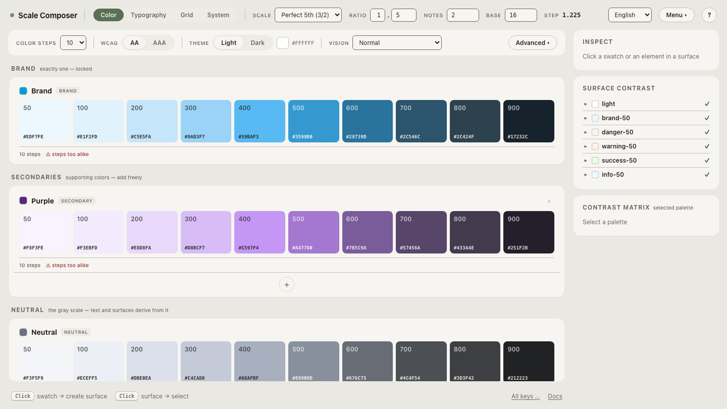
Producing this with HSL would require a hand-built correction table per hue, because its lightness axis means something different in every hue. In OKLCH it is simply what happens when two ramps share one lightness curve.
When is HSL still fine?
HSL is misleading specifically where cross-hue consistency matters — which leaves real room where it doesn’t. For a quick one-off tweak — nudging a single hover state darker, muting one badge, wandering through hues in a picker — HSL is convenient and harmless, because nothing downstream depends on comparing its numbers between hues. The trouble starts when systems are built on it: generated palettes, computed contrast, dark themes derived from light ones. There, the lightness distortion compounds through every step.
A workable rule: HSL for touching individual colors, OKLCH for anything that generates or compares them.
How do you make the difference stick?
Numbers make the case; watching the axes move makes it intuition. Take a ramp in Scale Composer and drag the hue offset from blue toward yellow and back. In HSL, an equivalent hue sweep would send perceived brightness swinging up and down. Here the lightness curve holds still: every step keeps its brightness while hue alone rotates through the palette. After one full sweep with lightness pinned in place, “same L means same brightness” stops being a specification claim and becomes something you can rely on while designing.