What Is Perceptual Uniformity?
A color space is perceptually uniform when equal numeric distances correspond to equal perceived differences — everywhere in the space. Nudge a color by 0.1 in lightness and the change looks the same size whether you started near white, in the midtones, or close to black; two colors a given distance apart look about as different as any other pair the same distance apart. The numbers, in short, can be trusted to mean what the eye sees.
That one property is what modern color models are built to deliver, and it is the quiet premise behind even ramps, predictable contrast, and measurable color difference. This article is the concept piece of our OKLCH guide: what uniformity is, why the familiar spaces don’t have it, and what having it changes in practice.
Why aren’t RGB and HSL perceptually uniform?
Because their numbers describe hardware, not perception. RGB values are instructions to a screen’s subpixels; HSL is a geometric rearrangement of the same numbers. Nothing in either model consults an observer — and observers turn out to be unevenly sensitive in ways the raw numbers never see.
Watch what happens to a plain gray series built in equal RGB steps — 51 added to every channel, five times over:
| Gray | Hex | Perceived lightness (OKLCH L) | Visible jump |
|---|---|---|---|
rgb(0, 0, 0) | #000000 | 0.00 | — |
rgb(51, 51, 51) | #333333 | 0.32 | 0.32 |
rgb(102, 102, 102) | #666666 | 0.51 | 0.19 |
rgb(153, 153, 153) | #999999 | 0.68 | 0.17 |
rgb(204, 204, 204) | #cccccc | 0.85 | 0.16 |
rgb(255, 255, 255) | #ffffff | 1.00 | 0.15 |
Five identical numeric steps — and the first produces more than twice the visible change of the last. The same +51 that turns black into a clearly lighter gray barely registers between two light grays. A numeric distance that looks huge in one region of the space is a minor adjustment in another, which is the definition of non-uniformity.
Across hues, the failure widens. HSL reports hsl(60, 100%, 50%) (yellow) and
hsl(240, 100%, 50%) (blue) as equally light; measured perceptually, the
yellow sits at L ≈ 0.97 — nearly white — while the blue sits at L ≈ 0.45, dark
enough to carry white text. A distance of zero in
HSL lightness spans half the visible lightness
range.
Why does matching the eye mean warping the math?
Because perception compresses. Sensory systems tend to respond to proportional change rather than absolute change — a pattern psychophysics has measured across brightness, loudness, and weight alike. One candle added to a dark room is an event; the same candle added to a floodlit one goes unnoticed. The physical addition is identical, the experience is not.
Light on a screen behaves the same way: doubling the physical intensity does not look twice as bright, only one comfortable step brighter. A color model that matches the eye therefore has to bake the compression in. Perceptually uniform spaces apply a compressive curve to the physical light values — OKLab uses a cube root — so that equal steps in the model land on equal steps of experience rather than equal steps of energy. Seen this way, the warp is not a distortion of color. It removes one: the mismatch between physics and perception that RGB carries silently.
How is color difference actually measured?
Once a space is close to uniform, the distance between two points becomes a meaningful quantity, and it has a name: delta E (ΔE), the formal measure of color difference. As a rule of thumb, a ΔE around 1 is at the edge of what most viewers can detect; small single digits read as “the same color, slightly off”; large values as plainly different colors. Print proofing, brand-tolerance checks, and screen calibration all run on it — none of which works if the underlying space lies about distance.
The chase for a space where this holds is decades old. CIELAB, standardized in 1976, was the field’s standard attempt and is still in wide use; OKLab, published in 2020, is the modern refinement, correcting known distortions in CIELAB — most notably hue shifts around blue. OKLCH is OKLab in cylindrical coordinates (lightness, chroma, hue), which is the form CSS adopted and the form designers actually meet.
What does uniformity buy design work?
Three things, each a direct consequence of numbers that track perception:
- Even ramps. Place ten steps on a lightness curve and the palette looks evenly spaced — for every hue, without a per-hue correction pass. Uniformity is what makes color scales generatable rather than hand-tuned.
- Predictable contrast. Text contrast is a function of perceived lightness difference. In a uniform space, “keep these two roles a fixed L-distance apart” becomes a rule you can enforce mechanically across a whole palette.
- Meaningful measurements. “How different are these two colors?” gets a number you can put a threshold on — for QA, for brand tolerance, for checking that a redesign hasn’t drifted.
The first is the easiest to see with your own eyes. Open a ten-step ramp in Scale Composer — the steps sit on an OKLCH lightness curve, and every jump between neighbors reads as the same size, from near-white to near-black.
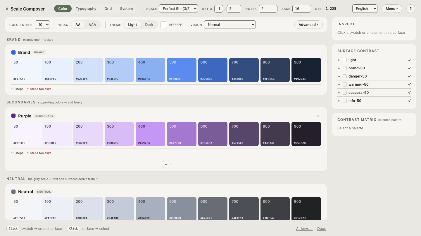
That evenness was not tuned per swatch; it falls out of the space. Producing the same result in raw RGB would require a different, irregular numeric spacing for every region and every hue — precisely the correction work a uniform space retires.
How do you see uniformity for yourself?
The gray table above showed numbers whose swatches disagree; a finished ramp shows swatches whose numbers stay hidden. Put the two together: open the ramp with each step’s OKLCH values visible and read down the L column — the values descend by equal amounts, and the swatches change by equal amounts, the agreement the RGB series couldn’t produce. Watched once, uniformity stops being a definition and becomes an expectation you’ll hold every palette to.