The CSS oklch() Syntax Explained
The CSS oklch() function specifies a color by three space-separated
values — Lightness, Chroma, Hue — with an optional alpha after a slash:
oklch(0.55 0.15 260) or oklch(0.55 0.15 260 / 40%). It has been native
CSS since 2023 and works in all major browsers without a build step. This is
a working reference for the syntax; what the values mean perceptually is
covered across our OKLCH guide.
What are the three values and their ranges?
color: oklch(L C H);
color: oklch(L C H / alpha);- L — Lightness. A percentage (
0%–100%) or a number (0–1);62%and0.62are the same lightness.0is black,1is white. - C — Chroma. A non-negative number. In principle unbounded, in practice
bounded by what screens can show: sRGB colors top out around
0.37, and everyday UI colors mostly live between0(gray) and0.25. There is no meaningful “100% chroma” — the maximum depends on lightness and hue. - H — Hue. An angle in degrees (
0–360, unit optional): roughly30is red-orange,145green,260blue. Gray has no meaningful hue — write any number, ornone. - alpha. After a
/: a percentage or0–1number, same as elsewhere in CSS.
The formal grammar lives in the MDN reference for oklch(); the summary above covers what day-to-day styling needs.
What does a real component look like in oklch()?
A button, written entirely in the syntax:
.button {
  background: oklch(0.55 0.15 260);          /* mid-lightness blue        */
  color: oklch(0.98 0.01 260);               /* near-white, hint of hue   */
  border: 1px solid oklch(0.55 0.15 260 / 40%);  /* same blue at 40% alpha */
}
Two details are doing quiet work here. The text color carries 0.01 chroma
in the button’s own hue — a near-white that belongs to the blue instead of a
sterile #fff. And the border reuses the background color with alpha rather
than a separately picked lighter blue, so it stays in step if the background
changes.
How do you derive one color from another?
The relative color form takes an existing color apart into l, c, h
channels you can modify:
:root {
  --brand: oklch(0.55 0.15 260);
}
.button:hover {
  background: oklch(from var(--brand) calc(l - 0.07) c h);  /* darker      */
}
.badge {
  background: oklch(from var(--brand) 0.95 calc(c / 3) h);  /* pale tint   */
}
This is where a perceptual model pays off in plain CSS: “hover is 0.07 darker” behaves the same whether the brand color is blue, green, or orange, because equal L-steps look equal. The same recipe in hex requires a hand-picked value per hue.
What do generated OKLCH values look like on a real ramp?
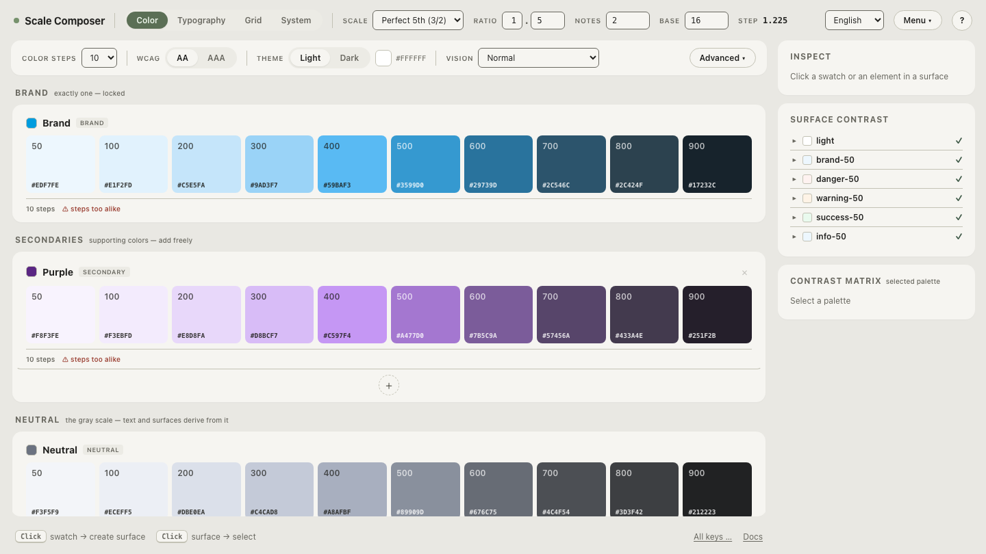
Reading raw values against real colors builds the intuition fastest. Open a ramp with each step’s L/C/H visible in Scale Composer — lightness falls step by step down one curve, chroma swells through the midtones and eases off at the ends, hue holds still. Three columns of numbers, three independent jobs.
What about browsers that don’t support oklch()?
Support has been universal in major browsers since 2023, so fallbacks are a legacy-traffic question rather than a default requirement. When you need one, CSS’s cascade does the work — declare the fallback first:
.button {
  background: #4263c7;                /* used where oklch() is unknown */
  background: oklch(0.55 0.15 260);   /* wins everywhere else          */
}
Or gate larger blocks with @supports (color: oklch(0 0 0)). Token
pipelines commonly sidestep the question by exporting hex alongside OKLCH,
which keeps legacy CSS consumers working from the same palette.
Where does the syntax go beyond hex?
Hex stops at sRGB; the OKLCH model doesn’t.
Flip the same ramp into Display-P3 mode and the steps carry
color(display-p3 …) strings alongside their sRGB-clamped hex — the midtones
gain chroma the hex column literally cannot express. Copy a pair of values
for the same step and compare them in your own stylesheet: that gap between
the two strings is the part of your screen’s gamut that hex-era CSS never
reached.