OKLCH vs LAB and LCH
OKLCH and LCH are the same kind of color space, two generations apart: LCH is the polar form of CIELAB (1976), OKLCH is the polar form of OKLab (2020), and OKLab exists to fix CIELAB’s best-documented defects — above all the blue hue shift, where darkening a saturated blue along a constant CIELAB hue drifts it visibly toward purple. For screen palettes and ramps, the OK variants are the safer default; LAB and LCH remain the right tools where print workflows and color-difference tolerancing already depend on them.
Both families ship natively in CSS, so this is a live choice in every stylesheet rather than a history lesson. This article untangles the four names, shows the blue defect with real values, and draws the boundary between the two families’ territories — it’s the comparison piece of our OKLCH guide.
How do LAB, LCH, OKLab and OKLCH relate to each other?
Four names, two color spaces:
| Space | Rectangular form | Polar form |
|---|---|---|
| CIELAB (1976) | lab(L a b) | lch(L C H) |
| OKLab (2020) | oklab(L a b) | oklch(L C H) |
The rectangular forms describe a color as lightness plus two opponent axes: a runs green–red, b runs blue–yellow. The polar forms read the same point out as lightness, chroma (distance from gray), and hue (an angle). Converting LAB to LCH, or OKLab to OKLCH, changes nothing about the color — it is one position expressed in two coordinate styles.
So the real comparison is CIELAB versus OKLab. Rectangular versus polar is ergonomics: designers reason in “same hue, a little less colorful,” which is why the polar forms are the ones design tools expose, and why this article says LCH and OKLCH from here on.
What did CIELAB get wrong about blue?
CIELAB served as the standard perceptual color space for over four decades, and much of it holds up well. Its best-documented defect sits around blue: the model’s constant-hue lines are bent there. Keep the CIELAB hue number fixed while changing lightness, and the colors you pass through do not stay on one perceived hue.
Here is the operation where it shows. Start from the blue #2563eb, which
sits at oklch(0.546 0.215 262.9), and darken it into a ramp while holding
the OKLCH hue at ≈263: lightness steps down from 0.546 through 0.45 and 0.35
toward 0.25, chroma follows the gamut, and every step reads as the same blue,
darker — the deep end lands near navy (≈ oklch(0.27 0.19 264)), which is
what the eye expects a dark version of this blue to be. Run the equivalent
darkening in LCH, holding its hue angle constant, and the classic result
appears: the lower half of the ramp picks up a visible purple cast. What
CIELAB calls “the same hue” in this region is not what the eye calls the same
hue.
OKLab, published by Björn Ottosson in 2020, was fitted against newer color-appearance data specifically to repair distortions like this one. It also predicts the lightness of strongly saturated colors more reliably — useful when vivid accents and muted tones need to read as coordinated in weight.
The blue defect earned its reputation because darkening at constant hue is not an exotic operation — it may be the single most common thing design work asks of a color model. Hover states, pressed states, dark-mode surfaces, text on tinted backgrounds: all of them are “the same color, adjusted.” A model whose hue number bends silently under that adjustment turns every ramp into a manual correction pass.
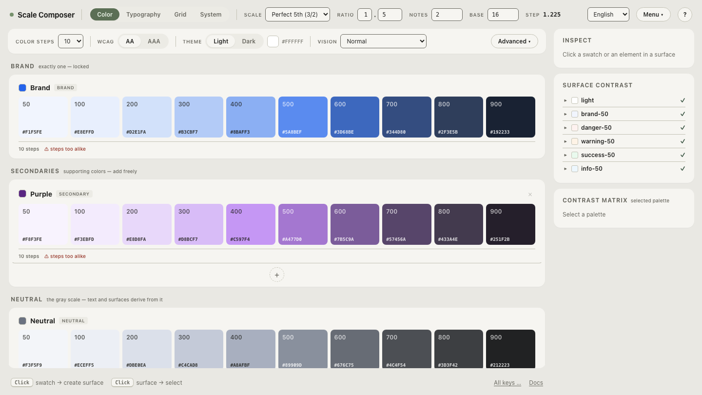
Open a blue ramp held at constant OKLCH hue: ten steps from near-white to near-black, hue pinned at ≈263 the whole way down. The deep steps are the ones to watch — this is the region where a constant CIELAB hue would have gone purple.
Why does CSS ship both families?
Because both have territory. The
CSS Color Module Level 4 defines
lab() and lch() alongside oklab() and oklch(), keeping both
generations available side by side rather than declaring a winner.
The split follows the data you’re matching. If the values you receive come
from a print or color-measurement pipeline — a brand’s spot-color spec, a ΔE
tolerance report — lab() and lch() express them without translation. If
you are generating colors for screens — palettes, ramps, hover derivations,
contrast planning — the OK forms give you the version of “perceptual” that
behaves in the regions screen work uses hardest.
When are LAB and LCH still the right choice?
Three situations keep CIELAB in the toolkit:
- Print production. ICC color management uses CIELAB as a profile connection space, spot-color libraries publish LAB reference values, and proofing workflows are built around them.
- Color-difference tolerancing. The ΔE formulas used for quality control — including ΔE2000 — are defined over CIELAB. Instruments, thresholds, and decades of accumulated tolerances speak it.
- Existing datasets. Measured LAB values keep their meaning; converting an archive to OKLab adds a step and improves nothing those workflows care about.
None of these are weaknesses being tolerated. The blue defect matters when you generate colors by moving along the model’s axes — which measurement and proofing workflows rarely do, and screen palette generation does constantly. That difference in usage, more than any difference in age, is the real boundary between the two families.
How do you tell model drift from a deliberate hue change?
Both look like “the hue moved,” so it helps to see the deliberate kind once. Drift arrives uninvited: you changed lightness, and hue moved as a side effect. A deliberate rotation is applied to the whole palette at once, on purpose, with lightness untouched.
Scale Composer exposes that as a hue-offset control on each palette. Drag the hue offset on the same blue ramp — the entire scale swings toward violet or toward teal in one motion while every step keeps its lightness. That is what an intentional hue change looks like; once you have made one, the unintentional kind is easy to name when you see it.