Should Color Ramps Shift Hue?
Put a hand-crafted palette from a mature design system next to a freshly generated one and study the ends. In many hand-built ramps the light steps lean subtly warm and the deep steps lean cool — the hue rotates as the ramp descends. A generated ramp typically holds one hue angle from near-white to near-black. Anyone who notices the difference arrives at the same question: is the rotation craft that generators lack, or a workaround that generators have retired?
Mostly the second, partly the first. A color ramp does not need to shift hue to look right: in a perceptually uniform space like OKLCH, a constant-hue ramp reads as one color at every lightness. Much of the traditional rotation compensated for older color models in which constant hue looked wrong — that reason is largely gone. What remains is a legitimate aesthetic choice: a deliberate warm-light, cool-dark rotation gives a palette a crafted temperature, which functional UI palettes usually skip and brand or illustration palettes sometimes want.
The rest of this article separates the two motives, shows a constant-hue ramp built from real values, and ends with rotation done on purpose. The color model behind it lives in our OKLCH guide.
Why do hand-crafted palettes rotate hue?
Through the years when serious palettes were tuned swatch by swatch — a craft documented in write-ups like Stripe’s, on designing an accessible color system — hue rotation was a recurring feature: ramps whose hue numbers slide a few degrees per step instead of holding still. It looked like pure taste. A good part of it was repair.
The models available did not keep their promises about hue. In HSL, a hue number is an angle on the RGB wheel, and it does not stay put perceptually: darken a color at constant HSL hue and its apparent hue wanders — yellows collapse toward olive, oranges toward a brown that reads redder than its source. To build a ramp that looked like one hue, you rotated the hue number against the drift, step by step, by eye. CIELAB, the perceptual space of its era, had its own version of the problem concentrated around blue: darkening a saturated blue at constant CIELAB hue steers it visibly toward purple, which put an honest constant-hue blue ramp out of reach by numbers alone. In both models, much of the rotation in the file was not a hue shift the designer wanted — it was the counter-shift that canceled the model’s.
That distinction matters, because a correction practiced long enough starts to look like a principle. “Ramps should rotate toward yellow at the top and blue at the bottom” was, in meaningful part, “ramps built in HSL need this not to look broken.”
Does constant hue actually look constant in OKLCH?
Repairing exactly this is much of
why OKLab exists: its hue lines were fitted
against color-appearance data, so a fixed hue number tracks a fixed perceived
hue — including in the blue region where CIELAB bends. Take the blue
#2563eb, which sits at oklch(0.546 0.215 262.9), hold the hue at 262.9,
and build the ramp by walking lightness along a curve while chroma follows a
bell profile:
| L | C | H | Hex (computed, ≈) |
|---|---|---|---|
| 0.95 | 0.02 | 262.9 | #e7effc |
| 0.80 | 0.09 | 262.9 | #9fbef8 |
| 0.65 | 0.16 | 262.9 | #598bf0 |
| 0.546 | 0.215 | 262.9 | #2563eb (seed, exact) |
| 0.40 | 0.17 | 262.9 | #0f3ca1 |
| 0.27 | 0.10 | 262.9 | #0a2256 |
One column never moves. On screen, each row reads as the same blue — lighter or darker, never drifting violet or teal — and the deep steps land at navy, which is where the eye expects this blue to go as the light goes out.
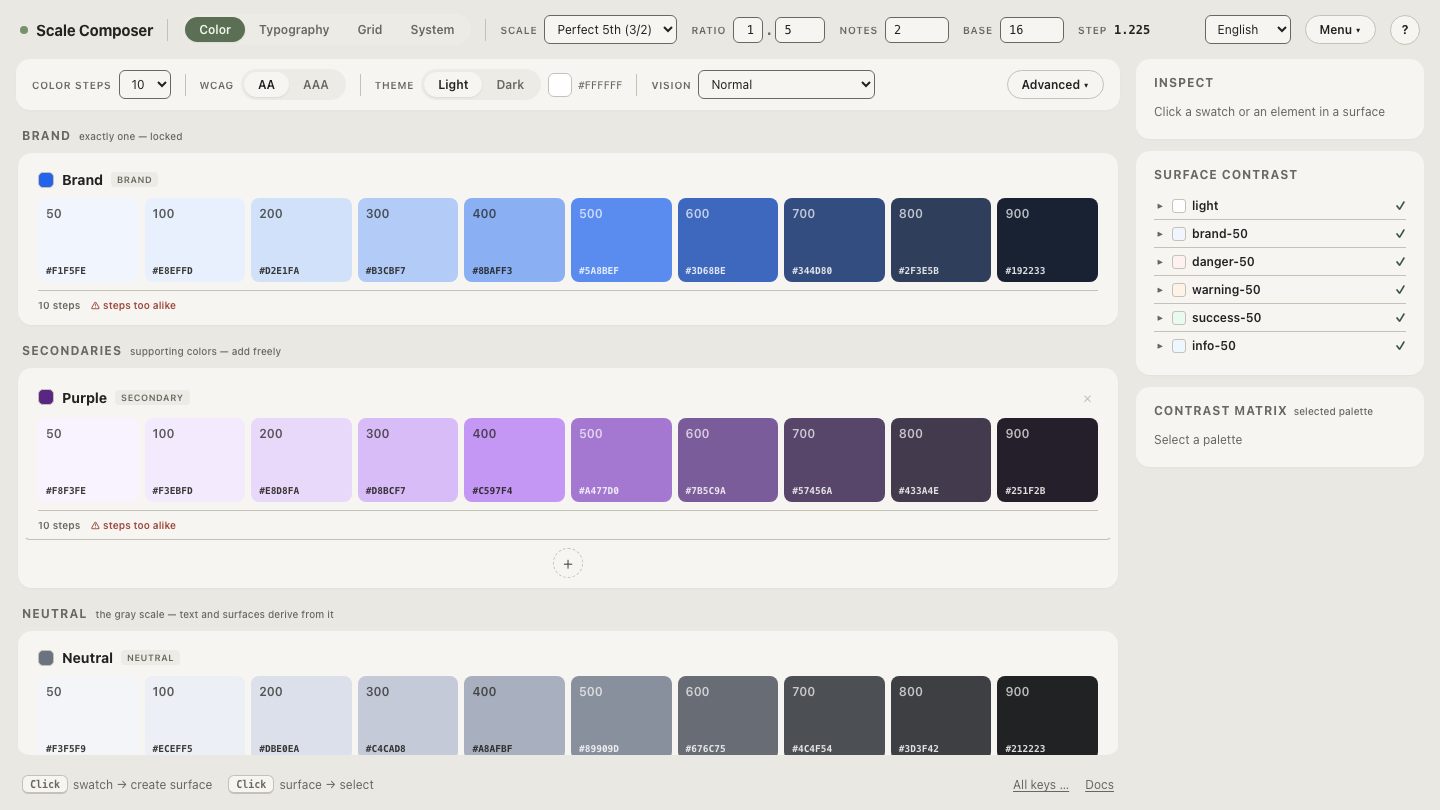
Open this constant-hue ramp in Scale Composer — the same seed expanded to ten steps, hue pinned the whole way down. A ramp with this appearance built in HSL would need a different hue number on nearly every row; here it takes one.
When is a hue shift the right choice?
Once the corrective motive is subtracted, a real one remains: temperature. Painting and photography carry a long tradition — worth naming as a tradition, not a law of perception — of rendering light warm and shadow cool: golden light sources, shadows filled by blue sky. A ramp that rotates its light end a few degrees toward yellow and its dark end toward blue borrows that atmosphere, and the result reads as crafted — closer to how surfaces behave in a lit scene than to how tokens behave in a stylesheet.
That quality earns its keep in illustration palettes, brand worlds with a strong pictorial identity, and editorial or marketing surfaces where the palette is allowed to be expressive. The cost is symmetry: a rotated ramp’s steps are no longer “the same color, darker,” so anything derived by walking the ramp — hover states, elevation tints — inherits a temperature change along with its lightness change.
When should a ramp hold its hue?
For functional UI palettes, constancy usually wins. Interface color systems are walked mechanically: hover and pressed states derived a step away, surfaces tinted from the same scale, dark themes computed from light ones. Every one of those operations assumes that moving along the ramp changes lightness and nothing else — an assumption a rotated ramp quietly breaks.
There is also a perceptual reason constancy feels right in an interface. The visual system works to separate the color of a surface from the light falling on it — the reason a red car still reads as red at dusk. A constant-hue ramp fits that machinery: it reads as one material under varying light, which is exactly the fiction an interface needs its primary color to sustain across states and elevations. A rotated ramp reads instead as an atmosphere, a lit scene. Neither reading is wrong; they answer different briefs.
How do you rotate hue on purpose, not by accident?
If the temperature is wanted, take it as a decision with a control attached rather than a drift inherited from a model. In Scale Composer, every palette keeps its ramp on a constant-hue spine and carries a hue-offset control on top: the rotation is explicit, reversible, and applied where you can see it. See the difference between drift and decision for yourself: pull the hue offset on the ramp above — the whole scale swings a few degrees toward violet or toward teal in one motion, while every lightness step holds still.