Fluid Spacing: One Slope for Everything
A fluid space scale is a spacing system whose values slide with the viewport at the same rate as the type they surround: margins, gutters and padding scale by the same proportion as the text, so the relationship between a heading and the space around it is the same at every screen width. Fluid type over fixed spacing is half a system — the text glides while its container stands still, and the composition quietly changes shape as the screen widens.
This guide is part of our fluid typography guide and covers the spacing half: why spacing has to glide when type does, how sharing one slope keeps proportions locked, and the rounding detail that lets gliding values stay on a grid.
Why does fluid type need fluid spacing?
Take a common fluid setup: the root font size glides from 16px at a 360px viewport to 18px at 1280px. Every rem-based size grows by 12.5% across that range — a heading token of 2.375rem renders at 38px on the narrow end and 42.75px on the wide end.
Now give that heading a fixed 24px margin below it. At 360px the heading-to-margin ratio is 38 / 24 ≈ 1.58. At 1280px it is 42.75 / 24 ≈ 1.78. Nothing broke and nothing jumped — but the proportion between the text and its surrounding space drifted by 12.5%, the full growth of the type. The wide layout is measurably tighter around its headings than the narrow one, in a way nobody decided.
A useful analogy: it is like enlarging the subject of a photograph without enlarging the frame around it. Each part is fine on its own; the relationship between them is what changed. And the relationship is what the eye actually reads — text and the space around it register as one composition, not as two independent values, and the proportion between them is most of what “well spaced” means. When half the composition scales and half doesn’t, the design at 1280px is not the design that was approved at 360px; it is a slightly different one.
How does a shared slope keep proportions constant?
The principle: spacing glides on the same slope as type. If the type grows 12.5% between viewports 360 and 1280, every compositional distance grows 12.5% over exactly the same range. Any ratio between a text size and a spacing value is then a constant — the drift disappears by construction.
That is how Scale Composer’s fluid mode exports spacing — and the mechanism is almost disappointingly simple: one clamp on the root font size carries the glide, and spacing tokens are plain rem values that ride it, exactly like the font sizes do. A 1.5rem spacing step renders 24px while the root sits at 16 and 27px when it reaches 18 — the step’s max is 1.125× its min because the root’s max is 1.125× its min. No second clamp exists anywhere: “one slope” is not a discipline the spacing values follow but a structural fact — there is only one gliding expression in the whole stylesheet, and everything in rem inherits it.
The drift, side by side — same heading, fixed margin versus fluid margin:
| Viewport | Heading (2.375rem) | Fixed 24px margin — ratio | Fluid margin | Fluid — ratio |
|---|---|---|---|---|
| 360px | 38px | 1.58 | 24px | 1.58 |
| 820px | ≈40.4px | ≈1.68 | 25.5px | 1.58 |
| 1280px | 42.75px | 1.78 | 27px | 1.58 |
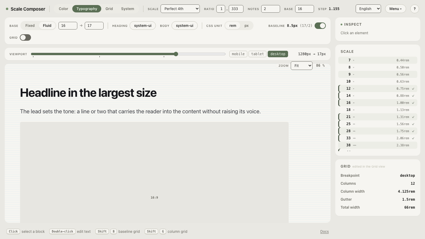
Open the fluid spacing export in Scale Composer — the CSS panel writes every spacing token as a rem value with its fluid pixel range in a trailing comment, so you can read the shared glide directly off the export.
Why round fluid spacing to half-rem steps?
Here is the tension the naive version ignores: spacing systems get their value from quantization. A spacing scale is a small set of allowed distances — a grid — and “every gap is one of a handful of values” is much of what keeps a large interface coherent. Raw fluid spacing in CSS destroys that: at a 700px viewport, a value gliding 16→18px passes through ≈16.74px — a distance that is on no grid at all, and different again at 701px.
Scale Composer’s export resolves this with CSS’s round() function (see round() on MDN), which snaps a computed value to the nearest multiple of a step you choose. Each spacing token is wrapped in it:
--space-md: round(nearest, calc(1rem * var(--spacing-density)), 0.5rem); /* 16→18px (fluid) */The density variable defaults to 1; set it to 0.75 or 1.25 and every spacing value tightens or relaxes by that factor before rounding.
The round(…, 0.5rem) wrapper snaps the result to the nearest half-rem — and the subtlety that makes this work is that rem itself is gliding. Under the root clamp, 0.5rem is 8px at the narrow end and 9px at the wide end, so a value can be quantized in grid units and fluid in pixels at the same time: the grid glides under the values that snap to it. Because both the token and the rounding step are rem quantities, their ratio never changes with the viewport — the token above is 2 × 0.5rem at every width, rendering 16px on the narrow end and 18px on the wide end with no half-step jumps anywhere in between. That is the glide-versus-grid tension resolved: fluid in pixels, stable on the grid.
What should stay fixed?
Not everything should ride the slope. The useful distinction is between compositional distances and optical constants:
- Borders stay in px. A 1px hairline is an optical constant — it reads as “a line” at every viewport, and 1.125px buys nothing but blur.
- Radii usually stay fixed. A 6px corner reads as the same shape at 360px and at 1280px; scaling it changes the perceived geometry of a component more than it preserves any composition.
- Icons usually stay fixed — or step with the type sizes they sit beside, rather than gliding independently.
The dividing question: does this value participate in the proportion between text and space? Margins, padding, gutters and gaps do — they glide. Hairlines and small geometric details don’t — they hold. (How the spacing steps themselves are chosen is the spacing system’s territory; fluid mode changes how steps render, not which steps exist.)
Read the slope off your own export
The fastest way to internalize the shared slope is to change one number and
watch everything follow:
open the same system’s export and find --spacing-density —
every spacing token multiplies by it before rounding, so setting it to 0.75 in
your stylesheet tightens the whole spacing layer by one factor while every
clamp keeps its slope. Density and fluidity turn out to be independent dials:
one scales the grid, the other makes it breathe.