Compact, Comfortable, Spacious: Density Modes
A density mode is the same layout resolved against different spacing values: the components, the hierarchy, and the type stay fixed, while the semantic spacing aliases they reference — row padding, cell gap, control inset — are remapped one scale step up or down. Compact fits more on screen, spacious fits less, and neither is a redesign: all three modes are one design read against three neighboring points on the same spacing scale.
That framing is worth insisting on, because “we should offer a compact view” sounds like a second product and is often scoped as one. This article covers who genuinely needs density modes, the alias mechanism that makes them a mapping swap rather than a fork, a table row worked through with real numbers, and the honest cost — all resting on the step logic of a spacing system.
Who actually needs density modes?
Data-heavy tools where practiced users spend hours a day: tables, admin panels, monitoring dashboards, IDEs. A support agent triaging a queue or an analyst reconciling a ledger measures the screen in rows per glance — every row that fits is one scroll saved, hundreds of times a day. The same product almost always has surfaces under no such pressure: settings, onboarding, billing. Those stay comfortable, whatever the tables do.
The demand is observable before anything is built: users zoom the browser to 80%, export tables to spreadsheets “to see everything,” or ask outright. Density is a per-surface answer to a demonstrated expert need — a point worth holding onto, because the cost section below is real.
How does a density mode work?
Through the two-layer token structure many
systems already have. The bottom
layer is the spacing scale itself: with a
16px base, ratio 2, and two notes
per doubling, the menu runs 8, 11, 16, 23, 32, 45, 64. The layer above is
semantic — aliases like table-row-padding, table-cell-gap, or
control-inset that point at steps. Components consume only the aliases.
A density mode is a remap of that pointer layer and nothing else. Comfortable points row padding at 16; compact re-points it at 11; spacious at 23. No component changes and no screen is redrawn by hand — one mapping is swapped, much the way a color theme swaps light for dark.
The scale’s geometry is what makes a one-step remap feel coherent. Each step is 2^(1/2) ≈ 1.41× its neighbor (the unrounded value below 16 is 11.31; the menu rounds it to 11), so stepping every alias down compresses every distance by roughly the same 30%. The gap inside a component and the gap between components shrink in proportion, and the layout reads as the same design, tighter — not as a different design.
What does a table row look like in each mode?
Take a table with 16px body text at line-height 1.5 — a 24px line box — and resolve the same two aliases in all three modes:
| Spacious | Comfortable | Compact | |
|---|---|---|---|
table-row-padding (top and bottom) | 23px | 16px | 11px |
table-cell-gap | 23px | 16px | 11px |
| Body text | 16px / 24px | 16px / 24px | 16px / 24px |
| Row height (24 + 2 × padding) | 70px | 56px | 46px |
| Rows in a 600px-tall table | 8 | 10 | 13 |
Compact shows 30% more rows than comfortable in the same viewport — the whole business case in one line — and every spacing value in the table comes from three neighboring steps of the scale’s short menu: 11, 16, 23.
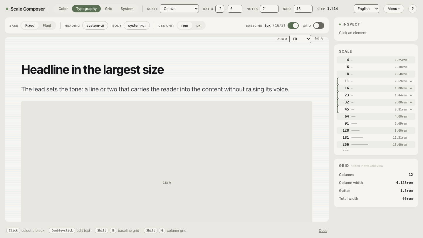
The three columns are one menu read at three offsets: open the spacing scale behind the mapping in Scale Composer — base 16, ratio 2, and two notes per doubling generate all seven steps, and every alias above points at one of them.
Does text get smaller in compact mode?
Mostly no — and this is the key insight of the whole pattern: density is a spacing decision before it is a typography decision. Spacing compresses; type largely stays. An expert scans structure faster than a novice, but expertise doesn’t shrink the print a reader can comfortably resolve — that limit is set by eyesight, not familiarity. Squeezing type also buys little: dropping body text from 16 to 14px saves 2px per line where a padding remap saved 10 per row, and it costs legibility for every user. Some data grids do drop secondary cell text one level in their densest mode, but it’s the last lever, pulled after spacing has done the work.
Why can practiced users read denser screens at all?
Because white space is doing communication work, and how much is needed depends on who’s reading. Spacing is how a layout teaches its structure — which label belongs to which field, where one record ends and the next begins. In the vocabulary of Gestalt psychology this is grouping by proximity. A first-time visitor leans on those cues heavily. A practiced user has moved the structure into their head; the screen no longer has to teach it, so the spacing budget can shrink with little comprehension cost.
The one-step remap respects that mechanism. Because every alias moves down the same geometric scale, the proportional contrast between gaps survives: the space between records stays visibly larger than the space within one. Compact turns down the volume of the cues without scrambling their relationships. It’s also why novice-facing surfaces — onboarding, settings, empty states — should stay comfortable: their readers still need the teaching.
What do density modes cost?
QA surface, multiplied. Every screen behind a density toggle now exists twice — three times with spacious — and each variant can fail on its own: text that truncates only at compact, badges and focus rings that fit in a 56px row and clip in a 46px one, touch targets that clear minimum-size guidance comfortably in one mode and barely in another. The remap itself is a few lines; verifying its consequences is a standing tax on every future screen. Material Design’s density guidance — a published treatment of the pattern — accordingly treats where density applies, and where it shouldn’t, as seriously as how to compress.
Hence the scoping rule from the top: add the mode when a segment demonstrably needs it, on the surfaces where they need it — not as a default feature of every new system.
Try the compact remap
The mechanism is easiest to judge on neighbor pairs: wherever comfortable reads 16, compact reads 11; wherever it reads 23, compact reads 16. Read the same menu one step down and decide which of your own screens would survive the swap — open the compact mapping in Scale Composer.