How Many Spacing Steps Does a System Need?
Before trusting anyone’s recommendation, measure your own product: grep the
stylesheets for every margin, padding, and gap value and count the
distinct results. Mature products that grew without a system commonly land
between 30 and 60 distinct values — 12px next to 13px, 20px next to 22px next
to 24px. Then list the jobs those values are doing — icon gap, control
padding, space between form fields, card padding, gap between cards, block
break, section break, page margin — and the list runs to about eight.
A spacing system needs six to ten steps: one or two micro steps for the inside of components, three or four middle steps for the space between elements and components, and two or three macro steps for sections and page regions. The gap between the forty values in use and the eight jobs to do is the answer to “how many” — a system needs about as many steps as there are jobs, plus a little headroom.
This article budgets the steps zone by zone, explains why so few hold up perceptually, and covers the one legitimate reason to add one — the sizing question inside the broader spacing system.
How many spacing values do unsystematized products accumulate?
Run the experiment concretely:
grep -rhoE '(margin|padding|gap)[^;]*:[^;]*px' src/styles \
  | grep -oE '[0-9]+px' | sort -n | uniq -c | sort -rn
The histogram tends to have a recognizable shape: a few heavyweights at the top (16px used hundreds of times, 8px and 24px close behind) and then a long tail — 18px used 22 times, 22px used 9 times, 13px used twice. Every tail value was once a local decision: a gap nudged to fix one crowded screen, a rounding that never got reconciled, a third developer’s guess at what the second developer meant. None of them is individually wrong; collectively they mean the same design decision is being re-made dozens of times with slightly different outcomes.
Set the two numbers side by side — 40-odd values in use, roughly eight distinct jobs — and the question answers itself. You don’t need more steps; you need each job to have exactly one.
How should you budget six to ten steps?
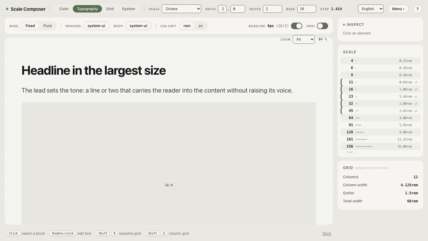
By zone, because spacing jobs cluster at three distinct sizes. With a 16px base, ratio 2, and two notes per doubling, the scale generates seven steps — 8, 11, 16, 23, 32, 45, 64 — and they distribute like this:
| Zone | Steps | Typical jobs |
|---|---|---|
| Micro (1–2 steps) | 8, 11 | icon-to-label gaps, chip and badge padding, tight control interiors |
| Middle (3–4 steps) | 16, 23, 32 | gaps between form fields, card padding, space between components |
| Macro (2–3 steps) | 45, 64 | section breaks, page regions and margins |
The budget explains both failure modes. Fewer than six steps starves a zone — usually micro, and components go from cramped (8) to loose (16) with nothing between. Many more than ten and the menu stops being short: neighboring steps stop having distinct jobs, people pick between them by mood, and the decision fatigue the scale was meant to remove creeps back in with a token name attached.
Open this seven-step scale in Scale Composer — three numbers generate all seven steps, dense at the micro end and sparse at the macro end.
Why do fewer steps still cover every job?
Because the eye compares space proportionally, not by pixel count. The difference between 8px and 12px is unmistakable — one gap is half again the other. The difference between 56px and 64px is the same 8 pixels and barely registers. Two steps can only hold two distinct jobs if readers can reliably tell them apart, and at large sizes that takes a visible ratio, not a fixed increment.
That’s the property a non-linear scale guarantees by construction. In the seven-step scale above, each step is about 41% larger than the one before (2^(1/2) ≈ 1.414) — every adjacent pair is distinguishable at a glance, from 8 versus 11 all the way to 45 versus 64. A linear menu like the 8-point grid’s 8, 16, 24, 32, 40, 48, 56, 64 spends half its options on large-end distinctions few readers will ever perceive. Fewer, proportionally spaced steps aren’t a compromise against a richer menu; they’re the menu with the imperceptible options removed.
When should you add a spacing step?
When a recurring distance genuinely straddles two existing steps — the same role test used for adding a font size. One screen where 23 feels loose and 16 feels tight is not evidence; a distance that keeps losing on both neighbors across many screens is a role without a step, and it has earned one.
Prefer changing the scale’s density over inserting a lone value: moving from two notes per doubling to three regenerates the whole menu with gentler increments (each step about 26% larger instead of 41%), so the new in-between values still share the scale’s logic. A hand-inserted 20 between 16 and 23 solves one gap and breaks the arithmetic every other step obeys.
What step counts do public design systems use?
Public scales are useful calibration, read correctly. Shopify Polaris, for example, documents its space scale openly: named steps, dense at the small end, sparsening toward the large end — the same shape the zone budget produces. Treat it as evidence about the shape of a workable scale, not as an authority on your product: Polaris is calibrated to the density of Shopify’s admin surfaces, and a content-heavy marketing site or a data-dense dashboard will land at different points inside the six-to-ten range. The convergent pattern across published systems — a short, non-linear menu — is the transferable lesson; the exact count is yours to measure.
Measure your gap, then pick your density
The audit gives you the two numbers that matter: values in use, and jobs to do. The remaining decision is density — whether your product’s middle zone needs three steps or four. Compare the candidates directly: the same base and ratio at three notes per doubling grows the menu from seven steps toward ten, and each added step has to answer the role test — which recurring job does this one own? Step through the denser scale and judge every addition against your own histogram: open the comparison scale in Scale Composer.