Spacing Tokens: Naming and Steps
Spacing tokens are named entries for the steps of a spacing scale —
space-4 or space-md instead of a raw 23px — stored in one source and
consumed by design tools and code alike. They turn a list of numbers into a
shared vocabulary: a gap is chosen by name, and the name resolves to the same
value everywhere it appears.
This article covers the two dominant naming conventions and their trade-offs, semantic aliases, how many steps to expose, and the export path that carries one scale into CSS, Tailwind, and Figma. It assumes a scale already exists — the spacing system hub covers how one is built.
Why name the steps at all?
Because names are how a menu becomes shared. A
spacing scale limits which values
exist; tokens make choosing between them communicable. Two people reaching for
“the gap between form fields” arrive at the same token, where they might not
arrive at the same number. It’s also easier to hold eight named steps in your
head than eight pixel values: nobody debates whether a gap should be 23px or
26px when the real choice is between space-4 and space-5. The conversation
moves up a level — one step more or one step less — which is the level where
spacing decisions belong.
Should spacing tokens use numbers or t-shirt sizes?
The two conventions in wide use, compared:
| Concern | Numeric (space-1…space-7) | T-shirt (xs…3xl) |
|---|---|---|
| Reading the order | Obvious — the numbers sort themselves | Learned, a little fuzzy past xl |
| What the name tells you | Position only — space-4 says nothing about use | A rough sense of size, still not usage |
| Adding a step at the top | Append space-8 | Append 4xl |
| Inserting a middle step | Renumber, or live with space-4-5 | No natural name between md and lg |
Neither column wins. Numeric names scale gracefully and stay honest about being positions on a scale; t-shirt names are friendlier to say and remember. What hurts is switching later: token names spread into components, stylesheets, design libraries, and documentation, and a rename touches every one of them. Pick one convention early and let it be boring.
On step count: expose the whole scale, and keep the scale short — somewhere between 6 and 10 steps serves many products. A token set much larger than the scale behind it is a sign that one-off values are sneaking back in under new names.
What are semantic spacing tokens?
Aliases that name an intent and point at a step: a gap-section that
resolves to space-7, a padding-card that resolves to space-4. The raw
steps stay the single source of values; the aliases record why a value was
chosen.
The payoff shows up when the scale changes. Rescale the system — a larger base, a different ratio — and every section gap in the product moves together, because each one points at an alias that points at a step. Layout intent survives the rescale, and no one hunts down hardcoded 64s. Keep the aliases few and genuinely structural (sections, cards, form rhythm); an alias per component reintroduces the sprawl the scale was built to remove.
How do the tokens get from design to code?
Through a tool-neutral file format. The Design Tokens Community Group defines a JSON format — DTCG — for design tokens, so one file can feed many tools. A spacing scale exported in the DTCG format looks like this:
{
  "space": {
    "1": { "$value": "8px",  "$type": "dimension" },
    "2": { "$value": "11px", "$type": "dimension" },
    "3": { "$value": "16px", "$type": "dimension" },
    "4": { "$value": "23px", "$type": "dimension" },
    "5": { "$value": "32px", "$type": "dimension" },
    "6": { "$value": "45px", "$type": "dimension" },
    "7": { "$value": "64px", "$type": "dimension" }
  }
}
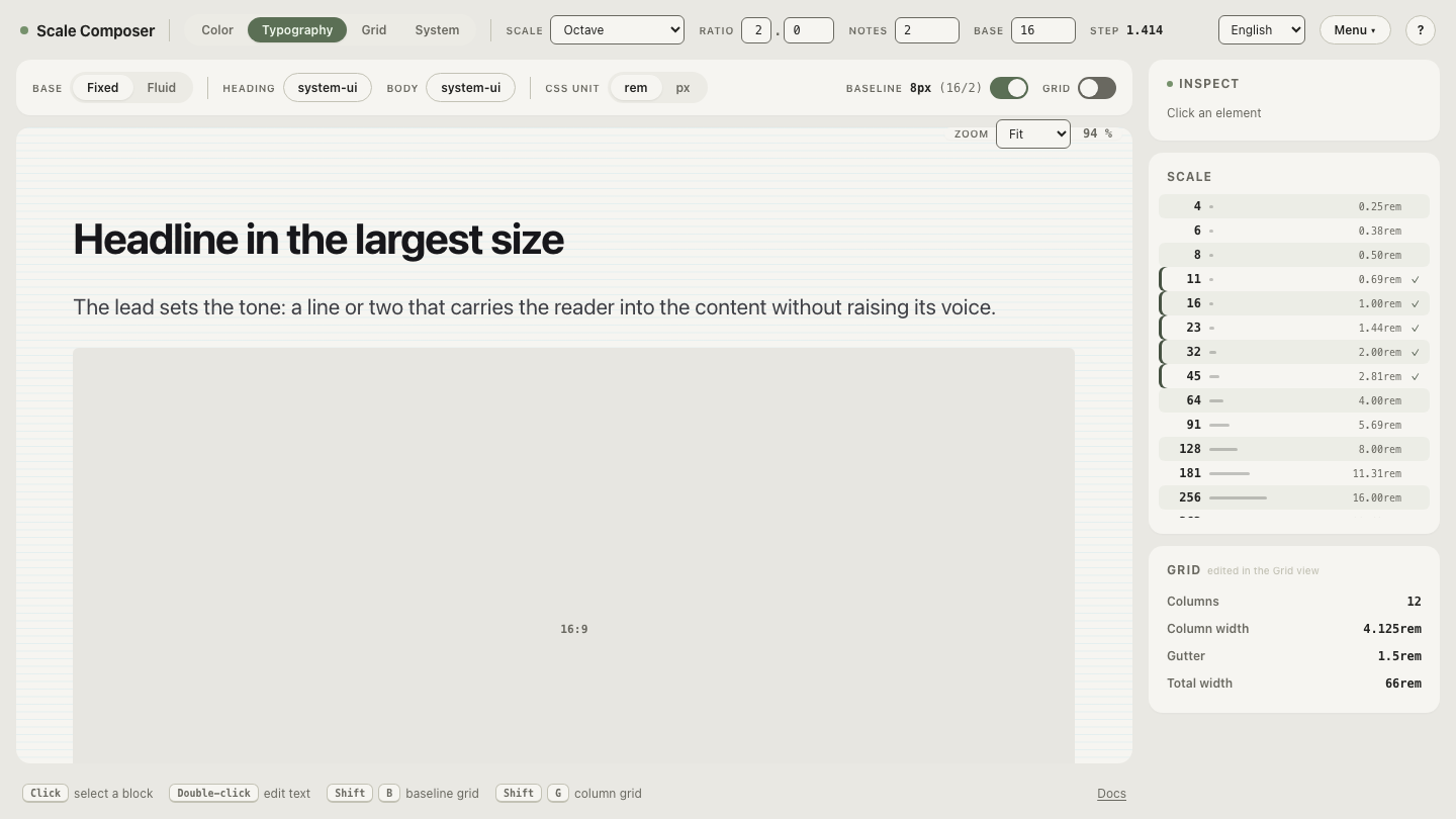
The values aren’t arbitrary — they’re a real scale (base 16, ratio 2, two notes per interval), which is the point: the token file is generated from three numbers, not assembled by hand.
From that single source, the same steps render as CSS custom properties, a Tailwind v4 theme block, and Figma Variables. Open the export view in Scale Composer — the same scale rendered as DTCG tokens, CSS custom properties, Tailwind v4, and Figma Variables. Change a scale parameter and every export reflects it, because all four are read from the same steps.
Why is keeping Figma and code in sync a token problem?
Because the drift is structural, not moral. When designers maintain a spacing list in Figma and developers maintain another in CSS, the two disagree eventually — someone adds a step on one side, rounds a value on the other, and six months later the design file and the product quietly describe different systems. Asking everyone to be more careful treats a source problem as a discipline problem. With one generated source feeding both sides — Figma Variables for the design file, custom properties or a theme for the code — the lists don’t get the chance to diverge, because neither side is maintaining a list. Both are reading one.
Export the same scale into your stack
Try the code end of the path:
export this scale as a Tailwind v4 theme — the steps arrive as
an @theme block ready to paste into a stylesheet. Then add a note to the
scale and export again: the in-between steps appear in the block, named and
ordered, without a single value chosen by hand.