The European Accessibility Act and Your Color Palette
The European Accessibility Act (EAA) is an EU directive that requires a broad range of digital products and services sold in the EU — e-commerce, banking, transport, e-books and more — to be accessible, with member-state enforcement phasing in from June 2025. For color, its practical effect runs through a chain of standards that ends at WCAG 2.1 AA: the 4.5:1 and 3:1 contrast floors moved from best practice to regulatory expectation for in-scope products.
One thing before the details: we are a design-tools site, not a law firm, and this article is orientation, not legal advice — where your product stands under the EAA is a question for counsel. What we can do is explain how a directive ends up pointing at the same contrast numbers covered throughout our contrast guide, and what that means for palette work in practice.
What is the European Accessibility Act?
The EAA is a directive, not a regulation — a distinction with consequences. A directive sets the goal and each member state writes it into national law, so the enforcement mechanisms, penalties, and some details differ by country. The commonly cited date, June 28 2025, is when obligations began applying to most in-scope products and services, but transition periods vary by state and by product category — some existing services and self-service terminals have longer runways. The safe general statement: as of 2025 the obligation is live, and the details of when exactly, for you depend on where and what you sell.
How does a law end up specifying contrast ratios?
The directive itself does not mention contrast — it states accessibility requirements in functional terms. The numbers arrive through the standards chain: conformance in practice is assessed against EN 301 549, the European standard for ICT accessibility, and for web content and apps EN 301 549 incorporates WCAG 2.1 level AA. Inside WCAG 2.1 AA sit the two criteria a palette answers to: text contrast at 4.5:1 (3:1 for large text) and non-text contrast at 3:1 for meaningful interface components.
So the chain runs: EAA → national law → EN 301 549 → WCAG 2.1 AA → your text-on-background pairings. Nothing in that chain is a new design requirement — these are the same floors accessibility work has targeted for years. What changed is their weight: for in-scope products, a failing pairing is no longer only a quality defect.
Which products are in scope?
The directive names categories rather than technologies: e-commerce services, consumer banking, passenger transport services, e-books and their platforms, electronic communications, and the consumer-facing sides of several device categories. Two commonly relevant carve-outs: purely B2B services fall largely outside the consumer-facing scope, and microenterprises — under 10 employees and under €2 million turnover — are exempt from the service obligations. Both boundaries have edges (a B2B company with a public e-commerce checkout, a growing company crossing the threshold) and those edges are exactly where counsel earns its fee. The design-side takeaway is simpler: if consumers in the EU buy or use your digital product, assume the floors apply until someone qualified tells you otherwise.
What does it mean for palette work, concretely?
Three things, in descending order of effort saved.
The pairings that always should have passed now carry legal weight. The work is unchanged — body text at 4.5:1, large text and UI components at 3:1 — but “we’ll fix contrast later” now ages differently on an in-scope product.
The cheapest compliance is construction-time floors. A palette whose roles are derived with the AA floors enforced at derivation cannot emit the failing pairing in the first place — one decision at the source replaces per-page audits downstream.
The audit trail matters. Enforcement regimes ask not only whether you conform but whether you can show it. Checks that run at derivation and exports that carry the derived values (design tokens, CSS variables) leave documentation as a side effect; ad-hoc fixes leave nothing to point to.
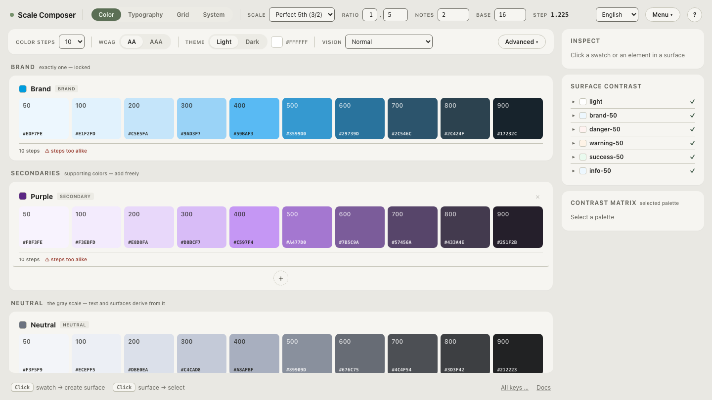
Open a palette derived against the AA floors — every text and UI role checked against its surface at derivation, with the ratio displayed next to each pairing.
What does the EAA not require?
Deflating the panic is as useful as stating the obligation. The EAA does not require APCA or any WCAG 3 draft metric — the chain ends at WCAG 2.1, and newer contrast models carry no regulatory weight in it. It does not require AAA: the 7:1 enhanced-contrast tier remains opt-in, and the regulatory bar is AA. It does not mandate any specific colors — no palette, hue, or “accessible color list” appears anywhere in the chain; any two colors that clear the ratios are fine. And it does not outlaw brand color: a mid-lightness brand blue that misses 4.5:1 on white remains fully usable for large text, UI components, and fills — what it cannot be is body text on that background.
How does it compare with laws elsewhere?
Lightly, because each deserves its own article: in the United States, ADA case law and Section 508 both reference WCAG in practice, so the same AA floors are the de facto bar. The UK’s Equality Act and public-sector accessibility regulations point the same direction, as do comparable regimes in Canada and Australia. The pattern for a palette is convenient: one standard — WCAG 2.x AA — satisfies the contrast expectations of essentially every major regime at once. Building to AA is not EU-specific work.
How do you gap-check an existing palette?
A worked pass, ordered by exposure — most-read pairings first:
- Body text on every page surface — white, cards, tinted panels — at 4.5:1. Highest volume, highest scrutiny.
- Secondary and muted text at 4.5:1 — among the most common failure
classes in audits: light grays like
#9CA3AFon white sit at ≈2.5:1, while#6B7280clears at ≈4.8:1. - Text on filled controls — labels against the fill, not the page:
white on a
#2563ebprimary button is ≈5.2:1. - Component boundaries at 3:1 — input borders, meaningful icons, focus indicators, checked-vs-unchecked states.
- State colors — error, success, warning text at 4.5:1 against their backgrounds (a common miss: error red on a pink tint).
- Both themes — dark mode re-rolls every row above; verify it separately rather than trusting inherited verdicts.
Disabled controls and decorative elements are exempt and can be excluded from the pass — but note that they were excluded, for the audit trail.
Run the gap check on your own palette
The list above is mechanical enough to delegate. Load your palette and step through the gap check — each role pair from the list, checked against the AA floors in order, so what remains is a to-do list rather than an open question.