Testing Contrast: Tools and Method
A palette that passed its accessibility audit in March can be failing by June. Nothing dramatic happened — marketing warmed the brand blue a step, a dark theme shipped, someone added a tinted panel for callouts — and each change quietly re-rolled dozens of text-on-background pairings that nobody went back to re-check. The audit was real; it just measured a product that no longer exists.
Contrast testing has two modes: auditing — checking pairings that already exist, with a color contrast checker, browser devtools, or an automated scanner — and construction — building the palette so that every pairing is checked at the moment it is derived. A workflow that holds up combines them: construct with the floors built in, scan releases for regressions, and reserve human attention for the judgment calls no tool can make. This piece of our contrast guide lays out the method and the arithmetic behind it.
What are the two ways to test contrast?
Auditing treats the palette as given and asks whether it passes. Its tools take two colors and return a ratio, or crawl rendered pages and flag failures. Auditing is how you learn the state of what exists — an inherited codebase, a marketing site, last year’s design system.
Construction moves the check to the source. Instead of picking colors and testing them afterward, each color role — body text, muted text, a border, a focus ring — is derived against the surfaces it will sit on, with the required floor applied at derivation. A pairing that would fail is never emitted, so the output does not need a first-pass audit; it passes by construction.
The two modes are not rivals — they test different moments. Audit looks backward at what shipped; construction looks forward at what is about to.
Why does audit-only fail at scale?
Because of the arithmetic. A modest product palette carries around 17 semantic color roles — several tiers of text, borders, focus, states, fills and the text on them. Set those roles across, say, 6 surfaces (page, card, tinted panel, header, two fills) and 2 themes, and you are holding 17 × 6 × 2 = 204 role-to-surface pairings. Not all combinations occur in the interface, but the honest audit surface runs well into three digits — and every brand tweak, every new surface, every theme addition re-rolls a slice of it.
Nobody re-audits two hundred pairings by hand after every palette change, and in practice nobody pretends to: manual audits sample. Sampling finds the failures you thought to look for — body text on white — and misses the ones you did not: muted text on the tinted panel, in dark mode, after the June rebrand. Construction inverts the economics. The checks run where the changes happen, so a palette tweak re-checks everything it touches, at the cost of zero additional attention.
What belongs in the audit toolkit?
Even with construction in place, auditing keeps three jobs: assessing what you inherited, catching regressions, and verifying the rendered truth. The toolkit, by category:
- Pair-by-pair checkers — paste two colors, read the ratio. Right for spot decisions and for settling disagreements about a single pairing.
- Browser devtools — most browsers show the contrast ratio of selected text and flag failures against the WCAG floors, measured on the rendered page. Right for verifying reality rather than intention: what the user’s screen actually composites, including opacity and layering.
- Automated scanners — crawl pages or run in CI, flag failing pairings in bulk. Right for regression coverage across releases.
- Manual spot checks — a human looking at real screens. Right for everything the tools cannot classify, which the next section is about.
Scale Composer sits on the other side of the divide — it is a construction tool, deriving roles with the floors applied as the palette is built — so the honest description of the workflow is: construct there, then audit what rendering did with the result.
What do automated scanners catch — and miss?
Scanners compute ratios well and tirelessly; treat that part as solved. What they cannot do is know what things mean. A scanner cannot tell decorative text from content, so it flags watermarks it should ignore. It cannot tell a disabled control from an enabled one that merely looks gray — the first is exempt from the floors, the second is a real failure. It cannot reliably judge which colors count as adjacent for a border or an icon, or whether text sitting on a photograph is incidental or meant to be read. Each of those calls changes whether a floor applies at all, and each is a judgment about intent, not arithmetic.
So the division of labor is stable: machines verify numbers, humans verify meaning. A workflow that asks humans to re-compute ratios wastes attention exactly where it is scarce; one that asks scanners to classify intent produces both false alarms and false comfort.
What does construction-time checking look like?
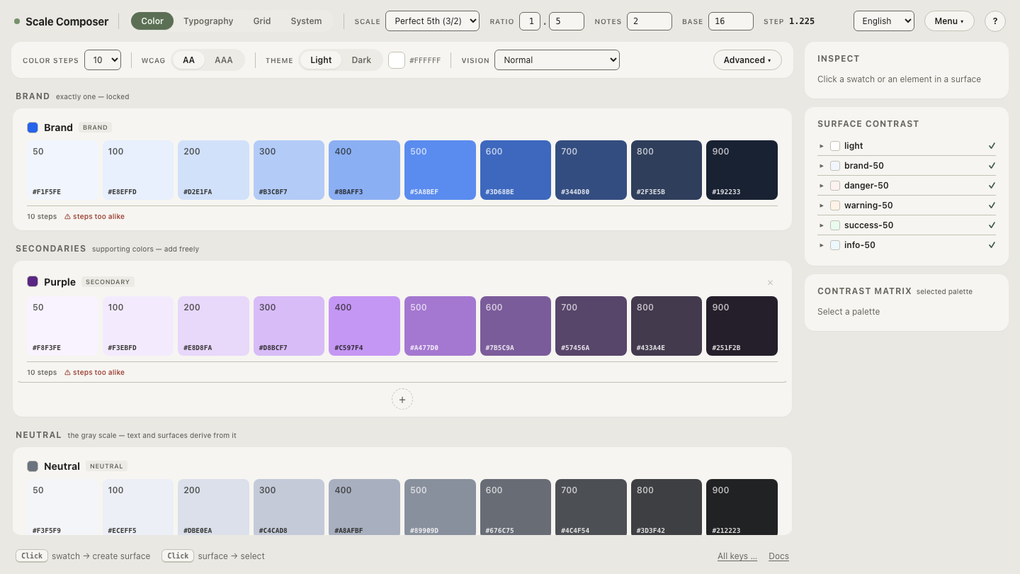
In Scale Composer, a palette is not a list of hand-picked hexes but a set of derived roles: text tiers, borders, focus, states, each computed against every surface with the selected floor — AA or AAA — enforced at derivation time. Text roles are scored for readability rather than maximum contrast, labels on fills fall back to an anchor color when pure white or black cannot carry them, and a derived dark palette re-runs every check rather than inheriting light-mode verdicts. The APCA Lc value is computed alongside each WCAG ratio as a second reading.
Open a derived palette and watch the checks happen — change a seed color and every affected pairing re-derives with its ratio recomputed in place.
What is the method, step by step?
- Construct with floors. Derive the palette’s roles against every surface with the AA (or AAA) floor applied at derivation — this is where the 204 pairings get covered, once, structurally.
- Record the judgment calls. Decide what is decorative, what is disabled, what is exempt — and write it down, so scanners and humans agree on what is in scope before anyone measures anything.
- Scan every release. Let an automated scanner walk the rendered product for regressions — hardcoded hexes, opacity surprises, a component that bypassed the palette.
- Spot-check the judgment cases. Human eyes on adjacency questions, text over images, meaning-bearing color, and anything the scan flagged as ambiguous.
- Re-derive, do not patch. When the brand shifts, change the seed and let the roles re-derive with their checks — hand-patching one failing hex is how palettes drift back out of compliance.
Move the checks to the start
The difference between the two modes is easiest to feel by doing both. Take one palette through audit and construction — first read the pairings as a checker would, one by one, then change the seed and watch every affected role re-derive against its floor at once.