Font Loading Performance Basics
Font loading performance comes down to three levers: request fewer font
files, make each file smaller, and control what the browser shows while the
files travel. In practice that means a disciplined set of families and
weights, WOFF2 as the only format on the wire, font-display: swap so text
is never invisible, and a preload for the one or two files that render
first.
The ordering matters more than most guides suggest. Formats and preload hints are tuning; the biggest lever sits upstream, in design: a type system that needs fewer fonts. A tool that composes type systems has no performance tooling to offer here — Scale Composer certainly doesn’t — but a system built from two families and four weights simply has less to load than a page that accumulated fonts one decision at a time, and no amount of tuning closes that gap. This article is part of our typography guide.
What happens while a webfont loads?
Text styled with a font that hasn’t arrived yet puts the browser in an awkward position, and historically it has answered in one of two ways. FOIT — a flash of invisible text — hides the text until the font lands; the layout is stable but the reader stares at blank space. FOUT — a flash of unstyled (really: fallback) text — shows the text immediately in a fallback face, then swaps when the webfont arrives; the reader can read at once, but the swap can shift the layout, because the fallback and the webfont occupy different amounts of space.
Both are symptoms of the same gap between first paint and font arrival. Everything in font loading practice is about narrowing that gap or choosing, deliberately, what fills it.
What does font-display: swap do — and what does it cost?
font-display: swap picks the second behavior on purpose: show the text
immediately in the fallback, swap when the webfont loads. It’s the standard
answer because invisible text is almost always the worse failure — a reader
who can read fallback text has lost nothing but polish.
The cost is the swap itself. If the fallback’s letters are wider or narrower
than the webfont’s, the swap reflows the page — the shift users notice as
text jumping mid-read. The modern mitigation is metric matching: CSS
size-adjust and its sibling descriptors let you scale a fallback face so
its rendered widths approximate the webfont’s, shrinking the swap to near
invisibility. Declaring a metric-tuned fallback is increasingly standard
practice, and increasingly generated by tooling rather than by hand.
Why is “fewer fonts” the biggest optimization?
Because with static font families — unlike variable fonts, which carry many weights in one file — every family × weight × style you use is a separate file and a separate request. The count grows quietly: one team adds a third family for a marketing page, another adds 300 for a hero, and soon the page requests a dozen files before the first paragraph settles.
A disciplined budget, in real numbers:
| File | Role | Typical Latin-subset WOFF2 |
|---|---|---|
| Body 400 | paragraphs, UI text | ~15–40 KB |
| Body 600 | labels, subheadings | ~15–40 KB |
| Heading 700 | titles | ~15–40 KB |
| Heading 500 | secondary display | ~15–40 KB |
Four files, commonly landing well under 150 KB combined — the sizes vary with glyph coverage, so treat the ranges as shapes rather than quotes. The undisciplined version — three families in four weights each, plus a couple of italics — is fourteen files, often several hundred kilobytes, for a page that doesn’t look better.
The reason four weights suffice is the type-system argument: hierarchy comes from a type scale — size steps and weight steps working together — not from adding fonts. A scale plus two families plus four total weights covers most products.
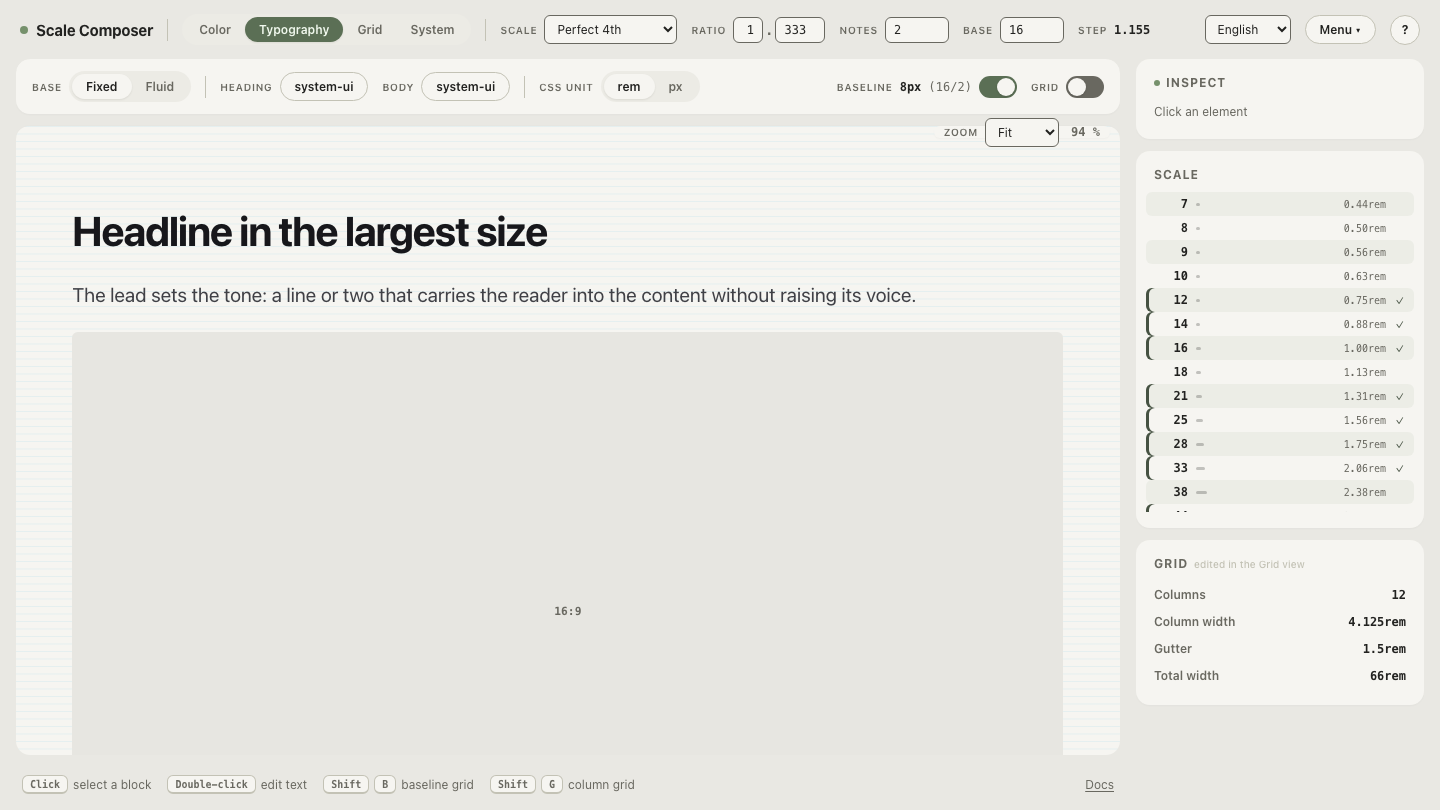
See a full system on that budget in Scale Composer — every level from caption to display drawn from two families and four weights, at a real scale’s sizes. That’s the entire font bill for the page.
What else belongs on the checklist?
The remaining items are mechanical. web.dev’s font best practices guide treats each in depth; the working versions:
- WOFF2 only. Every current browser supports it, and it compresses meaningfully better than WOFF. There is no 2026 reason to ship TTF, OTF, or EOT to a browser.
- Preload the critical one or two files.
<link rel="preload" as="font" type="font/woff2" crossorigin>for the body face (and perhaps the heading face) starts those downloads before the CSS is parsed. Preloading everything defeats the point — preload is a priority claim, and claiming priority for six files claims it for none. - Self-host or Google-hosted: both are fine. The classic argument for Google’s CDN — that a font cached on one site would be reused on yours — expired when browsers partitioned their HTTP caches per site. Self-hosting gains you version control, same-origin preloads, and one less third-party dependency; Google hosting gains you convenience and automatic subsetting. Pick for control or convenience, not for the cache myth.
- Subset if your toolchain allows. A font file carrying scripts your
product never renders is dead weight. Google’s CSS API already serves
per-script subsets via
unicode-range; if you self-host, subsetting becomes your job, and tools exist for it.
Load less by designing more tightly
Run the checklist in order and the first item does most of the work: fewer families and weights is a design decision with a bigger payoff than any build-step tuning that follows it. The tightest budget of all — short of loading no font at all — is one family. Try the one-family version of the system — a complete hierarchy from a single family and four weights, hierarchy carried by size and weight alone: the smallest font bill a full type system fits inside.