The Best Google Fonts for UI in 2026
The Google Fonts catalog holds roughly 1,800 families, and that number is the problem, not the promise. Most of those families were never meant to set a settings page: single-weight display faces, decorative scripts, revival projects with three glyphs of punctuation. The catalog sorts by popularity and trending — neither of which measures fitness for interface work. The list you actually want is short.
The best Google Fonts for UI are the families that pass five criteria: legibility at interface sizes, a real weight range (four or more useful weights), an x-height suited to screens, coverage for the languages you serve, and active maintenance. By those criteria, roughly a dozen families carry most production interfaces — Inter, Source Sans 3, IBM Plex Sans and Noto Sans for interface text; Lora, Source Serif 4 and Newsreader for editorial reading; Space Grotesk, Playfair Display and Fraunces for display; JetBrains Mono and IBM Plex Mono for code. The criteria matter more than the names, because the names will shift and the criteria won’t. This article is part of our typography guide.
Why do most Google Fonts fail in an interface?
Because interface text is read small, fast, and thousands of times. A poster headline is seen once at 60px, where almost any face survives; a navigation label is glanced at repeatedly at 14px, where small design decisions become legibility decisions. Closed apertures let e collapse toward o; a lowercase l that mirrors capital I and digit 1 turns identifiers into guesswork; letterforms drawn for print contrast lose their thin strokes on a low-density screen.
The intuitive reason is that people don’t read interfaces letter by letter — they recognize word shapes in glances. A face that keeps its letterforms distinct at small sizes preserves those shapes; a face that was drawn to be admired at large sizes blurs them. That failure is invisible in the catalog’s specimen view, which shows you a headline, and visible only in the product, which shows your users a caption.
What criteria make a Google Font UI-ready?
Five, roughly in the order families fail them:
- Legibility at UI sizes. Open apertures — c, e and a that stay open at 13px — and distinct forms for the classic confusables: capital I, lowercase l, digit 1, and the rn pair that shouldn’t fuse into m. This is testable in thirty seconds, and most families fail it.
- A real weight range. Interface hierarchy runs on weight: body at 400, labels at 500, subheadings at 600, titles at 700 is already four. A family shipping only regular and bold runs out of hierarchy on the second screen.
- An x-height suited to screens. A generous x-height reads larger at the same pixel size, which is why most modern UI faces have one. Extremes cut both ways — when the x-height crowds the ascenders, word shapes flatten and reading slows.
- Language and glyph coverage. Latin-only is a constraint teams tend to discover late, usually from a bug report in another language. Check the scripts you serve, and check for tabular figures if the product shows numbers in columns.
- Active maintenance. Fonts are software: hinting improves, weights get added, coverage grows. A family updated in recent years is a safer dependency than one untouched since 2012.
How do the criteria work on a real candidate?
Apply them to two popular families. Playfair Display ships six weights (400–900), so it passes the range criterion easily — but its high-contrast hairlines thin toward invisibility at 14px, so it fails the first criterion for UI text. That’s not a disqualification; it’s a role assignment: display sizes only. Inter ships nine weights (100–900), a tall x-height, tabular figures, and years of continuous maintenance — it passes all five for interface work, and the trade you accept is deliberate neutrality, a quality you can also get by not loading a font at all.
The spot test for any candidate: set Illustrate 1lI, rn m at your caption size and look. If the confusables merge, the family belongs in headlines or on someone else’s project.
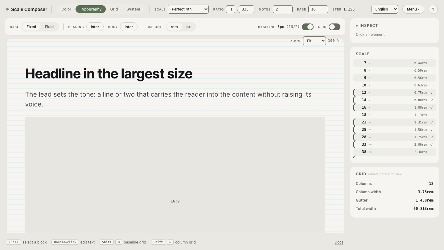
Tour the curated picker in Scale Composer — around fifty Google Fonts families that hold up in UI use, previewed in heading and body slots at a real scale’s sizes. Replace the specimen text with the spot-test string and run it at the smallest size on the scale.
Which Google Fonts are widely used for UI and body text?
The families below are widely relied on rather than objectively ranked — each earns its place against the five criteria, and each line says what the family is for.
Interface and body workhorses:
- Inter — the neutral default for product UI: tall x-height, nine weights, tabular figures, relentless maintenance.
- Source Sans 3 — the same job with humanist warmth; friendlier than Inter without losing evenness in paragraphs.
- IBM Plex Sans — slightly more voice than the neutrals; holds up well in dense, data-heavy screens.
- Noto Sans — coverage as its mission; the practical answer when the language list is long.
Editorial serifs, for long-form body text:
- Lora — a contemporary serif drawn with screens in mind; a comfortable, even paragraph voice.
- Source Serif 4 — Source Sans’s serif sibling; editorial register without costume.
- Newsreader — designed for news text on screens; at its best in running paragraphs, not headlines.
Display and character:
- Space Grotesk — a quirky grotesque for headlines, paired over a neutral body.
- Playfair Display — high-contrast editorial drama; headline sizes only.
- Fraunces — a soft old-style with deliberate personality; display first, body rarely.
Monospace:
- JetBrains Mono — drawn for code: generous x-height, unambiguous confusables by design.
- IBM Plex Mono — the mono that matches Plex Sans when the product already speaks Plex.
Names on a list like this age — families get added, updated, and displaced, which is why the year is in the title. The criteria are the durable part: when a new family arrives, test it against the five rather than against this list.
Test a shortlist against your own words
A shortlist is a hypothesis until it meets your product’s actual copy. Pick two or three candidates for the role you’re filling, then judge them where UI faces earn their keep: at body and caption size, in your own sentences, not in a specimen headline. Load two candidates into the heading and body slots — paste your interface copy into the editable specimen, step down to the smallest size you ship, and keep the family that stays legible when nothing else about the layout is helping it.