Border Radius Scales
A rounded thumbnail sits flush inside a rounded card. Both corners use the same value — 16px, straight from the style guide — and the result still looks subtly wrong: the space between the thumbnail’s edge and the card’s edge runs even along the sides, then swells visibly at each corner. Designers nudge the padding, swap the image, blame the shadow. Every individual value is “correct,” so nobody can say what’s off.
A border radius scale fixes this the way a spacing scale fixes gaps: a short, fixed menu of corner values — commonly four steps plus a pill, such as 0, 4, 8, 16, and 9999px — that every component draws from, shipped as tokens. It comes with the one rule most guides skip: a nested corner’s radius equals the outer radius minus the gap between the edges — 16 − 8 = 8 — which is exactly what un-fights the card above.
Radii reward the same systematization as the rest of the spacing system, and reward it quickly, because a wrong corner is easier to spot than a wrong gap — as the opening scene shows.
Why do nested rounded corners look wrong?
Plain geometry. Draw two rounded rectangles, one inside the other, with a uniform 8px gap along the straight edges. For that gap to stay 8px around the corner, the two arcs must be concentric — drawn from the same center point — and concentric arcs differ in radius by exactly the distance between them. If the outer corner is 16px, the inner corner must be 16 − 8 = 8px.
Give the inner corner 16px instead — the “same token everywhere” instinct — and its arc is drawn from a different center. The gap still measures 8px along the straights, but across the corner’s diagonal it opens to about 11.3px (8 × √2), roughly 40% wider. That swelling band is what the eye catches: people register uneven spacing between two edges running in parallel long before they can name it. The corner simply looks off, and it keeps looking off until the radii become concentric.
What is the rule for nested radii?
Inner radius = outer radius − gap. It generalizes to any nesting:
| Outer radius | Gap between edges | Inner radius |
|---|---|---|
| 16px | 8px | 8px |
| 16px | 4px | 12px |
| 23px | 8px | 15px |
| 8px | 8px | 0 — a square inner corner is the correct result |
Two things follow. Derived values like 12 or 15 don’t need to sit on the radius menu — the menu governs free-standing corners, while nested corners are computed from them. And when the gap equals or exceeds the outer radius, the inner corner goes square: also correct, however counterintuitive it looks in a design review.
In CSS the rule is a one-line calc():
.card {
  border-radius: 16px;               /* --radius-lg */
  padding: 8px;                      /* --space-1  */
}
.card > .thumbnail {
  border-radius: calc(16px - 8px);   /* inner = outer − gap */
  /* with tokens: calc(var(--radius-lg) - var(--space-1)) */
}
border-radius
also takes per-corner longhands and an elliptical syntax — rarely needed,
but useful to know about when a design calls for a single flattened corner.
How many radius values does a system need?
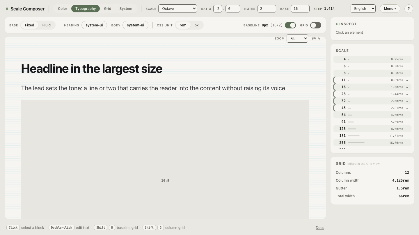
Fewer than spacing needs: four steps plus a pill covers many products. A workable menu is none (0), small (4), medium (8), large (16), and full (9999px — any value past half the element’s height renders a pill, so the number just needs to be safely enormous).
Rather than inventing those numbers, borrow the small end of the
spacing scale. With a 16px base, ratio 2, and two notes per doubling, the spacing
menu’s smallest steps are 8, 11, and 16 — and dividing the smallest by the
ratio extends the same arithmetic one step lower: 8 ÷ 2 = 4. A radius menu
of 0, 4, 8, 16, and full stays on the scale’s formula, with 11 in reserve if
a middle corner ever earns a role. Keeping both menus on one formula keeps
corners and gaps visually related — and means they ship together: the
Scale Composer’s Tailwind v4 @theme export carries radii alongside the
spacing tokens, type levels, colors, and
breakpoints, as do the DTCG and Figma Variables exports.
Open the scale the radius menu borrows from in Scale Composer — the working range for radii is the bottom of the same menu the spacing steps come from.
What does corner radius say about a brand?
Radius is one of the fastest tone signals an interface has. Sharp, small radii (0–4px) tend to read as technical, precise, serious — the look of developer tools and financial dashboards. Mid radii (around 8px) read as neutral; large radii (16px and up) as friendly and approachable; full pills as casual and consumer. None of these readings is a law — context shifts them — but the tendency is consistent enough that the choice belongs at the brand level: decided once, encoded in the scale, applied everywhere.
What erodes the signal is deciding it per component. Each new screen resolves the corner question slightly differently, and the product drifts into a mix of sharp and soft that says nothing at all — the same failure mode, corner for corner, as unsystematized spacing.
Run the numbers on your own corners
Pick the most-nested pair on your busiest screen — image inside card, card inside panel, button flush against a container’s padding. Note the outer radius and the gap between the edges, subtract, and compare the result with what’s actually shipped: if the inner corner is larger than the difference, you’ve found the swelling band from the opening scene. Then see how the pair maps onto scale steps — open the nested-radius math in Scale Composer.