Color Spaces Explained for Designers
“Color space” covers two different kinds of things, and most of the confusion around the term comes from mixing them up. Gamuts — sRGB, Display-P3, Rec.2020 — are sets of producible colors: what a given screen can physically show. Coordinate systems — HSL, LAB, OKLCH — are ways of addressing colors with numbers, independent of any screen. In the broad sense, a color space is any organized system for representing color; the practical skill is recognizing which of the two kinds a given name refers to.
This article is the orientation map: the two kinds, how they combine, and which pairing fits which job. It belongs to our OKLCH guide, which covers the coordinate-system side in depth.
What is a gamut?
A gamut is the set of colors a device or standard can reproduce. The three names you will meet most form nested rings:
- sRGB — the baseline, standardized in the mid-1990s and still the safe assumption for the web: essentially every screen in use can show all of it.
- Display-P3 — roughly 25% larger, with the extra colors concentrated in saturated midtones: vivid reds, greens, teals. Standard on iPhones since 2016 and on Macs nearly as long; most current phones and many laptops ship P3-capable panels.
- Rec.2020 — the broadcast specification for ultra-high-definition video, wider still. It is a target more than a present reality: today’s consumer screens cover only part of it.
Each ring contains the previous one, so a color that is safe in sRGB is safe everywhere, while the most vivid P3 colors have no sRGB equivalent at all. A gamut answers exactly one question — can this hardware produce this color? — and says nothing about how you should name, compare, or manipulate colors. That is the other kind’s job.
What is a color model?
A color model — a coordinate system — is a scheme for addressing colors with numbers:
- HSL rearranges RGB values into a hue/saturation/lightness cylinder. Convenient to read, but its “lightness” is a geometric fraction of RGB, not a statement about perception.
- LAB (CIELAB) was built for perceptual measurement and remains the backbone of print and color-management workflows.
- OKLCH (the cylindrical form of OKLab) is the modern perceptual model: colors with the same L genuinely look equally light, which is why newer CSS color features and tools have standardized on it.
The crucial property is what a model is not: it is not tied to a gamut. A coordinate system can address all visible colors and then some; a gamut is a region inside that space. You can describe an sRGB color in OKLCH, and a P3-only color in OKLCH, with the same three numbers meaning the same things. (HSL is the exception that proves the rule — it is defined on sRGB values, which is one reason it cannot reach wide-gamut colors.)
Should I use P3 or OKLCH?
The question compares things from different categories — like asking whether to travel by passport or by airplane. P3 is a gamut; OKLCH is a coordinate system. You don’t choose between them: you choose one of each, and any combination is coherent.
A useful analogy — and it is only an analogy — is spoken language. The coordinate system is the language you describe colors in; the gamut is the vocabulary a particular screen can pronounce. An sRGB screen and a P3 screen speak the same OKLCH, one just has more words available. “P3 or OKLCH?” dissolves into two independent questions with clear answers: which language should I think in? (a perceptual one, because design judgments — “same color, lighter”, “equally vivid across hues” — are perceptual judgments, and you want words that match them) and which vocabulary should I target? (sRGB as the floor everyone can render, P3 as enhancement where screens allow it).
What does the same color look like in different notations?
Take the blue #2563eb. Every row of this table names the same point in
color space:
| Notation | Value | What it is |
|---|---|---|
| Hex | #2563eb | sRGB coordinates, 8 bits per channel |
| HSL | hsl(≈221 83% 53%) | the same sRGB values, rearranged |
| OKLCH | oklch(0.546 0.215 262.9) | perceptual coordinates, gamut-independent |
| color() | color(display-p3 ≈0.213 0.383 0.889) | P3 coordinates |
Four notations, one color. Now push the chroma from 0.215 to 0.26, holding lightness and hue. At this lightness and hue the sRGB ceiling is ≈0.251, so the new color has left sRGB — but P3’s ceiling here is ≈0.269, so it remains producible on a P3 screen. Watch the notations diverge:
- OKLCH still names it exactly:
oklch(0.546 0.26 262.9). The language doesn’t care that some screens can’t pronounce it. - The P3 notation can still produce it: ≈
color(display-p3 0.154 0.345 0.981). - Hex has no code for it. The closest sRGB value, ≈
#0b59ff, is a nearby but different color — slightly darker and duller than what was asked for.
Two notations follow the color past the fence; one stops at it. That single observation is the gamut/model distinction in working form.
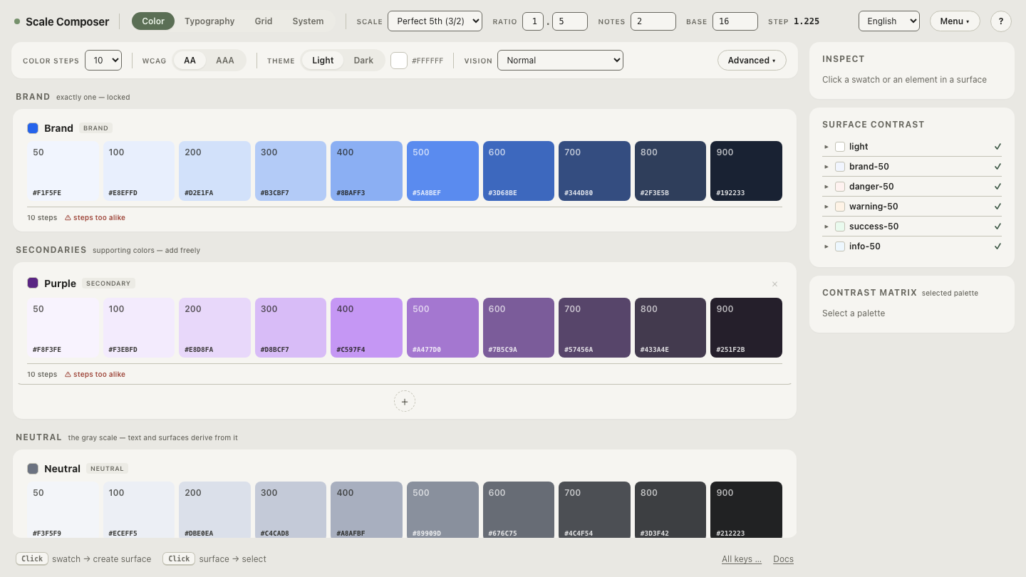
Open this blue in Scale Composer — the same seed generated as
a full scale against the sRGB baseline, with each step’s oklch()
coordinates and hex value side by side.
Which color space should I use for which job?
One of each kind, chosen per job:
| Job | Coordinates | Gamut / delivery |
|---|---|---|
| UI palettes, design tokens | OKLCH | sRGB-safe values first, P3 as enhancement |
| Photos, illustration | handled inside the image | files tagged sRGB or Display-P3 |
| Print handoff | LAB-based workflows | the printer’s profile, checked via proofs |
For interface work, generate and reason in OKLCH, deliver values that render
safely in sRGB, and layer color(display-p3 …) on top where it earns its
keep — accents and brand color, mostly. For imagery, the color travels inside
the file; the job is correct profile tagging rather than notation. For print,
paper is a different gamut altogether, and LAB has long served as the neutral
language between screen and press.
Watch the two kinds move independently
The cleanest proof that gamut and model are separate things is to change one
while the other holds still:
toggle the same palette into Display-P3. The coordinate
system doesn’t move — L, C and H remain the readout — while the vocabulary
grows: midtone steps take on chroma that sRGB had no words for, each step now
carries a color(display-p3 …) string, and the hex column stays clamped at
the sRGB fence. Same language, larger vocabulary, and nothing about the
palette’s logic had to change.