Focus Indicators That Actually Show
A familiar way this goes wrong: mid-redesign, someone notices the browser’s
default focus outline clashing with the new buttons and adds outline: none
to the reset stylesheet. Visual QA passes, because nothing looks different —
until the first report arrives from someone who navigates by keyboard,
tabbing through a page that no longer shows where they are.
A focus indicator is the visible marker for which element keyboard input
will act on, and removing it makes an interface unusable without a mouse.
WCAG 2.4.7 requires a visible focus indicator at level AA, and the indicator
needs 3:1 contrast against the colors around it. The working fix: never
outline: none without a replacement, style the ring with :focus-visible,
and make sure it shows on every background it can land on. That last part
is where most rings quietly fail, and it is the part this piece of our
contrast guide works through with computed numbers.
Why do focus indicators exist?
A mouse user has a standing answer to “where am I?” — the pointer is on screen, and the element under it responds. A keyboard user moving through a page with Tab has exactly one equivalent — the focus indicator. The same is true for people using switch devices, and for anyone whose hands, eyes, or setup make a mouse impractical. The ring is not decoration on top of navigation; it is the navigation feedback.
That is the intuitive frame for outline: none: it does not tidy up a
visual detail, it turns off someone’s pointer. The interface still works in
the sense that Tab still moves focus — but invisibly, which for the person
tabbing is the same as not working.
What do the WCAG rules require?
The core requirement is Success Criterion 2.4.7, Focus Visible: any keyboard-operable interface must show a visible focus indicator. It sits at level AA — the tier that regulation typically references — so a missing ring is a compliance failure, not a style choice.
Visibility has a number attached. The non-text contrast criterion asks 3:1 of the visual information needed to identify interface components, and a focus indicator is exactly that kind of information — so the working floor is 3:1 between the ring and the colors adjacent to it.
WCAG 2.2 extended the picture: Focus Not Obscured (2.4.11, AA) says the focused element may not be fully hidden behind other content — sticky headers and cookie banners are the usual offenders — and a stricter AAA criterion describes the indicator’s minimum size and contrast in more detail. The specifics of the AAA tier are opt-in and more rarely targeted; the reliable takeaways are the visible ring, the 3:1 floor, and not burying the focused element.
What replaces outline: none?
The historical reason designers deleted the ring is that :focus fires on
mouse clicks too, so buttons kept lighting up after being clicked. That
problem has a selector-shaped solution: :focus-visible matches when the
browser judges the focus should be shown — keyboard navigation, essentially
— and skips ordinary mouse clicks.
/* let mouse clicks stay quiet, keep the ring for keyboards */
:focus {
  outline: none;
}
:focus-visible {
  outline: 2px solid var(--focus);
  outline-offset: 2px;
}
This preserves the aesthetic that motivated the deletion and the lifeline
that the deletion severed. One caution: pair the two rules as above —
outline: none on :focus alone, with no :focus-visible rule beside it,
recreates the original failure.
Why does one ring color rarely work everywhere?
Because the ring is checked against whatever it lands on, and a real product
is many backgrounds. Here is one ring color — a brand blue, #2563eb —
tested against four surfaces it would actually meet, each ratio computed:
| Surface | Ring vs surface | 3:1 floor |
|---|---|---|
white card #FFFFFF | ≈5.2:1 | passes |
tinted panel #EFF6FF | ≈4.8:1 | passes |
brand button #2563eb | 1:1 | invisible |
dark header #111827 | ≈3.4:1 | passes, thin margin |
The failure is not random — it lands on the brand-colored button, which is often the most-focused element on the page, and it is total: a ring the same color as its background does not fail gradually, it disappears. The dark header passes with little to spare. One color, four verdicts.
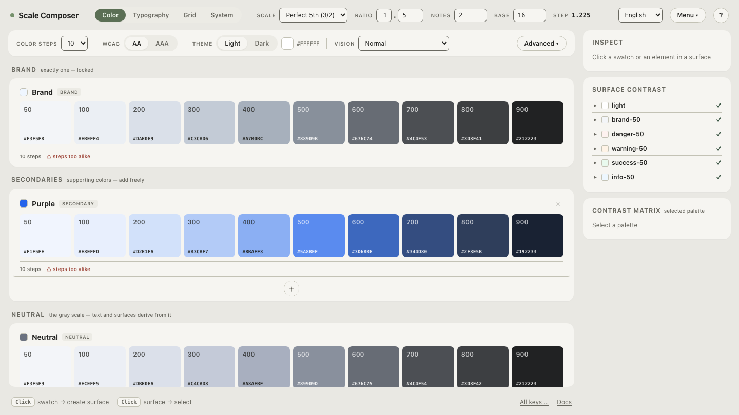
This is why a focus color is better treated as a per-surface decision than a global constant. Open the focus roles panel in Scale Composer — it derives a focus role for each surface in the palette and checks it against that surface at derivation, so the ring that lands on the brand fill is not the ring that lands on the white card.
How does a two-color ring fix it?
If the design wants one focus style everywhere, the robust pattern is a ring
with two layers — a light inner line and a dark outer one (or the reverse).
The reasoning is arithmetic: no single color contrasts with every
background, but a light and a dark color between them cover the range,
because any surface is either light enough for the dark layer or dark enough
for the light one. The same four surfaces, with a white inner ring and a
near-black #111827 outer ring:
| Surface | white inner | #111827 outer | one layer ≥3:1? |
|---|---|---|---|
white card #FFFFFF | 1:1 | ≈17.7:1 | yes |
tinted panel #EFF6FF | ≈1.1:1 | ≈16.3:1 | yes |
brand button #2563eb | ≈5.2:1 | ≈3.4:1 | yes — both |
dark header #111827 | ≈17.7:1 | 1:1 | yes |
Each layer fails somewhere; the pair fails nowhere. In CSS the two layers
are typically an outline plus a box-shadow, or two stacked shadows.
Do offset and thickness matter?
Yes, and in the same direction as contrast. A 1px hairline hugging the element’s edge tends to disappear even when its color technically passes — it reads as part of the border, and along a colored edge it is one pixel of information asking to carry the whole signal. A common working floor is a 2px ring with about 2px of offset: the gap separates the ring from the element so it reads as an indicator rather than a border, and the thickness survives sub-pixel rendering and lower-quality screens. WCAG 2.2’s AAA appearance criterion points the same direction, asking for an indicator of substantial size, not just passing color.
Give every surface its own ring
The four-surface table above is small; a real palette has more surfaces and a theme switch doubles them. Derive focus roles across your own surfaces — add a dark header or a tinted panel and watch the focus color adapt per surface, each pairing checked against the 3:1 floor as it is derived.