Stop Hand-Picking Colors: The Scale-First Method
The audit that ends most eyedropper careers looks the same everywhere. Grep
the stylesheets of a product that has grown for a few years and count the
color literals: audits of this kind routinely surface twenty-odd distinct
blues where the design intends one. #2563eb in the buttons, #2361e8 in a
link style someone matched by eye, #1d4ed8 in a chart, three hovers within
a few RGB points of each other, and a scattering of blues nobody can date.
None of them is wrong on its own screen — which is precisely the problem.
Each was picked to look right somewhere, and no rule connects them.
The scale-first method inverts the workflow: instead of choosing colors one at a time, you fix the rules — a seed color, the scale’s endpoints, a lightness curve, a chroma profile — and generate every value from them. Any two colors then agree by construction, because both are outputs of the same small system rather than separate acts of judgment. It is the method running through our color scales guide; this article makes the case for it, aimed at anyone still choosing values by eye.
What does hand-picking actually cost?
The eyedropper tax has four line items, and teams usually pay all of them.
Inconsistency. Nothing binds one pick to the next. The blue chosen for a button in March and the blue chosen for a banner in September were both judged against different neighbors, on different screens, and they disagree — the twenty-three-blues audit is this item compounding.
Unmemorable values. #2361e8 cannot be recalled, derived or explained;
it can only be looked up. A hand-picked palette is a list of arbitrary facts,
and every designer and engineer who touches it must either memorize the list
or — more often — approximate it, which feeds the first line item.
Contrast re-tested per pair. With no structure guaranteeing anything, every new text-on-background combination is a fresh accessibility check. A hundred-value palette has thousands of possible pairs; hand-picked systems meet them one bug report at a time.
Dark mode as a second project. A hand-picked light palette offers no rule to consult when the dark theme arrives, so every value gets picked again — the entire tax, paid twice.
Why does local picking fail globally?
The intuitive reason sits in perception. Color judgment is relational: the same value reads differently against white, against a gray card, next to a saturated neighbor. When you eyedropper a color until it looks right, you are optimizing it against one background on one screen — a local judgment, and usually a sound one. But an interface is hundreds of such contexts, and twenty locally sound judgments do not assemble into a system, because each one answered a different question. What the eye actually tracks across a product is not the values themselves but the relationships between them — this surface slightly darker than that one, this text comfortably above its background — and relationships are exactly what per-color picking cannot produce. Rules produce relationships; picks produce points.
What does “fixing the rules” look like in numbers?
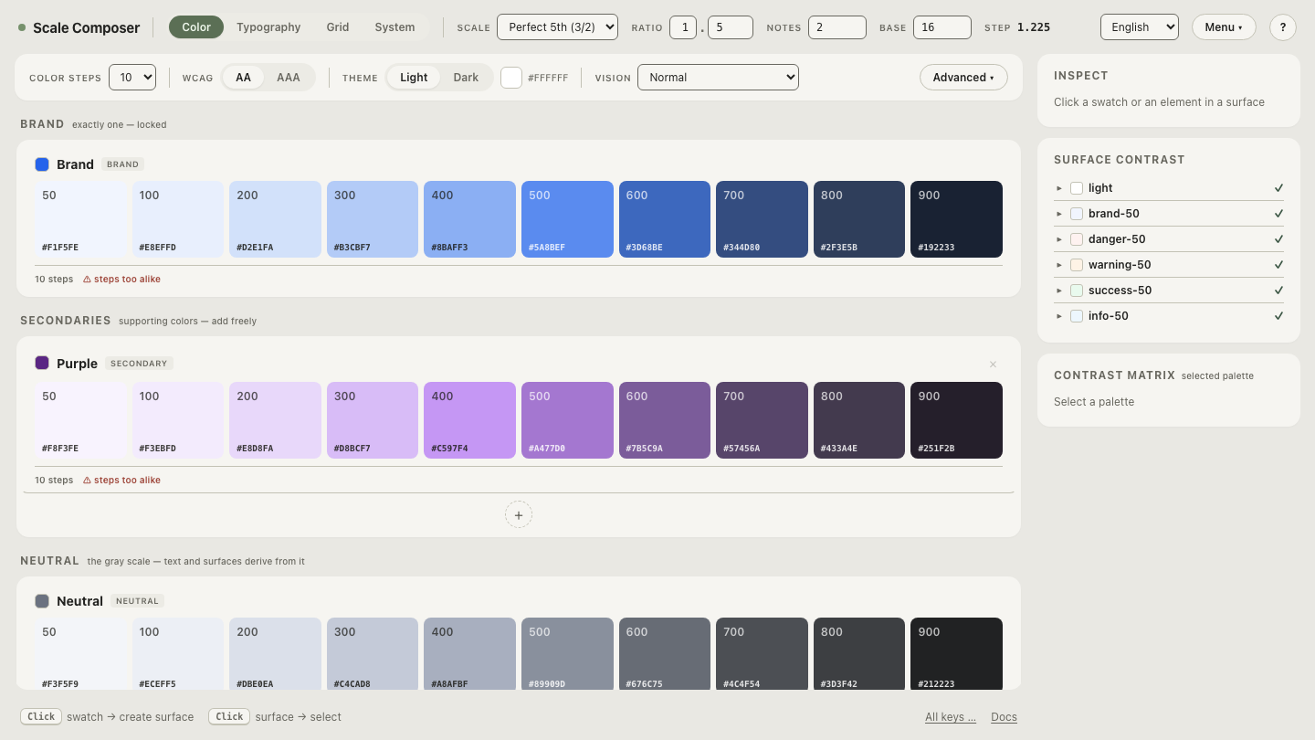
Concretely, a scale-first blue costs four decisions. Seed: #2563eb, which
is oklch(0.546 0.215 262.9). Steps: ten, labeled 50–900. Lightness: from
0.97 down to 0.25 along a piecewise curve. Chroma: a bell profile peaking at
the seed’s own 0.215, with a 12 % floor so the ends never go gray. Those
four decisions produce the entire ramp — five of its ten steps:
| Step | L | C | Hex |
|---|---|---|---|
| 50 | 0.97 | ≈0.028 | ≈#EBF6FF |
| 300 | ≈0.77 | ≈0.188 | ≈#71AEFF |
| 500 | ≈0.63 | ≈0.192 | ≈#4781FB |
| 600 | ≈0.52 | ≈0.134 | ≈#3E65B5 |
| 900 | 0.25 | ≈0.026 | ≈#1B222E |
Every value in the table is an output. Nobody picked the 300; it follows from the curve and the profile, and it will still follow from them when the seed changes. Dark mode stops being a second project for the same reason: a dark palette derives from the same seed with its own lightness curve and a chroma boost of roughly 20 %, rather than being re-picked from scratch. And contrast stops being a per-pair audit, because roles are assigned against contrast floors as part of the generation. Teams that have rebuilt palettes this way have documented the same trade — Stripe’s account of rebuilding its color system is a good public example of contrast arriving by construction rather than by after-the-fact testing.
Open these rules in Scale Composer — the seed, the lightness curve and the chroma profile on one screen, with the generated steps below them. Drag any rule and watch every value follow.
What judgment does scale-first not remove?
The honest half of the argument: generation does not make the palette decision-free — it changes which decisions exist. The seed is still chosen, not derived; no rule knows your brand. Step-role assignment is still a call: the seed’s lightness of 0.546 lands between the generated 500 (L ≈0.63) and 600 (L ≈0.52), and deciding which of those serves as the working button color is judgment, usually settled by white-text contrast. The temperature of the neutrals, whether any supporting hue exists at all, how loud the functional colors may be — all still yours.
The accurate framing is that judgment moves up a level instead of disappearing: from picking values to designing rules. A hand-picking workflow spends design attention on hundreds of small, unrecorded decisions; a scale-first workflow spends it on perhaps half a dozen large, legible ones. The half dozen are harder — an endpoint or a curve shape carries more consequence than any single hex — but they are made once, written down, and inherited by every value downstream.
Hasn’t typography already made this shift?
A useful precedent, offered as a parallel rather than a proof: font sizes went through the same inversion years ago. Hand-picked point sizes gave way to modular type scales — pick a base and a ratio, and every size follows — and in many modern design systems, generating sizes from a scale is simply how typography is done. Color is the same shift arriving later, and part of the delay was technical: a type scale needs one multiplication, while a color scale needs a perceptually honest space for its rules to behave — equal steps in the rule reading as equal steps to the eye. That is what working natively in OKLCH supplies, and it is why rule-based color has become practical rather than merely principled.
The fastest way to weigh the argument is against your own brand. Generate a scale from your own seed — paste the hex you currently eyedropper around, and compare what the rules produce against the blues your last audit found.