Generating a Full Palette from One Brand Color
The rebrand ships, and the brand arrives as one approved color — say the blue
#2563eb — plus a logo, a typeface and a deck of mood images. Then someone
opens the product backlog: hover states, disabled buttons, input borders,
table stripes, a success toast, an error state, chart series, a dark theme.
Ten steps of a brand ramp, ten neutrals, four functional colors with ramps of
their own, roughly seventeen semantic roles per surface — the interface needs
on the order of a hundred related values, and the guideline names exactly
one. That gap is where most rebrands meet their first engineering ticket.
The gap can be closed by derivation: one brand color can generate a full palette in a fixed order — (1) the seed becomes its own ten-step ramp, (2) a neutral scale is built on the same lightness logic with a whisper of the brand hue, (3) supporting-color candidates are proposed from the seed’s hue geometry, (4) the four functional colors are tuned to the palette’s saturation level, and (5) semantic roles are assigned against contrast floors. Generation gets you a coherent 80 % — the remaining calls are design judgment. This article walks the derivation in order; the ramp mechanics underneath it live in our color scales guide.
How does one hex become a ramp?
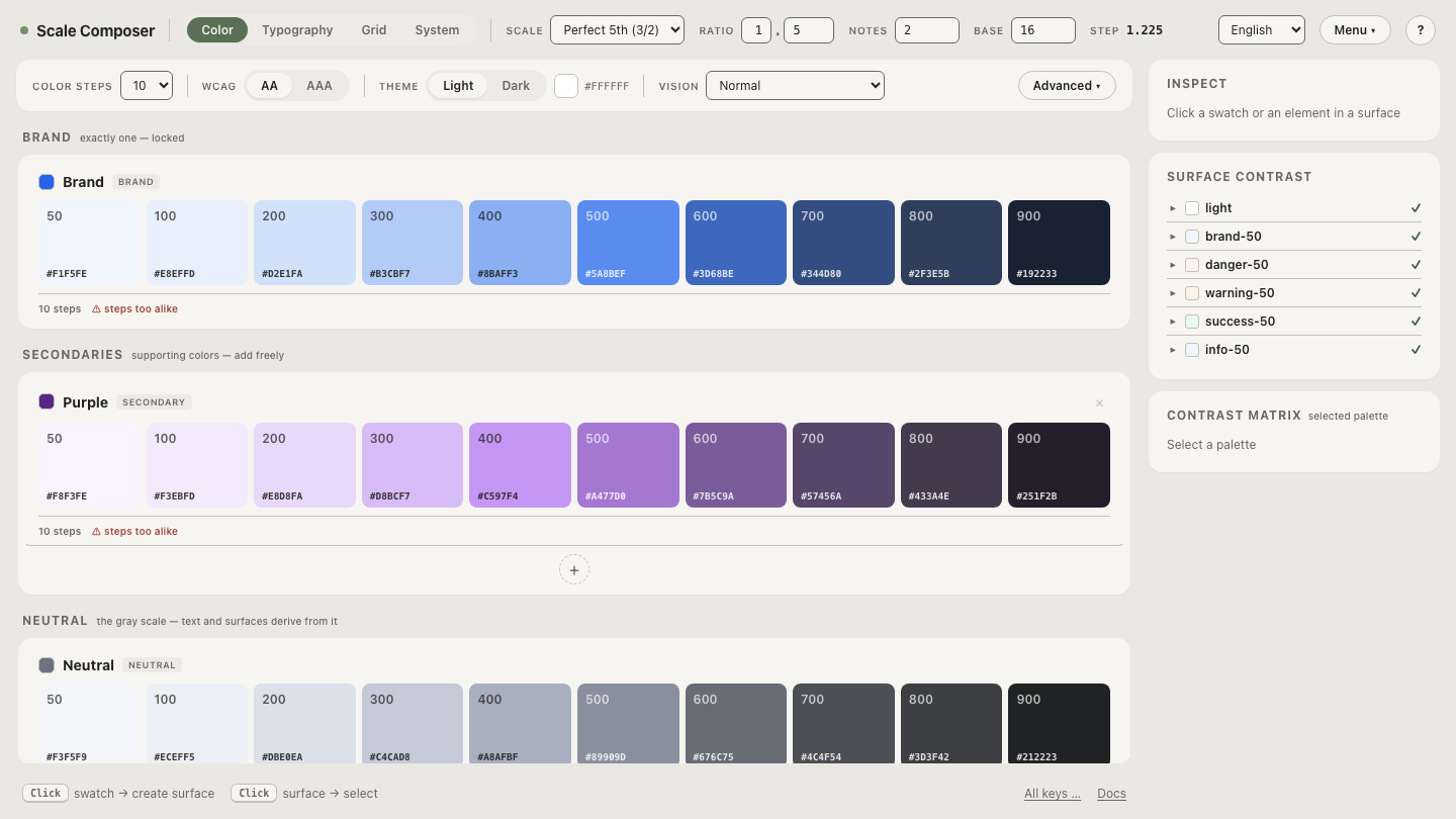
Stage one. #2563eb converts to oklch(0.546 0.215 262.9), and each
coordinate seeds a different part of the ramp. The hue, 262.9°, is held
through all ten steps. The chroma, 0.215, becomes
the ramp’s saturation peak,
with color easing off toward the ends. The steps themselves run from a
near-white L ≈0.97 (#F1F5FE) down to L ≈0.25 (#192233) along a
lightness curve — and the seed’s own lightness, 0.546, falls between the generated 500
(L ≈0.63) and 600 (L ≈0.52). The ramp brackets the brand color rather than
necessarily reproducing it, and which of those two steps serves as the
working core is one of the judgment calls that comes later.
Where does the neutral scale come from?
Stage two. The neutrals reuse the same lightness machinery at near-zero saturation — near-zero, not zero: a whisper of chroma aimed at the brand hue (262.9° here), because pure equal-channel grays tend to read detached next to a colored palette. The result is ten grays that lean imperceptibly blue, so the pages, cards and borders — the majority of an interface’s pixels — belong to the same family as the brand ramp. The neutral inherits its structure from the seed; its temperature remains a call a designer can override.
Where do the supporting colors come from?
Stage three, and the point where derivation becomes visible. From the seed’s position on the hue wheel, Scale Composer proposes four supporting candidates — rotations of the brand hue, each also dialed down in lightness or chroma so it supports rather than competes:
| Proposal | Geometry | From #2563eb | What arrives |
|---|---|---|---|
| Depth | −22° | ≈#0E3B58 | an inky, deep blue |
| Counter | +165° | ≈#734B18 | a warm bronze from across the wheel |
| Steel | +210° | ≈#787C5B | a muted gray-olive |
| Tint | +12° | ≈#C0CAF8 | a pale periwinkle wash |
Deriving from wheel geometry is the classical color scheme move — relationships between hue angles standing in for visual relatedness — and its honest limit belongs next to it: geometry guarantees the candidates are related to the brand color, not that they are right for the brand. These four are proposals for a designer to curate — keep the bronze and drop the rest, or keep none. Each one that survives becomes a full ramp of its own, on the same machinery as the brand’s.
Open the whole derivation from this blue in Scale Composer — the seed, its ramp, the tinted neutrals, the four supporting proposals and the functional colors, all generated from the single hex.
What happens to success, warning, error and info?
Stage four. The four functional intents keep their conventional hues — users arrive already trained on green, amber, red and blue — but their saturation is tuned toward the palette’s level, so a muted brand yields functional colors that murmur rather than shout, and a vivid brand yields four that can hold their own. Each is generated as a full ramp, because an error state needs a pale tint, a mid-strength core and a readable text step — not one red.
Where do roles and contrast checks come in?
Stage five is where colors get jobs. Around seventeen semantic roles are derived per surface — background, layered text levels, borders, action colors — with WCAG contrast floors enforced and APCA checked alongside. A dark variant is derived rather than inverted, on its own lightness curve with a chroma boost of roughly 20 %, because dark surroundings mute perceived colorfulness. This stage turns the palette from a picture into an artifact: the result exports as DTCG, CSS, Tailwind or Figma variables, with hex alongside.
What still needs a designer?
The remaining 20 % is concentrated in a few named decisions. Which supporting candidates survive — no generator knows whether the product needs an illustration hue or a second data series. Whether the working brand core is the 500 or the 600 — white-text contrast usually decides. How warm the neutrals should feel. How loud the functional four may be in this particular product. Derivation guarantees the palette is coherent; only judgment can make it right. What derivation adds beyond speed is that the whole system stays a function of its seed — which makes it re-runnable.
And that property is the fastest thing to test. Swap the seed and watch the system re-derive — replace the blue with a different brand color and every stage above recomputes: ramp, neutrals, supporting proposals, contrast relations. A palette built this way is one decision plus curation, and the tool makes the first part instant so the second part gets the attention.