Lightness Curves: Why Linear Ramps Look Wrong
Build a ten-step blue ramp the obvious way. Take the usual endpoints — lightness 0.97 at the top, 0.25 at the bottom — divide the distance by nine, and deal out even jumps of 0.08. Then set the result next to a generated ramp with the same endpoints, the same hue, the same saturation plan. The even ramp is not broken, but beside the curved one it reads oddly cheap: its light end jumps from white-ish to visibly blue with nothing in between, while its dark half spends step after step on nearly interchangeable navies.
The difference is the lightness curve. Interfaces consume many more distinct values at the light end of a ramp — backgrounds, cards, washes, subtle and default borders all crowd between L ≈0.84 and 0.97 — than in the deep end, so a well-built scale distributes lightness on a curve: closely spaced steps up top, bigger strides through the midtones. In Scale Composer the curve is piecewise — two segments with their own exponents, meeting at a break point 75 % of the way down — and the top exponent is set by the same ratio that drives the site’s type scale. How that works, and why even spacing fails, is this piece of our color scales guide.
Why does even spacing fail if lightness is perceptual?
The objection worth taking seriously first: OKLCH’s L is a perceptual measure — built so that equal moves in lightness look like roughly equal moves to the eye. Divide it evenly and the steps really do look evenly spaced. That is exactly the problem: the supply of steps is uniform, and the demand for them is not.
Inventory the light end of a typical product screen: the page background, the card on it, the table stripe, a hover wash, a selected fill, a subtle border, a default input border. Seven jobs that need distinguishable values, all living between L ≈0.84 and 0.97. A linear ramp grants that whole neighborhood two steps — 0.97 and 0.89 — with a gap between them too coarse for a background-and-card pair. Now ask how many distinct near-blacks the same screen needs: heading text, perhaps one high-emphasis surface. The linear ramp funds that end just as generously. Even spacing fails not perceptually but economically — it spends resolution where nothing needs it.
What does a lightness curve actually do?
It moves the resolution to where the demand is. Scale Composer’s curve is piecewise: the ramp is split at a break point, by default 75 % of the way down, which lands at L ≈0.43. Each segment runs its own exponent-shaped curve, and an exponent above 1 packs a segment’s steps toward its light end. The top segment packs steps toward white, giving the surfaces their resolution. The bottom segment restarts gently just below the break, creating a second pocket of closely spaced steps — the dark text values — before taking the final plunge to 900, where a big jump is harmless because few roles distinguish between near-blacks.
Here is the default curve (at scale ratio 1.333) against the linear ramp, same endpoints:
| Step | Linear L | Curved L |
|---|---|---|
| 50 | 0.970 | 0.970 |
| 100 | 0.890 | ≈0.939 |
| 200 | 0.810 | ≈0.883 |
| 300 | 0.730 | ≈0.810 |
| 400 | 0.650 | ≈0.724 |
| 500 | 0.570 | ≈0.626 |
| 600 | 0.490 | ≈0.517 |
| 700 | 0.410 | ≈0.423 |
| 800 | 0.330 | ≈0.355 |
| 900 | 0.250 | 0.250 |
Read the light end first. The curved ramp lands three steps at or above L 0.84 against the linear ramp’s two — and, as important, its gaps are graded: ≈0.031 from 50 to 100, then ≈0.056, then ≈0.073, against the linear ramp’s fixed 0.080. The background-to-card move becomes a whisper instead of a lurch. Then read the dark half, where the second pocket appears: the curved 700-to-800 gap is ≈0.068, tighter than the ≈0.09–0.11 strides around it — exactly where a palette wants its dark text steps distinguishable.
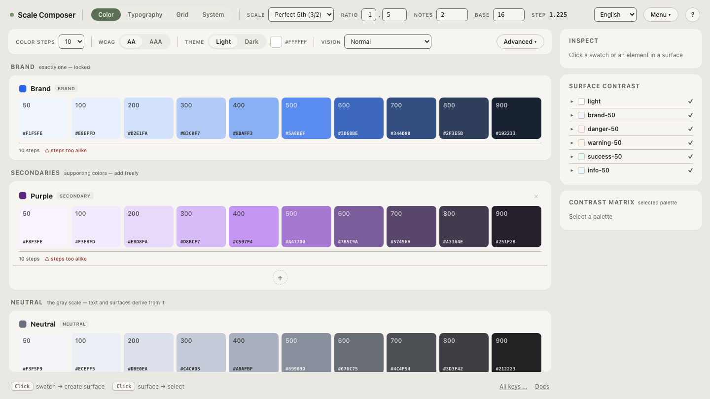
Open the piecewise curve on this ramp in Scale Composer — the ten steps plotted on the curve, the break point visible at 75 %, and the graded gaps readable in the step list.
What does the type scale have to do with the color ramp?
In Scale Composer, the two share one number. The site-wide scale ratio — the multiplier that spaces the type scale’s font sizes — also sets the color curve’s top exponent:
p₁ = 1 + (ratio − 1) × 1.5A perfect-fourth scale (ratio 1.333) gives p₁ ≈ 1.5. A denser major third (1.25) gives 1.375; a more dramatic augmented fourth (1.414) gives ≈1.62. The effect runs in one direction: the higher the exponent, the longer the ramp’s light steps hug white before falling — at ratio 1.25, step 100 lands at L ≈0.931; at 1.414 it rises to ≈0.946, with the descent through the midtones correspondingly faster.
The consequence is a system that moves together. Choose a steeper type scale — bigger jumps between heading sizes, a more theatrical hierarchy — and the color ramps steepen with it: light values held finer and longer, midtones falling away faster. Choose a denser, flatter scale and the ramps relax the same way. Whether hierarchy in type and hierarchy in color should share a temperament is a design stance rather than a law — but coupling them buys something concrete: one dial, and no way for the two systems to drift apart by accident.
Where should the break point sit?
The 75 % default puts the break at L ≈0.43, between the working midtones and the dark text steps — but it is a parameter, not a constant. Pull the break higher up the ramp and the bottom segment starts earlier: more of the scale becomes text-resolution territory. Push it lower and the top segment stretches, favoring surfaces. The guardrail while experimenting is the JND warning: when any two neighboring steps come within 0.02 L — roughly the threshold below which they stop being tellable apart — Scale Composer flags the pair, the sign that a curve has been pushed until steps collapsed.
Drag the break point on this ramp — move it up and down and watch the pockets of resolution travel with it; push it far enough and the JND warning shows exactly which pair of steps collapses first.