Primary, Secondary, Accent: Role-Based Color
Primary, secondary and accent are roles a color plays in a product, not kinds of color — and the ladder is shorter than the vocabulary suggests. A palette has exactly one primary (the brand color that identifies the product and marks its actions: buttons, links, focus), zero or more secondaries (supporting hues for illustration, data and marketing surfaces), and an accent — which is not a third color class but a usage: the highlight job, usually given to the primary itself or to one secondary. Around these stands the fixed supporting cast every palette carries: a neutral scale doing the surfaces and text, and the four functional colors doing success, warning, error and info.
The vocabulary got tangled because the terms arrived from different traditions — brand identity, interior design, component libraries — each using them slightly differently. Untangling them is mostly a matter of asking what job each color holds, which is the question running through our color scales guide.
What does each role actually do?
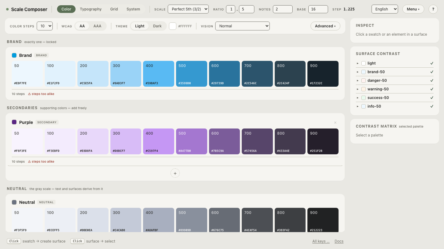
Primary (the brand color). Exactly one. It identifies the product and marks interaction: buttons, links, focus rings, selected states. The exactly-one is structural, not stylistic — when two hues compete for the action color, every screen has to renegotiate which one means “press here.” In Scale Composer’s palette UI the group is literally sized for it: Brand holds one color.
Secondaries. Zero or more supporting hues, and the honest note first: many strong interfaces have none. One brand color plus a neutral scale plus the functional four covers a complete product — every button, form, state and text level accounted for. Secondaries earn their place on surfaces the primary can’t cover alone: categorical data series, illustration, marketing sections, sub-brand areas. They are also where palettes go to bloat — hues added because the palette page looked empty, which then wander the product hunting for a job. In Scale Composer they are the open group, addable via the +.
Accent. A usage, not a color. In a one-color palette the primary is the accent; where a distinct accent hue exists, it is a secondary that has been given the highlight job. Treating accent as a role dissolves the “we still need to pick our accent color” worry — you may already have it.
Neutral and functional. The fixed cast: the neutral scale carries most of the pixels, and the four functional intents are convention-bound (a fixed group in Scale Composer). Neither is optional, and neither is really chosen so much as tuned.
How many colors does a palette actually need?
Fewer than palette pages suggest — and there is a useful proportion rule, provided it is handled as what it is. The 60-30-10 rule is a borrowed heuristic from interior design: a dominant share, a secondary share, a small accent share. Mapped honestly onto UI, the split skews further than the name implies: neutrals take the ~60 and usually far more — closer to 90 % of the pixels in a text-dense product — the brand color takes the ~10 as punctuation, and the middle band is everything else combined: secondaries where they exist, tints, functional moments.
The proportions are not a law; the ordering is the insight. The eye needs a dominant quiet field for figure to read against ground, a subordinate family, and a scarce highlight — scarcity is what makes an accent read as an accent. A palette where three hues each claim 30 % has no hierarchy for attention to follow.
Open a full palette’s role anatomy in Scale Composer — the four groups in one view: the single brand slot, the secondaries row with its +, the neutral scale, and the fixed functional four.
How do you choose secondaries well?
The common failure is mood-picking: a teal because it feels fresh, a coral because a moodboard had one. The colors may be pleasant, but nothing binds them to the palette — they are guests, not family. The alternative is to derive candidates from the primary’s own geometry, so the relationship is structural before it is aesthetic. From one primary, Scale Composer proposes four:
| Proposal | Hue offset | From #2563eb (H 262.9) |
|---|---|---|
| Tint | +12° | ≈275° — a close violet-blue sibling |
| Depth | −22° | ≈241° — a deeper, calmer blue |
| Counter | +165° | ≈68° — a warm amber across the wheel |
| Steel | +210° | ≈113° — a green counterweight on the complement’s far side |
The geometry is worth reading: two proposals are near neighbors of the primary (tint, depth) — harmony by kinship — and two sit across the wheel, flanking the exact complement at ≈83° rather than landing on it, since a pure complement tends to vibrate against its partner. Classical color theory knows that neighborhood as split-complementary territory. The proposals are candidates, not conclusions: a designer curates — takes the amber and discards the rest, or takes none. Each secondary that survives becomes a full ramp with the same machinery as the brand’s: lightness curve, chroma profile, derived roles.
What do real palette compositions look like?
Three compositions, smallest first. The ramp count assumes each color is a full scale: one brand + one neutral + four functional = six ramps before any secondary exists.
| Composition | Ramps | What it supports |
|---|---|---|
| Minimal — brand + neutral + functional | 6 | A complete product UI: actions, forms, states, the full text hierarchy. Nothing is missing. |
| Standard — plus 1 secondary | 7 | Illustration accents, marketing sections, two-series charts. |
| Expressive — plus 3 secondaries | 9 | Categorical data visualization, an illustration system, sub-brand surfaces. |
The guidance falls out of the table: start minimal, and add a secondary when a real surface demands one — a chart with four series is a reason; an empty-looking palette page is not. A secondary that arrives with a job stays coherent; one that arrives on mood goes looking for one.
The + in the secondaries group is where the role model becomes concrete. Add a secondary and derive it from your primary — the four proposals appear with their hue geometry. Keep one only if you can name the surface it will own.