Success, Warning, Error, Info: Functional Colors Done Right
Picture a muted enterprise dashboard: slate-blue brand color, tinted grays, nothing above a murmur — a palette tuned for eight-hour working days. A save completes, and a toast slides in: full-throttle neon green, straight from a component library’s defaults. Nothing is wrong with the green as a green. In this interface it looks pasted in from another product — and the seam it exposes runs through the entire category of colors it belongs to.
Functional colors — success green, warning amber-orange, error red, info blue — are the four conventional intent colors of interface design, and doing them right means two commitments: keep the hues on convention, because users arrive already trained to read them, and build each one as a full ramp tuned to your palette — chroma matched to the palette’s overall level, lightness placed so the four feel equally loud and pass contrast, and hue never left to carry a meaning alone. The neon toast fails the tuning half. This article covers both halves; the ramp machinery underneath lives in our color scales guide.
Why green, amber, red and blue — and not hues of your choosing?
Because the code is learned, not natural. Nothing in perception makes green mean success; the association is a convention, reinforced by traffic signals and by decades of interfaces repeating the same assignments, and users bring it with them into every new product. That prior training is the entire value: a red border reads as “something failed” before a single word is parsed.
Fighting the convention costs comprehension. A purple error is a puzzle first and a message second, and the tax is charged at the worst possible moments — when something has already gone wrong. The brand gets expressed everywhere else in the palette; these four are the place to conform. What you keep is still substantial: the exact hue angle within each band, the chroma level, the lightness placement — enough freedom to make the four unmistakably yours without breaking the code.
Why is each functional color a ramp, not a swatch?
Follow error through one form submission. The failing field needs a pale red
background — a 50-level tint. The icon and the field’s border need a
mid-strength core, a 500 or 600. The message text under the field needs a
700 that clears 4.5:1 against the pale tint behind it. One intent, three
steps — and hover states, dark surfaces and charts keep adding more. That is
the same tint–core–text anatomy a brand ramp has, and a single #ff0000-class
swatch cannot supply it.
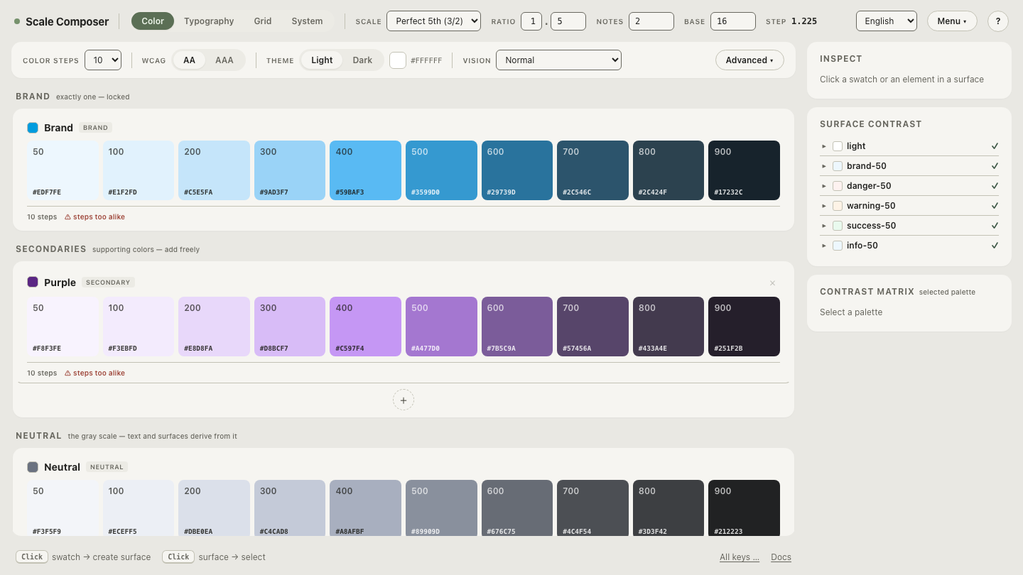
In Scale Composer, the four intents are a fixed group in the palette UI, and each is generated as a full 50–900 ramp by the same machinery as the brand color: steps on the lightness curve, chroma shaped by a profile and capped below the gamut ceiling, semantic roles derived per surface against WCAG floors and APCA.
Open the four functional ramps in Scale Composer — success, warning, error and info as ten-step scales, each with its tint, core and text steps derived the same way the brand ramp’s are.
How do you make the four feel native rather than pasted in?
Match their chroma to the palette’s overall level. The neon toast fails because of distance: a muted palette whose brand peak sits around chroma ≈0.09 cannot absorb a success green at ≈0.22 — the green is playing in a different register. Pull the four’s peak chroma toward the palette’s level, sitting slightly above it so they still signal: around ≈0.11–0.13 against that ≈0.09 brand, as a working figure. The reverse failure exists too — a vivid consumer palette with timid functional colors makes real states look decorative.
This rule is only statable because OKLCH chroma is absolute across hues: “the four peak within ≈0.02 of the brand” means the same amount of color for the green, the amber, the red and the blue alike.
Why does red shout while green whispers at “equal” intensity?
Because the full-strength primaries are perceptually lopsided. Full red
#ff0000 is oklch(≈0.63 0.26 29); full green #00ff00 is
oklch(≈0.87 0.29 142). Pick both at “full intensity” and you have paired a
heavy, dark color with an airy, light one — the error dominates every layout
it shares with success, reading angrier than intended while the green fades
to wallpaper.
The fix is placement, not intuition: give the four similar chroma and similar core lightness in OKLCH — say cores near L ≈0.55–0.60 at matched chroma — and they come out equally loud. Equal loudness is a palette property you can construct, not a coincidence you hope for.
Why is warning the hardest of the four?
Because amber lives high. The hue band users read as “warning” reaches its
vivid best at high lightness — a representative amber sits around
oklch(≈0.77 0.19 70) — and against a white background that computes to
roughly 2.1:1. That fails everything: the 3:1 floor for icons and borders and
the 4.5:1 floor for text.
The worked case: to clear 3:1 against white, an amber icon or border needs its lightness down to about L ≈0.67; warning text on white needs about L ≈0.57. But darkening amber drags it toward brown, so the craft is to hold chroma up as the steps darken, accept that the 600–700 steps read more orange than the 500, and lean on the ramp’s anatomy: a pale 50–100 amber surface with dark 700–800 amber-brown text carries the intent, while the 3:1-clearing 600 draws the border. (On dark backgrounds the problem eases — bright amber is at home there.)
What about users who can’t read the hue at all?
Roughly 1 in 12 men has a red–green color-vision deficiency, which collapses precisely the success–error distinction the convention leans on. So hue is never the only signal: WCAG’s use-of-color criterion makes this a hard rule, and the practical form is that an icon and text always accompany the color. The ramp anatomy helps here too — a pale tinted background with dark text carries “something needs attention” through lightness structure alone, even for someone who cannot tell the red field from the green one.
The tuning half is the part to practice, because it is the part component libraries skip. Re-tune the four functional ramps against a muted brand palette — pull their chroma toward the palette’s level and watch the moment the toast stops shouting and starts belonging.