Deriving Supporting Colors from a Primary (Color Harmony)
Here is a two-minute experiment. Take a saturated blue — #2563eb, which is
oklch(0.546 0.215 262.9) — and rotate its hue halfway around the wheel to
its textbook complement, an orange at ≈83°. Render that complement at the
blue’s own lightness and chroma (≈#AB5B00, trimmed to what sRGB can hold)
and set the two side by side as flat fields sharing a hard edge. Look at the
boundary. It shimmers. Each color seems to push against the other, and the
edge between them refuses to sit still. The effect is simultaneous contrast,
and it is the first thing the classical harmony rules fail to warn you about.
Color harmony is the practice of deriving supporting colors from a primary through hue-wheel relationships — complementary, split-complementary, analogous, triadic. A color harmony generator applies those rotations to a seed automatically, but one built for UI adjusts the textbook twice: it offsets around the complement rather than landing on it, and it drops each candidate’s lightness and chroma below the primary’s, so the result supports rather than competes. What comes out are structurally related candidates — whether the palette needs any of them is still a design decision. How candidates become ramps and roles is covered across our color scales guide; this article is about why the rotations themselves work.
Where does the harmony vocabulary come from?
The scheme names are painting-tradition vocabulary, and it helps to say so plainly. Complementary: two hues opposite each other on the wheel, 180° apart. Analogous: close neighbors, typically within 30–40°. Split-complementary: a hue plus the two hues flanking its complement. Triadic: three hues spaced 120° apart. The classical color scheme catalog rests on one premise: the hue circle is a map of relatedness, and colors whose positions have a describable geometric relationship tend to read as belonging together.
That premise transfers to interfaces well. The rest of the tradition needs translation, because a painting and a UI use color differently. A painter mixes, glazes and mediates — a complementary pair in a landscape usually meets through neutrals and broken color, rarely as two flat fields at full strength. An interface does exactly the thing painting avoids: solid fills, hard edges, no texture in between. The schemes name useful relationships; the strengths at which painting deploys them do not survive the move to flat color.
Why do complementary pairs vibrate on screen?
The shimmer in the opening experiment has a mechanism. The visual system encodes color partly through opponent channels, and a strong field of color induces a tinge of its complement in whatever sits next to it — that is simultaneous contrast. Put a color and its actual complement side by side at full chroma and the two inductions collide along the shared edge, each field exaggerating the other. If the two colors also sit at similar lightness, the edge gets worse: the eye locates edges largely by luminance difference, and an equal-lightness boundary between two vivid complements gives it very little to lock onto. The result is the characteristic unstable, vibrating border — famous in op art, unwelcome in a toolbar.
None of this means complements are unusable in UI. It means the textbook pair — full strength, equal footing, side by side — is the one configuration that reliably misbehaves. Practical derivation keeps the temperature contrast a complement offers and gives up the head-on collision, in two moves.
Why offset around the complement instead of landing on it?
The first move is angular. From the blue seed’s hue of 262.9°, the exact complement sits at ≈83°. Scale Composer’s counter proposal is placed at +165° instead of +180° — landing at ≈68°, a warm bronze fifteen degrees short of the collision point. Its steel proposal approaches from the far side at +210°, ≈30° past the complement. The two across-the-wheel candidates bracket the complement without touching it — which is split-complementary territory in the classical vocabulary. You keep most of what the complement offered (a hue as warm as the primary is cool) while stepping off the axis where the opponent channels fight hardest.
Why do derived candidates also drop lightness and chroma?
The second move is about strength, and it follows from a simple observation: rotation alone produces a rival, not a support. A supporting color that matches the primary’s vividness competes with it — two hues at equal chroma and similar lightness claim equal attention, and the palette acquires two first voices. So practical derivation dials every candidate down. Measured against the seed’s chroma of 0.215, the four proposals below arrive at roughly ≈0.05–0.08 — between a quarter and two-fifths of the primary’s colorfulness — and their lightness moves well off the seed’s 0.546 in one direction or the other. The intuition worth keeping: hue rotation decides where a candidate stands; the lightness and chroma drop decides how loud it speaks, and a supporting color speaks second.
What do the four proposals look like from a real seed?
Run the derivation on the blue seed and the geometry becomes concrete:
| Proposal | Hue offset | Result | L | C |
|---|---|---|---|---|
| (seed) | — | #2563EB | 0.546 | 0.215 |
| Tint | +12° | ≈#C0CAF8 | ≈0.85 | ≈0.07 |
| Depth | −22° | ≈#0E3B58 | ≈0.34 | ≈0.07 |
| Counter | +165° | ≈#734B18 | ≈0.45 | ≈0.08 |
| Steel | +210° | ≈#787C5B | ≈0.57 | ≈0.05 |
The table reads as a compressed harmony lesson. Tint and depth are the analogous moves — near neighbors, one lifted toward a pale wash, one sunk toward ink. Counter and steel are the split-complementary moves, flanking the ≈83° complement from either side. And every row carries a fraction of the seed’s chroma: no candidate arrives at a strength where it could be mistaken for a second primary.
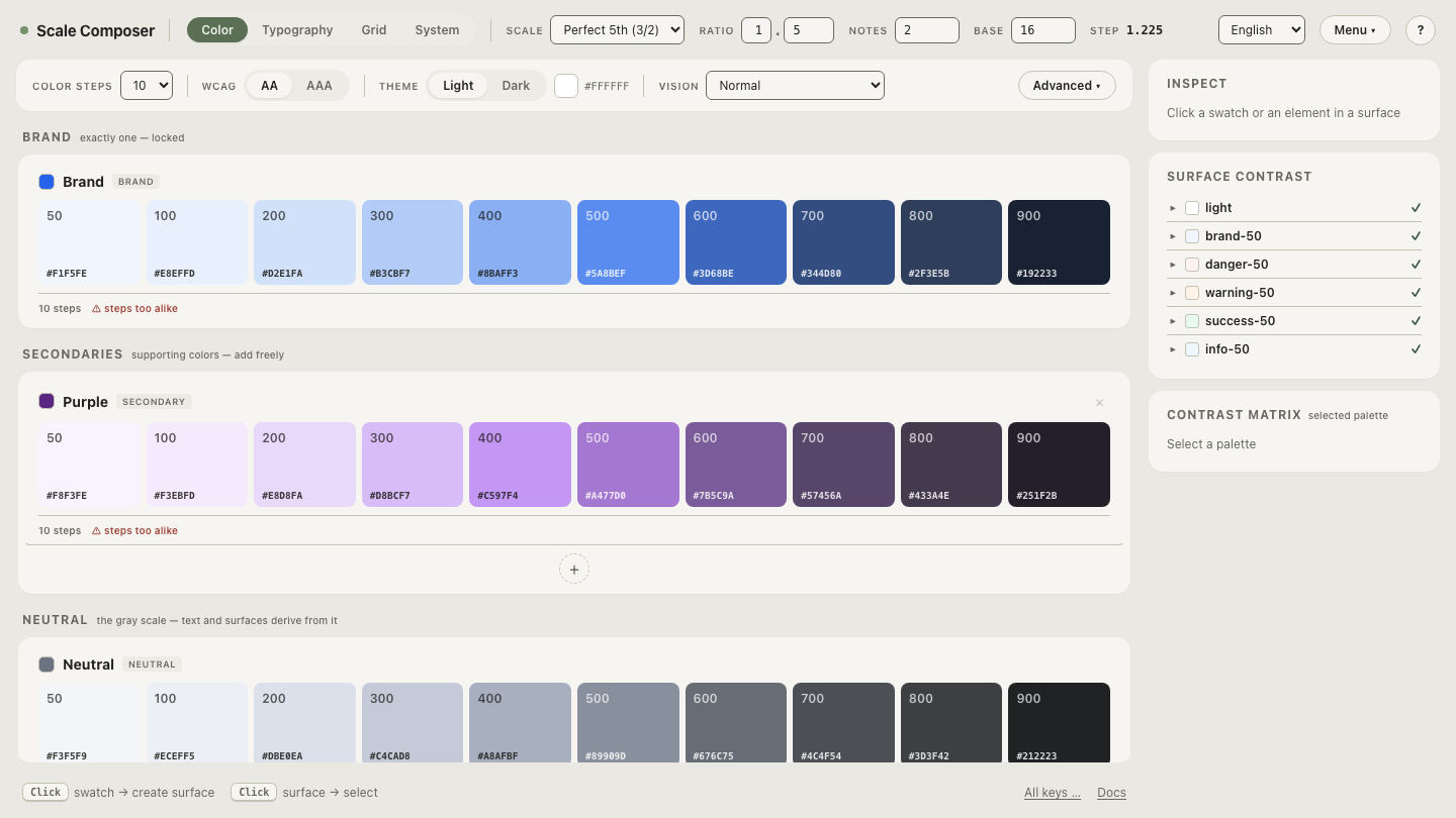
Open the four proposals derived from this blue in Scale Composer — the seed with its four candidates side by side, each one’s hue offset and dialed-down strength visible against the original.
What can harmony decide — and what can’t it?
The honest boundary: geometry guarantees that candidates are related to the primary, not that they are right for the product. Wheel relationships are a filter against arbitrary color — a bronze derived from the brand blue is family in a way a moodboard coral never will be — but they know nothing about whether the product has charts that need categorical hues, marketing surfaces that want warmth, or neither. Many interfaces do their entire job with one hue plus neutrals and functional colors, and for them the correct number of supporting colors is zero. That call sits outside harmony’s reach.
So treat the output of any harmony generator as a shortlist, not a palette. Open the proposals and keep at most one — discard the rest, and keep that one only if you can already name the surface it will own. A candidate that survives curation with a job attached is harmony doing its actual work: narrowing infinite hue space to a handful of structurally sound options, and leaving the decision where it belongs.