Text on Colored Buttons: Picking the On-Color
A team ships a brand refresh, and the new primary button — a friendlier, lighter blue than the old one — goes out with the white label every button before it wore. The accessibility audit comes back weeks later: the label fails contrast. Nobody changed the text; the fill moved under it. The pairing that passed for years stopped passing the day the brand brightened.
The text on a colored button is checked against the fill it sits on, not against the page — and mid-lightness fills are the trap: there is a band of brand colors where neither pure white nor near-black text clears the 4.5:1 floor for body-size labels. Systems solve this with a derived on-color — a text role computed per fill with a hard contrast floor, falling back to a near-white or near-black anchor when no step of the ramp passes. How that band works, and how to design your way out of it, is this piece of our color scales guide.
Which contrast pair actually gets measured?
The label against the fill — nothing else. A blue button on a white page involves three colors, and the pair that decides whether the label is readable is label-on-blue. The floors come from WCAG’s contrast minimum: 4.5:1 for text at ordinary sizes, relaxing to 3:1 for “large” text — 24px and up, or 18.66px and up if bold. Most button labels are neither, so 4.5:1 is the working floor.
Run the numbers on the blue used throughout this hub, #2563eb
(oklch(0.546 0.215 262.9)): white text on it measures ≈5.2:1 — passes with
room. But near-black text (#111-class) on the same fill measures ≈3.6:1 —
fails. This fill has exactly one viable direction, and it happens to be the
one convention prefers. Not every brand is so lucky.
Where is the danger zone?
Brighten the brand and watch the pass flip. A lighter blue of the
#4A8CF7 class — around L 0.65 in OKLCH — gives white text ≈3.3:1 (fails
body-size text) while dark text now clears ≈5.7:1 comfortably. Somewhere
between those two blues the two options trade places, and in the crossover
band — fills around L ≈0.58–0.62 — neither pure white nor near-black
reaches 4.5:1. That band is the danger zone, and it is not exotic: friendly,
saturated mid-tones are exactly where many contemporary brands like to live.
The intuitive way to hold it: white text needs a dark stage and dark text needs a light one, and a mid-lightness fill is neither. It sits in the middle of the seesaw where nobody gets enough leverage.
What is an on-color, and how is it derived?
The system answer is to make the label a derived role rather than a
per-button choice. Among the ~17 semantic roles Scale Composer derives per
surface is onFill: the text color for content sitting on a colored fill,
picked with a hard WCAG floor — and when no step of the ramp passes against
the fill, the role falls back to a system anchor, the near-white or
near-black that wins on raw contrast. The derivation replaces the guess:
every fill — including functional fills like error and success —
gets a label color that was checked at generation time, and a
future brand shift re-derives the answer instead of silently invalidating it.
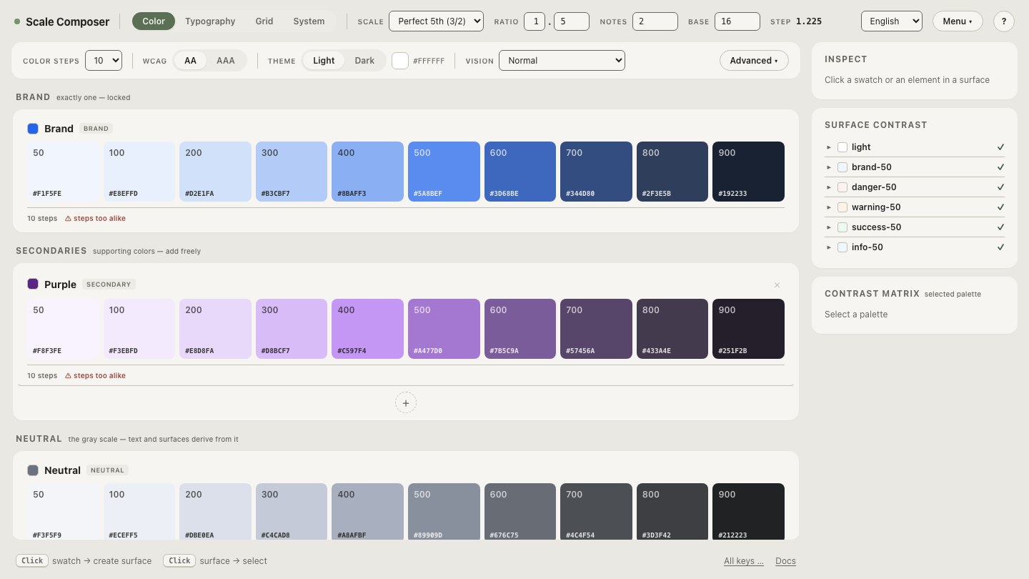
Open the on-color derivation in Scale Composer — the brand
fill with its derived onFill role, the contrast ratio it clears, and the
APCA value alongside.
Why does “just use white” persist?
Two honest reasons. Aesthetically, white-on-color reads cleaner to many eyes — dark text on a colored fill has a utilitarian flavor some brands resist. And the large-text carve-out muddies the water: a bold 19px label only needs 3:1, so a pairing that fails the audit for one button passes for its larger sibling, and teams generalize from the button they tested. The carve-out is real — larger, heavier strokes genuinely need less contrast to read — but it rescues only the buttons that actually meet the size threshold, which most don’t.
What are the escape hatches when the brand sits mid-zone?
Three, in rough order of how often systems reach for them:
- Darken the fill one step. The quiet choice many systems made: buttons use the 600 rather than the 500, precisely so white text clears the floor. The brand hue survives; the fill moves a step down its own ramp — the same move that derives hover and pressed states.
- Embrace dark text. Material 3 took this road across its tonal palettes — dark-on-tonal pairings as the default. It reads contemporary once the initial unfamiliarity fades, and it opens the light half of the ramp for fills.
- Qualify as large. Bold the label and size it 18.66px up, and 3:1 applies. Legitimate, but fragile — it binds a color decision to a typography decision, and the next person to shrink the label breaks the contract invisibly.
One paragraph on the newer instrument: APCA, the contrast model WCAG’s next generation is built around, grades the mid-zone more finely than the ratio does, distinguishing pairings the 4.5:1 rule lumps together. The Scale Composer shows the Lc value alongside every ratio without passing verdicts on it, because APCA’s thresholds depend on use. As a second opinion in the danger zone, it is exactly where that finer grain helps.
Find your own brand’s edge
Whether your brand sits safely on one side of the crossover or inside it is a measurement, not a guess. Load a mid-lightness fill and watch the on-color derivation work the edge case — nudge the fill’s lightness step by step and see where the derived label flips from white to dark, and where the system anchor has to step in because the ramp itself has nothing that passes. That flip point, found once, is worth a page of guidelines: it tells you exactly how much room your brand color has before its buttons start arguing with their own labels.